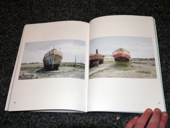
In The Beginning It Was Humid. Bastien Aubry – Dimitri Broquard. Nieves.

Posted in sculpture on January 23rd, 2012
Tags: , , ,

In The Beginning It Was Humid. Bastien Aubry – Dimitri Broquard.

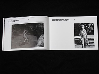
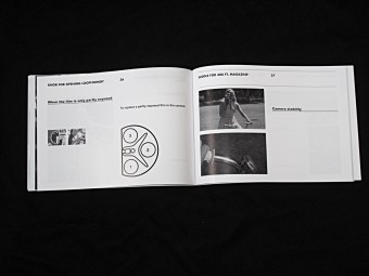
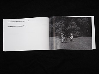
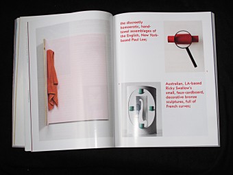
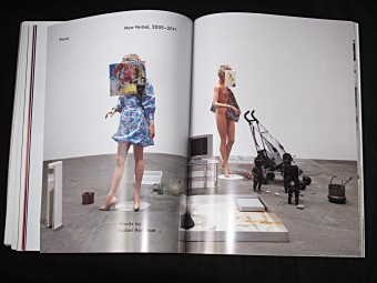
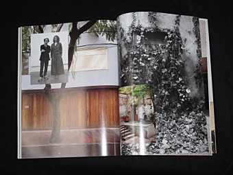
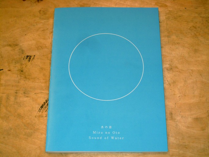
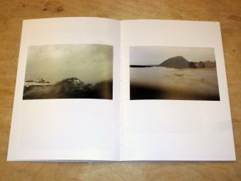
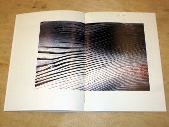
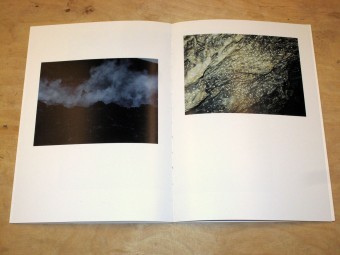
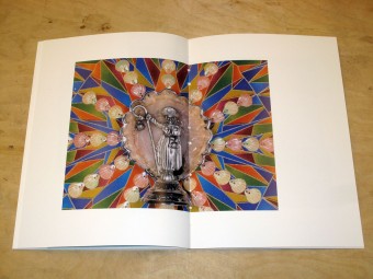
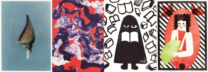
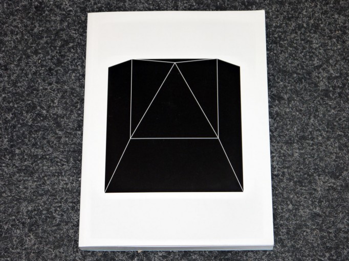
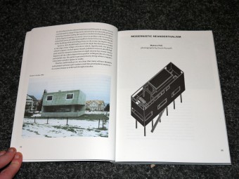
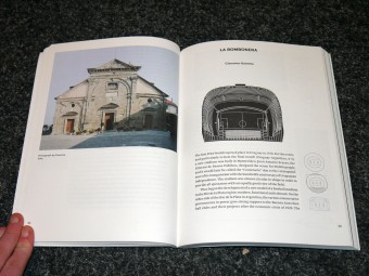
Since a few years, Bastien Aubry and Dimitri Broquard do artistical work inspired by outsider art or the applied arts like handcrafts or ceramics. It appears as if they both don’t think much of rules and that they just spontaneously adapt their ideas. That makes their work fresh and full of expression. In the Beginning it was Humid – their fourth publication with Nieves – features a broad selection of their ceramic works from the last few year, and concludes with a short story by A.C. Kupper.

Bastien Aubry (1974) and Dimitri Broquard (1969) established the two-man design studio Flag in 2002. They work for art and cultural institutions, producing catalogues, artists books, magazines and posters. FLAG also creates drawings, illustrations for editorials and private projects. Both Broquard and Aubry respectively teach at art schools in Switzerland.

D 16€

Buy
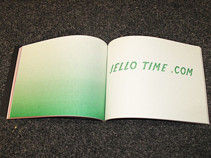
Paper Rehabilitation Project: Blank Book #1

Posted in Uncategorized on January 21st, 2012
Tags: ,


Paper Rehabilitation Project: Blank Book #1

Made of paper from a warehouse of excess, rejected and damaged paper in Detroit.
Bound at a printing shop on the east side.
Designed by I.T.U. (Daniel Aubert and Lana Cavar) in collaboration with Maia Asshaq, Harry Burstyn and Pete Janutul.

162 pages; 81 blank sheets
Covers available in three colors.

D 10€

Buy
Wandering #1: Zürich Launch, 26.01.2012 @ Motto Zürich

Posted in magazines, Motto Zürich event on January 21st, 2012
Tags:

Wandering #1
With contributions from: Airen, Jean du Arc, David Aylers, Tenzing Barshee, Daniel Baumann, Bill Berkson, Bomec, Juliette Bonneviot, Max Brand, Stefan Buck, Caroline Busta, Kerstin Cmelka, Ann Cotten, Dari, Iris Därmann, Nikola Eschenbach, Fredi Fischli, Gregory Fong, Lars Erik Frank, Nina Franz, Dillon de Give, Lena Henke, Viggo Julsgard Jensen, Julia Jung, Nuri Koerfer, Wolf von Kries, Quinn Latimer, David Lieske, Ariane Müller, Silvio Do Nascimento, Eckhart Nickel, Niels Olsen, Aude Pariset, Danica Phelps, Sam Pulitzer, Roy Radich, Marta Riniker-Radich, Michele Robecchi, Jörg Harlan Rohleder, Sarah Colony Rose, Andreas Rosenfelder, Emanuel Rossetti, Vanessa Safavi, Emily Segal, Brandon Shimoda, Martin Schmitz, Chris Sharp, Queen of Sheba, Fabrice Stroun, Kate Sutton, Greg Parma Smith, Mark Soo, Julian Stalbohm, Rui Tenreiro, Uvid, Stewart Uoo, Hendrik Weber, Jean-Michel Wicker, Amelie von Wulffen, Adolf Wölfli, Dena Yago, Amy Yao, Anicka Yi.

Launch on the 26th of January, @ Motto Zürich, 7pm.

And screening of: Zazie dans le métro, Louis Malle
And music by: Florent/M + WTF

http://wanderingmagazine.tumblr.com/

How To Look Out. Marijn van Kreij. De Hallen Haarlem.

Posted in Exhibition catalogue on January 20th, 2012
Tags: , ,

How To Look Out. Marijn van Kreij.

Van Kreij’s play with appropriation and copying fits comfortably with our contemporary visual culture, where the immediate and endless reproduction of the image takes centre stage and no single image is ‘safe’ any longer. The artist questions this mechanism by returning to manual workmanship (drawing is the basis of Van Kreij’s artistic practice) and by partly concentrating on insignificant and meaningless pictures. Following in Van Golden’s tradition Van Kreij for example presents paintings that are based on the geometric patterns on the inside of envelopes. By magnifying these trivial things the artist intensifies our awareness of the fleeting visual structures that surround us all in daily life.

D 10€

Buy

Types We Can Make. ECAL.

Posted in graphic design, typography on January 20th, 2012
Tags: , , , , ,

Types We Can Make. ECAL.

Depuis le 8 septembre 2010 et jusqu’au 25 février 2011, l’ECAL/Ecole cantonale d’art de Lausanne présente «Types We Can Make» au MIT Museum/Compton Gallery. Cette exposition imaginée par l’ECAL en collaboration avec le Consulat de Suisse/swissnex Boston et le MIT Museum/Massachussets Institute of Technology offre une sélection de typographies contemporaines suisses. A l’occasion de cet événement, l’ECAL publie un livre de 150 pages.

Par le biais de cette exposition à la Compton Gallery du MIT Museum, produite avec le Massachusetts Institute of Technology (MIT), le Consulat général de Suisse et Swissnex à Boston, l’ECAL/Ecole cantonale d’art de Lausanne est fière de confronter la tradition suisse à une approche irréverencieuse plus contemporaine. Les deux d’ailleurs s’inscrivent parfaitement dans la ligne de ce qui a été fait à l’ECAL depuis l’arrivée en 1995 de Pierre Keller en tant que directeur. Notamment grâce à l’Unité de design graphique dirigée jusqu’en 2009 par François Rappo (présent dans l’exposition avec diverses fontes) et aujourd’hui responsable avec Pierre Fantys du Master in Art Direction lancé à l’automne dernier.
Cette exposition reflète totalement la politique instaurée dans cette école. On y trouve ainsi tout ce qui a permis d’hisser cette institution dans le club très select des dix meilleures écoles d’art et de design du monde. A commencer par la présence d’intervenants et professeurs de renommée internationale tels que Ludovic Balland, Cornel Windlin, Jonas Voegeli, NORM (Dimitri Bruni et Manuel Krebs). Des personnalités qui ont su dispenser leur savoir-faire tant en matière de Corporate Identity (fonte, logo, affiche…) que de design de caractères. L’apprentissage de la courbe qui va droit au but!

On y trouve également les travaux d’un grand nombre d’anciens étudiants qui ont pu expérimenter par eux-mêmes ou avec le concours de l’ECAL les différents champs de l’art typographique et les nombreuses applications qui en découlent. Qu’il s’agisse de la création pure de fontes comme celles d’Aurèle Sack, Nicolas Eigenheer, Philippe Desarzens, Mathieu Cortat, Emmanuel Rey, Jeremy Schorderet ou Ian Party. Du lancement d’un magazine tel que Sang Bleu par Maxime Büchi dont les qualités sont louées aux quatre coins du globe. D’un travail de recherche par David Keshavjee et Julien Tavelli mis en application dans l’ouvrage Typeface as program édité par JRP/Ringier et l’ECAL. De monographies d’artistes, de revues et magazines, voire même de logos comme celui réalisé pour RocNation du célèbre rappeur américain Jay-Z, par Gilles Gavillet et David Rust. De projets de scripting qui confinent au design interactif comme ceux initiés par Jürg Lehni et Alex Rich. De travaux de direction artistique par FAGETA composé d’Adeline Mollard et Philippe Egger pour Gestalten Verlag, d’Annina Mettler pour Das Magazin ou encore de Marie Lusa pour Migros Museum für Gegenwartskunst à Zurich. Sans oublier des affiches illustrées par Körner Union (formé de Guy Meldem, Tarik Hayward, Sami Benhadj) et Tatiana Rihs.
La scénographie réalisée par Alexis Georgacopoulos, responsable du Master en design de produit, met en lumière les typographies grâce à des affiches au format mondial (F4), qui est celui utilisé dans les rues en Suisse. Elles sont directement imprimées sur du carton «nid d’abeilles», un matériau rigide, léger et respectueux de l’environnement.

D 40€

Buy

Lines from the series After Modern History. Tramnesia.

Posted in Uncategorized on January 18th, 2012
Tags:


Lines from the series After Modern History. Tramnesia.

After Modern History is a report on world events that re-edits the news of the day by linking together images according to a totally idiosyncratic perspective of pattern recognitions and typologies. After Modern History lifts photos from daily newspapers and re-organizes disparate, often atomized subjects into newly imagined affinities. For most people caught on the hard end of luck, the newspaper can be a lonely place. But in this second draft of history, bad news is no longer so isolated. There is no dateline.

Lines is a collection of newspaper clippings from the New York Times and the Wall Street Journal of people lining up.

D 8€

Buy

I.T.U. Books @ Motto Berlin. 18.01.2012

Posted in Events, Motto Berlin store on January 16th, 2012


I.T.U. – International Typographical Union
Wednesday Jan 18th
start 7pm

Paper Rehabilitation Project, Series 1
Detroit Blank Book

The blank books in this first series of the Paper Rehabilitation Project are made of stock found at a warehouse of excess, rejected and damaged paper. Each book contains four different sheets and three different stocks for the covers – blue and gray with a linen finish, and a plum, with a sort of faux -leather finish. They were bound by Janutol Printing
on Detroit’s East side.
The paper in these books was probably originally purchased by printers for their clients, but for one reason or another it was not used as intended. It ended up on the scrap market at a high-volume paper recycler, where there was a small chance it would be bought by another printer, or more likely it would be shredded and sold (by weight) to a paper mill where it would become the recycled content in a new sheet of paper.
It took us a long time to learn of the existence of this paper. Printers, paper distributors, and even many paper recyclers are reluctant to speak of this kind of surplus paper, perhaps because it threatens the commodity status of ‘clean’ paper. We had the feeling that by having it bound into a book we were causing a minor disruption in the circulation of paper. We captured these sheets at this particular moment in time, while they were available, and made 600 books that we will never again be able to reproduce.

I.T.U. – International Typographical Union
Danielle Aubert, Maia Asshaq, Lana Cavar
http://internationaltypographicalunion.org/

White Fungus # 12

Posted in magazines, painting, photography, politics, writing on January 12th, 2012
Tags:

White Fungus # 12

White Fungus is an experimental arts magazine based in Taichung City, Taiwan. Featuring writing on art, new music, history and politics, plus original artworks, poetry, fiction and comics, White Fungus is an ongoing experiment in community media art.

Often described as a work of art in itself, White Fungus is held in library collections including The Museum of Modern Art (New York), The Southbank Centre (London), Museu d’Art Contemporani de Barcelona (Spain), National Library of Australia and Te Papa (National Museum of New Zealand).

Complimenting its publishing schedule, White Fungus holds interdisciplinary arts events at galleries around the world. Past events have been held at P.P.O.W (New York), Taipei Contemporary Art Center, ARTSPACE (Auckland) and Adam Art Gallery (Wellington).

WF, from their unique vantage, come across one minute as hardcore situationist anarchists yet offset with the economic nerdiness and steadfast verve of a William F. Buckley; it’s captivating to follow how the gears shift. – FANZINE, 2010

As the spores have been released its creators look forward to seeing which way the wind blows. The only thing more uncertain than its future is its past.

D 15 €

Buy

Motto Disco 01: KUEDO

Posted in Motto Disco, music on January 12th, 2012
Tags: , , ,

When we first moved to Berlin in summer 2008, we imagined many things were ahead of us. Motto Berlin has just turned 3 years and to celebrate this we’ve had a couple of ideas. The first one takes form right here and we’d like to name it Motto Disco. Friends, collaborators and people we admire have been asked to put together mixtapes with the idea that they should be played within the context of Bookstores. Stay tuned in the weeks and months to come as this is the start of a collection of unexpected and versatile encounters. Enjoy!


Motto Disco 01: Kuedo


The first offering from the Motto Disco project comes in the form of a playlist selected by the eminent Kuedo.
Under varying projects, the UK born / Berlin based artist has been an instrumental figure in the evolution of electronic music in the UK and beyond for just under a decade. He most recently released his critically acclaimed debut album ‘Severant’ on the prevalent British label, Planet Mu.

Kuedo has curated this playlist entitled ‘Sinking in the Datatank’ specifically with the act of reading in mind, delving into a hypnotic modern history of avant-garde electronics and rousing soundscapes.


KUEDO – SINKING IN THE DATATANK

http://official.fm/tracks/337465


soundcloud.com/kuedo
kuedo.tumblr.com

‘Severant’ is available at Planet Mu Records


Judith Raum “even running” & Shannon Bool “Inverted Harem” @ Motto Berlin. 14.01.2012

Posted in Events, Motto Berlin event on January 12th, 2012

The evening will feature a discussion between Judith Raum and Suhail
Malik on international-financial-statehood and globalised trade as
seen through Raum’s textile and steel constructions based on
improvisation, and a discussion between Shannon Bool and Monika
Szewczyk regarding the complex position that feminism offers and how
this relates to an aesthetic ambivilance in Bool’s practice. The talks
will develop into a broader discussion that addresses the underlying
psychology and social-historical readings of Bool and Raum’s material
processes.

Judith Raum: even running
The publication translates Judith Raum’s lecture performance „harmless
entrepreneurs“ (2011) into a book format and documents recent
solo-exhibitions at uqbar Berlin and The Return, Dublin. For both
shows, Raum’s painting and installations focused on Deutsche Bank’s
economic engagement in the Ottoman Empire during the early 20th
century. Raum contrasts the entrepreneurs’ modus operandi as evidenced
in archival correspondences and photographs with the improvisational
nature of some of the production along the railway line constructed by
the bank, as well as with her own material interventions.

Texts by Jonathan Carroll, Suhail Malik and Judith Raum, design by HIT.

Shannon Bool: Inverted Harem
Bool’s first institutional solo exhibitons „Mind the Gap“ Crac Alsace,
Altkirch, „The Inverted Harem I“ GAK Bremen, and „The Inverted Harem
II“ Bonner Kunstverein culminated in this publication. Her paintings,
photograms, collages, carpets, wall paintings, and objects revolve
around displacements of context, transfers of meaning, and how
different cultures and periods articulate different ideas about one
and the same thing. Bool interweaves high art with less reputable
techniques to create works that revolve around displacements of the
meanings of materials, visual traditions, and ideas of femininity,
eroticism, or the oriental.

Texts by Janneke de Vries, Christina Vegh, and Monika Szewczyk, design
by Michael Pfrommer

Judith Raum “even running”

November 2011, German/English
21 x 29,7 cm, 72 pages, color, softcover
ISBN 978-3-89462-208-4
Edited by the Graduate School for the Arts and Sciences of the Berlin
University of the Arts and Goethe-Institut Irland
published by Verlag der Universität der Künste Berlin

Shannon Bool „Inverted Harem“

EDITORS: CRAC Alsace Centre Rhénan d’Art Contemporain Altkirch, GAK
Gesellschaft für Aktuelle Kunst Bremen, Bonner Kunstverein
LANGUAGE: German / English
FORMAT: 22 x 29,5 cm
FEATURE: 96 pages, approx. 30 color images, hardcover
ISBN: 978-3-942405-61-4