Vilaine Fermière 2023. Tess Robin

Posted in graphic design, illustration, printmaking on December 22nd, 2022
Tags: , , , ,

The 2023 edition of the Vilaine Fermière calendars have the theme of ‘death gods’, with references to antique, medieval and modern representations of different demons throughout the world.

Each copy is riso printed and bound by hand. Each page has 2 colors and the cover has 3.

Order here

Type Life Issue #2. Swiss Typefaces. SWTY Publishing.

Posted in graphic design, magazines, Motto Berlin store, newsprint, printmaking, typography on February 2nd, 2018
Tags: , , ,

Type_Life_2_Swiss_Typefaces_Motto_1Type_Life_2_Swiss_Typefaces_Motto_2.2Type_Life_2_Swiss_Typefaces_Motto_4Type_Life_2_Swiss_Typefaces_Motto_5Type_Life_2_Swiss_Typefaces_Motto_6Type_Life_2_Swiss_Typefaces_Motto_7Type_Life_2_Swiss_Typefaces_Motto_8Type_Life_2_Swiss_Typefaces_Motto_9

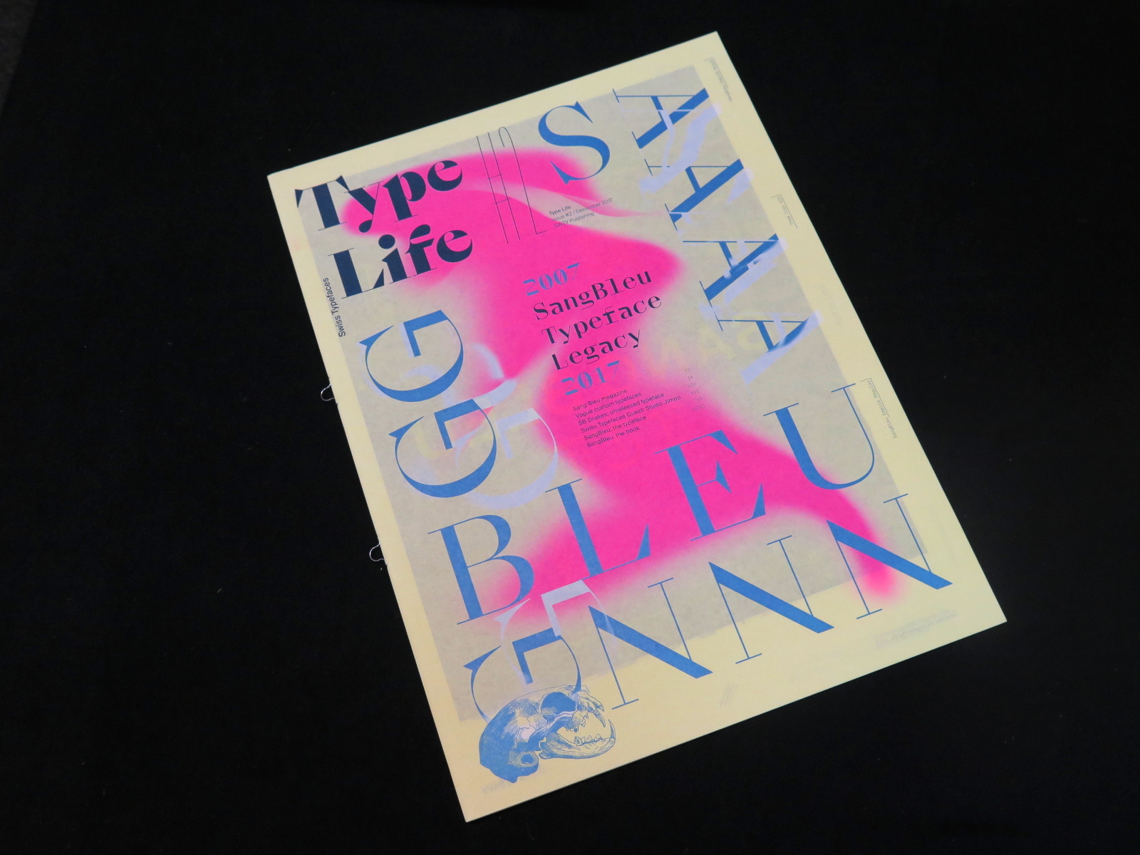
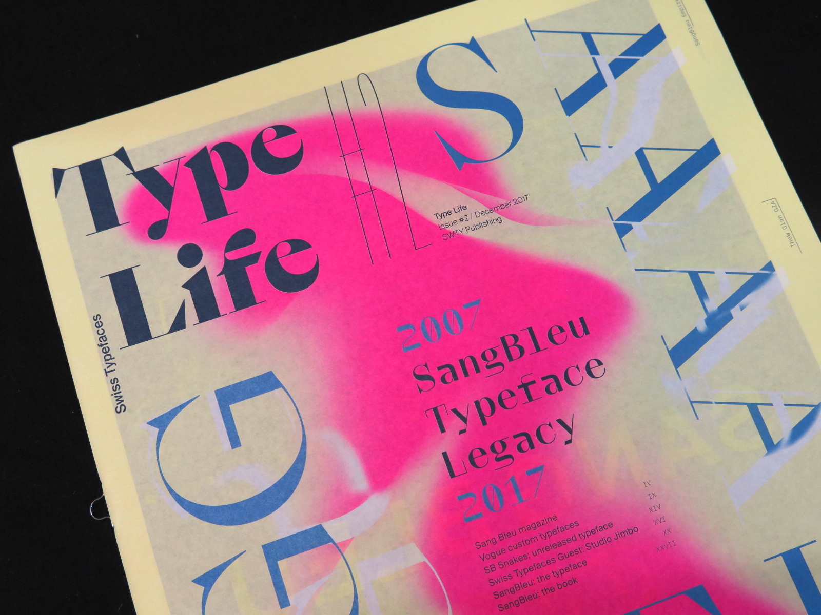
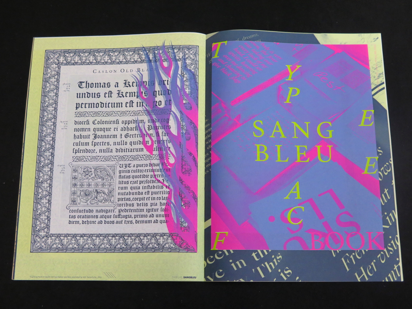
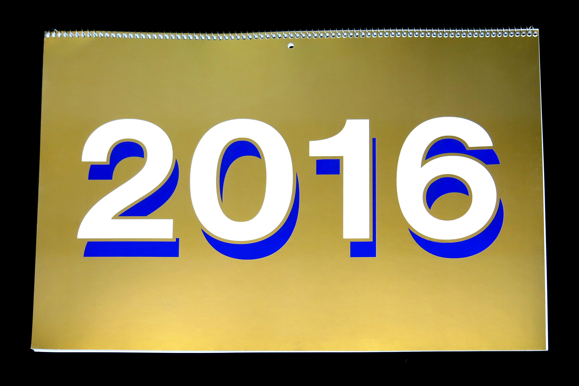
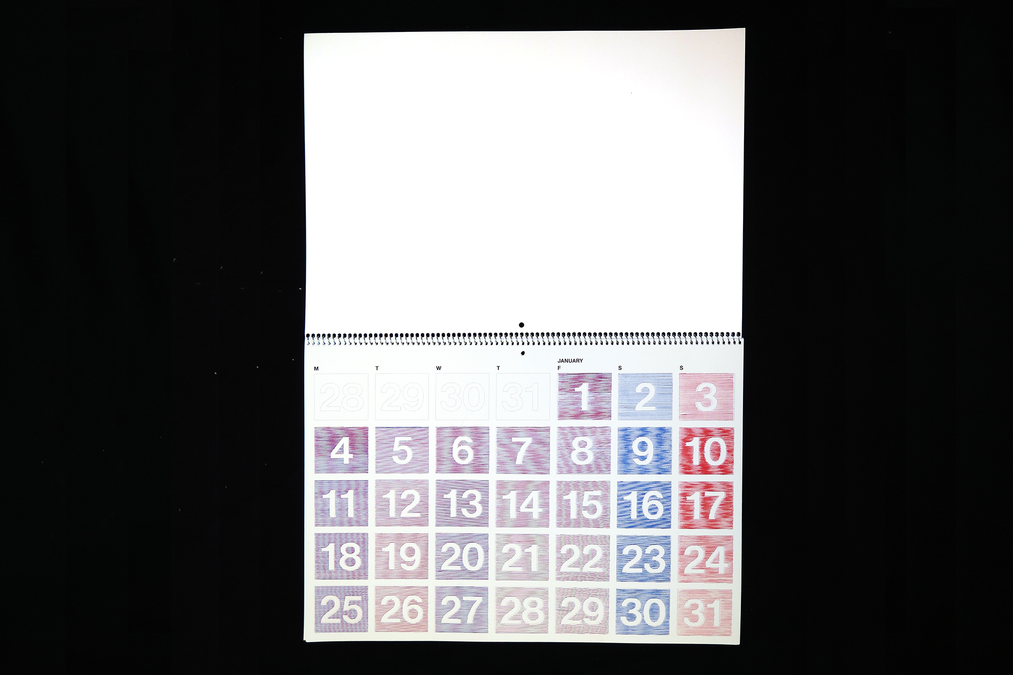
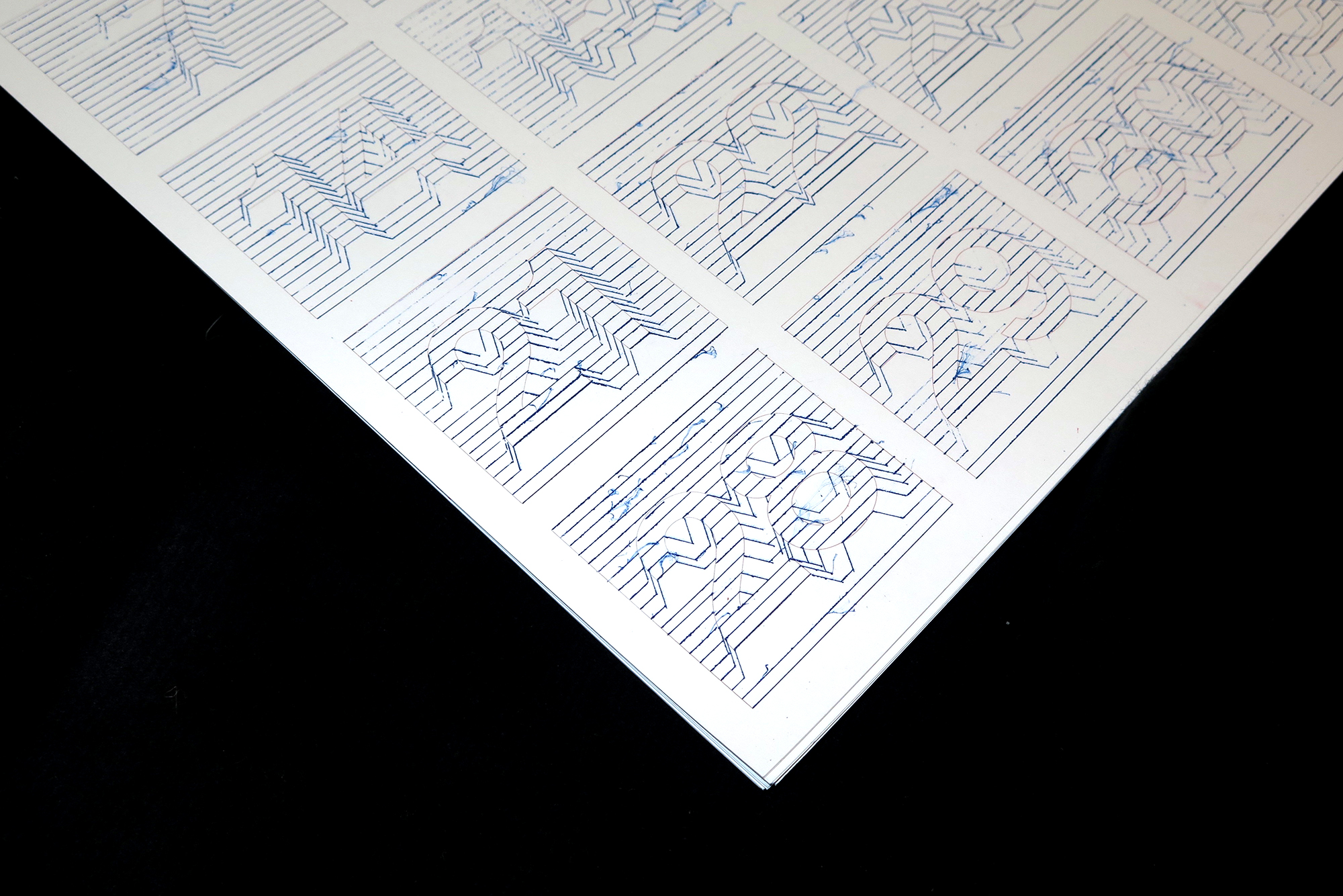
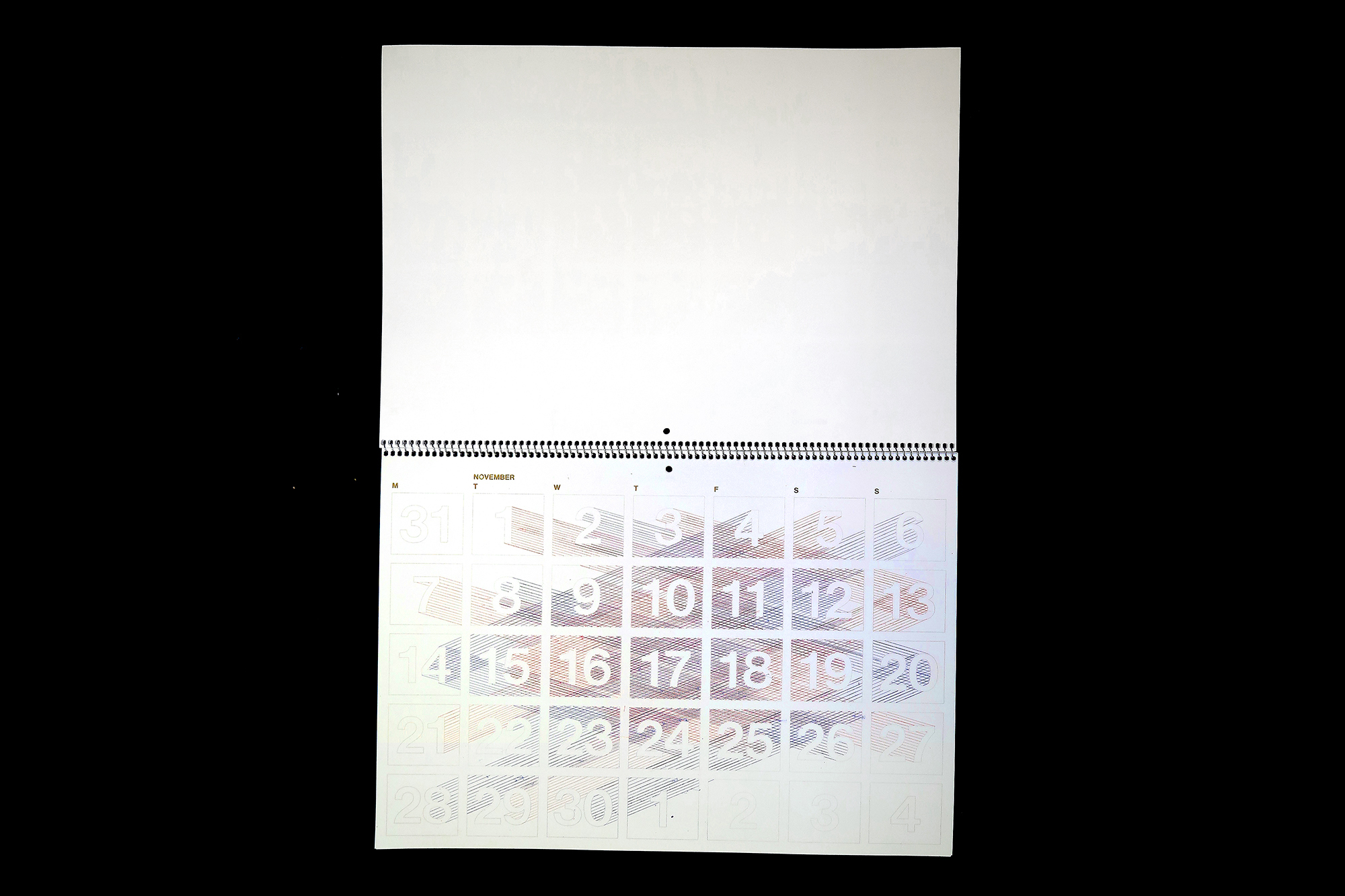
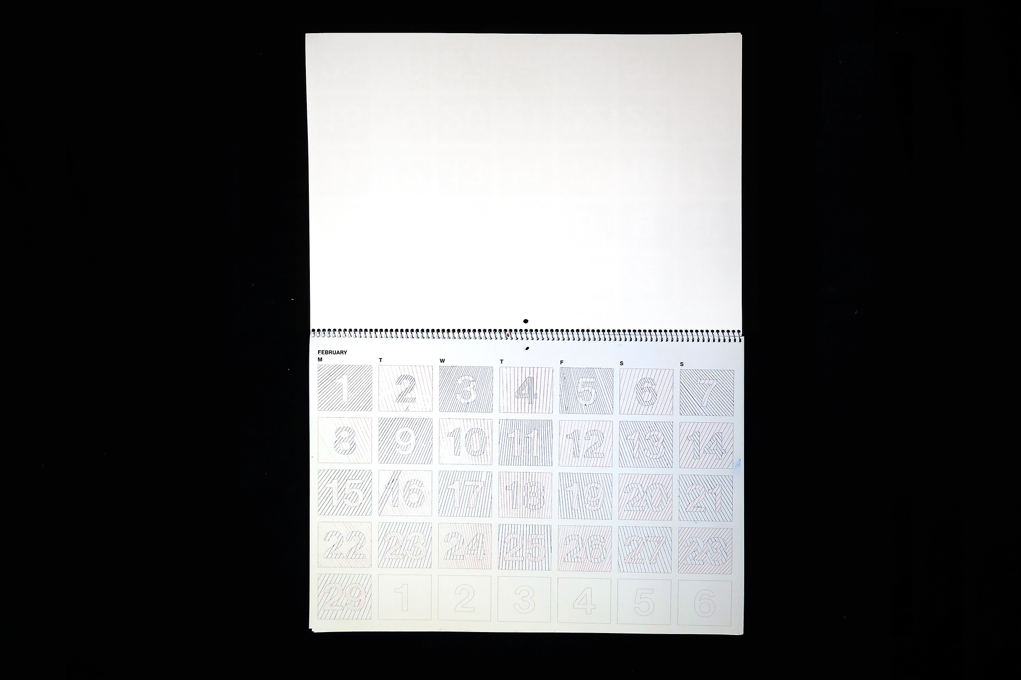
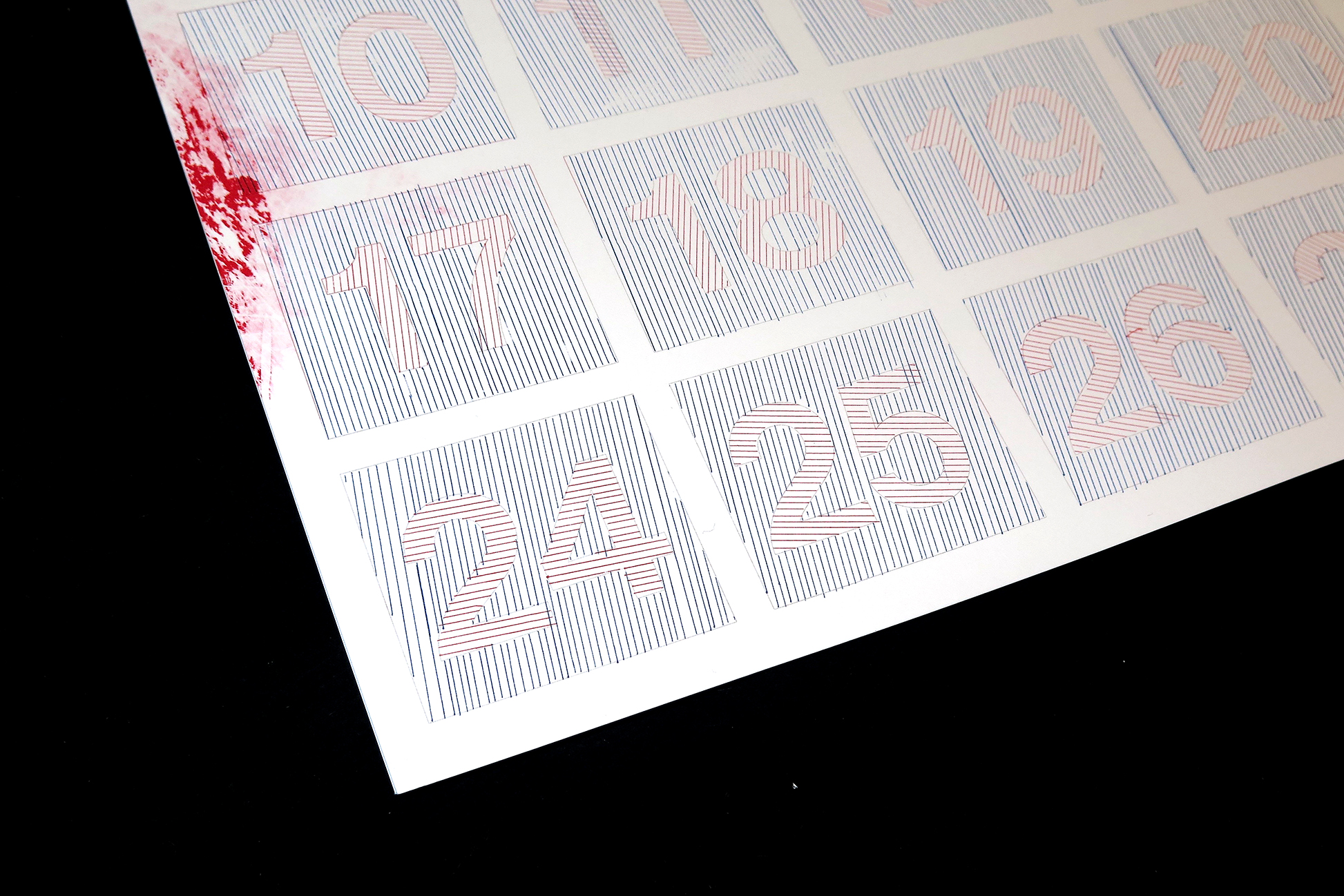
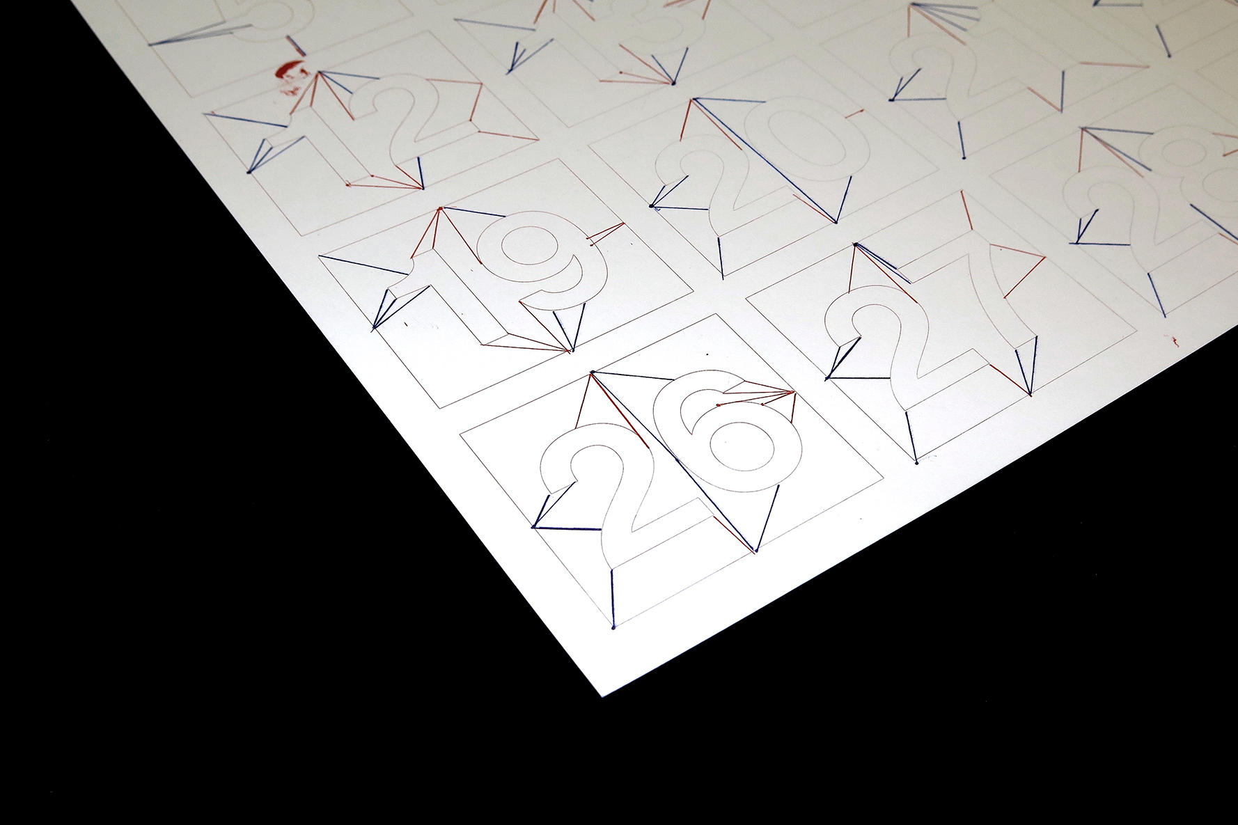
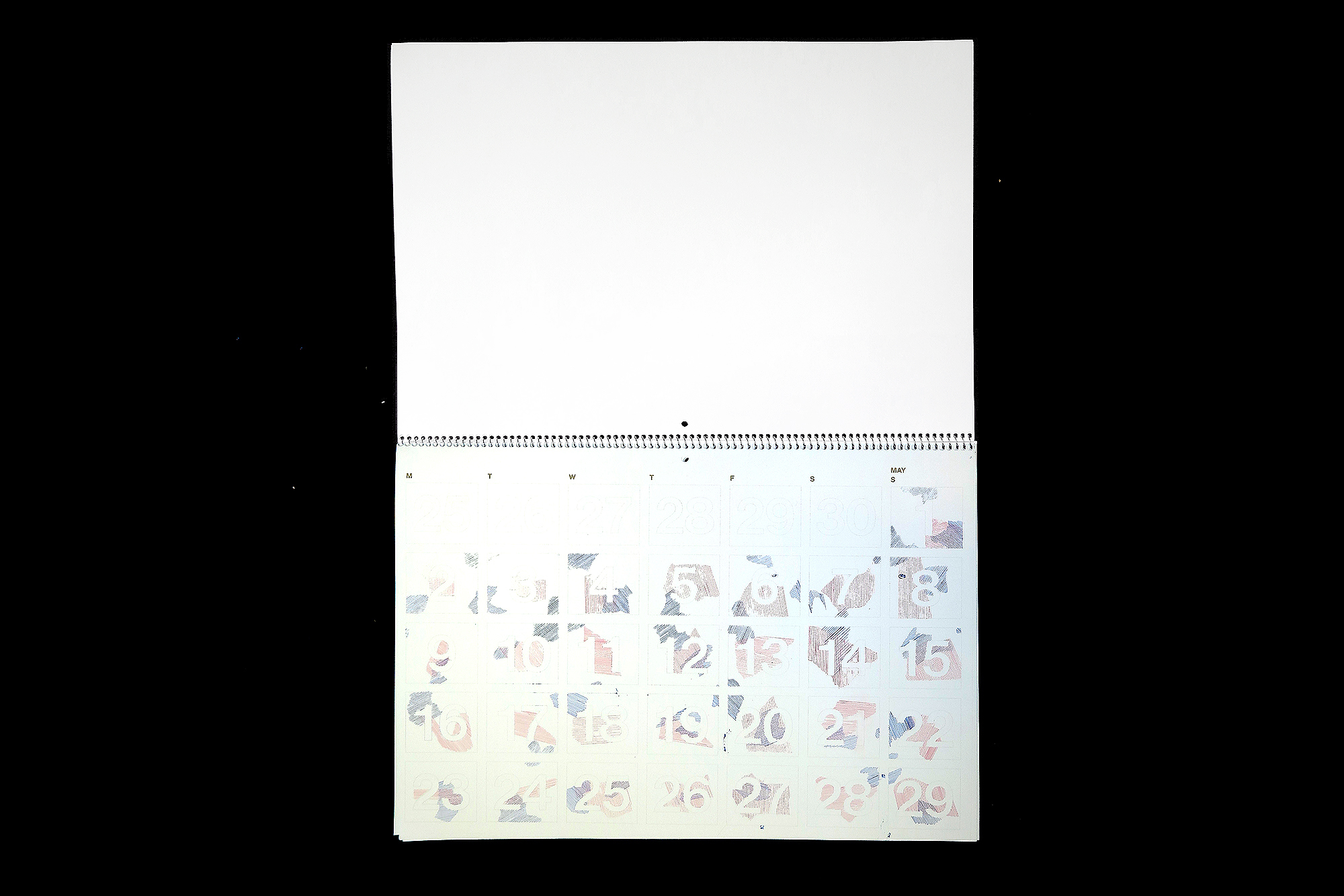
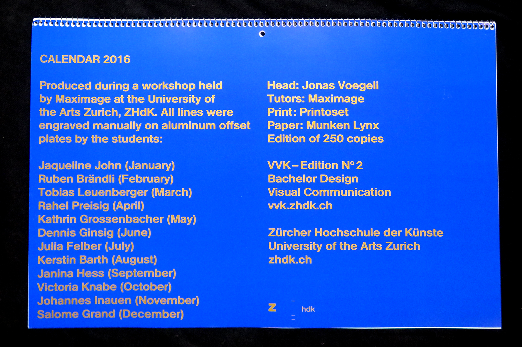
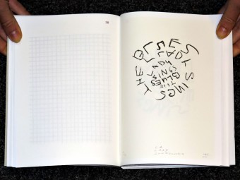
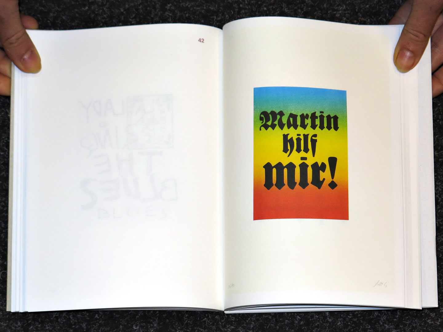
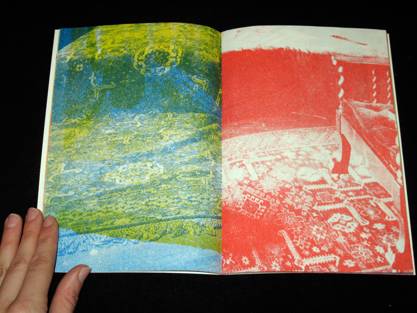
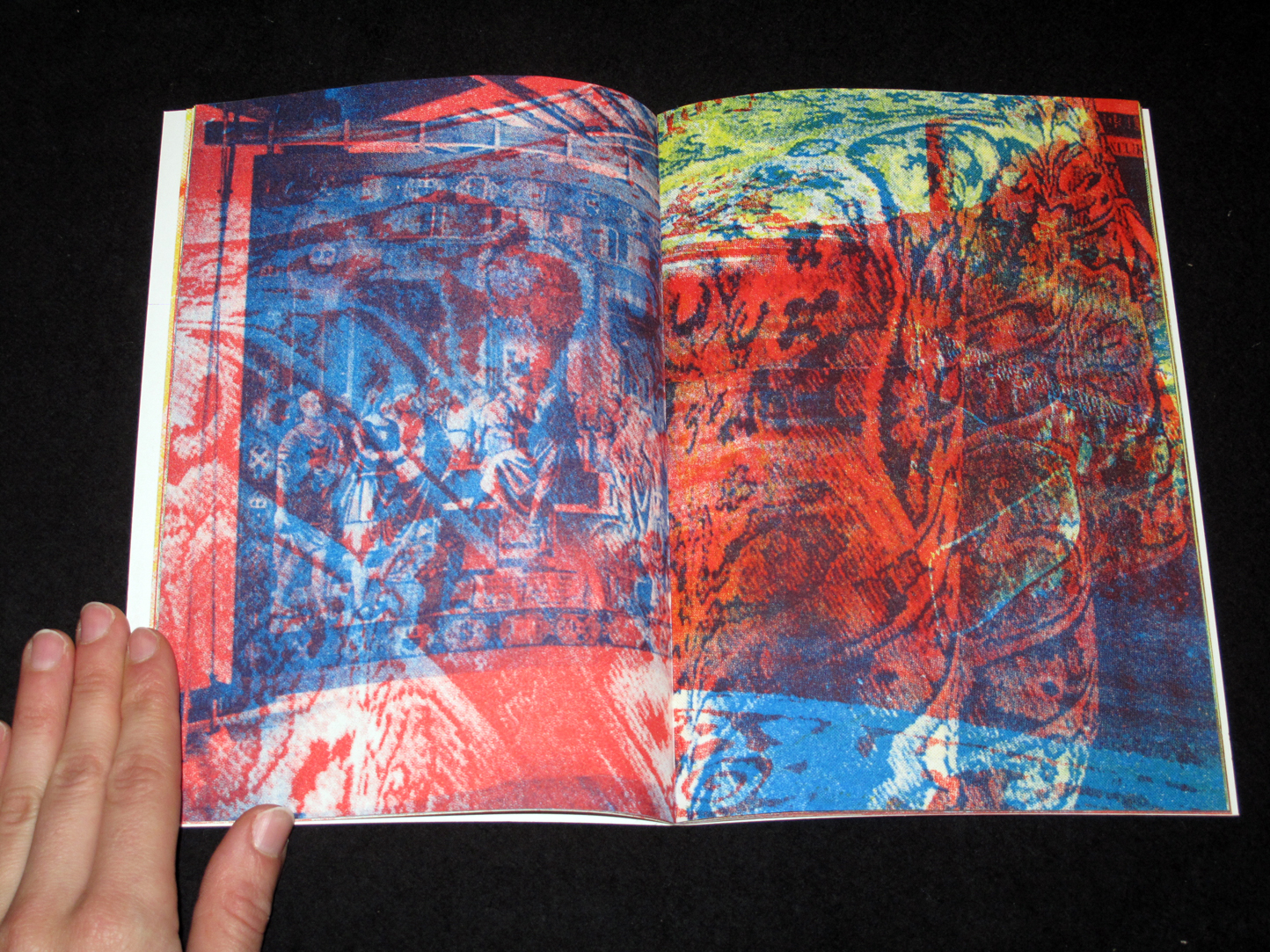
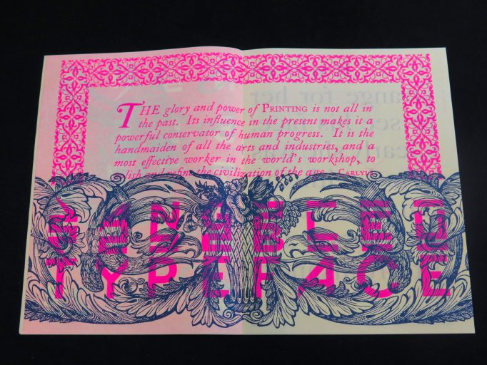
The second issue of Type Life brings a cornucopia of visual inspiration. Swiss Typefaces presents insights into their cosmos of style, fonts, and fashion. This is the only place where you’ll find both Rihanna and Rudolf Koch, and where photos of contemporary art and streetwear are framed by engravings from the Caslon foundry. Type Life doesn’t make many words, and instead shows plenty of letterforms. Printed in six Pantone colors, it features mirrored words, slanted letters, gradients and all the other things your design prof wouldn’t approve of.

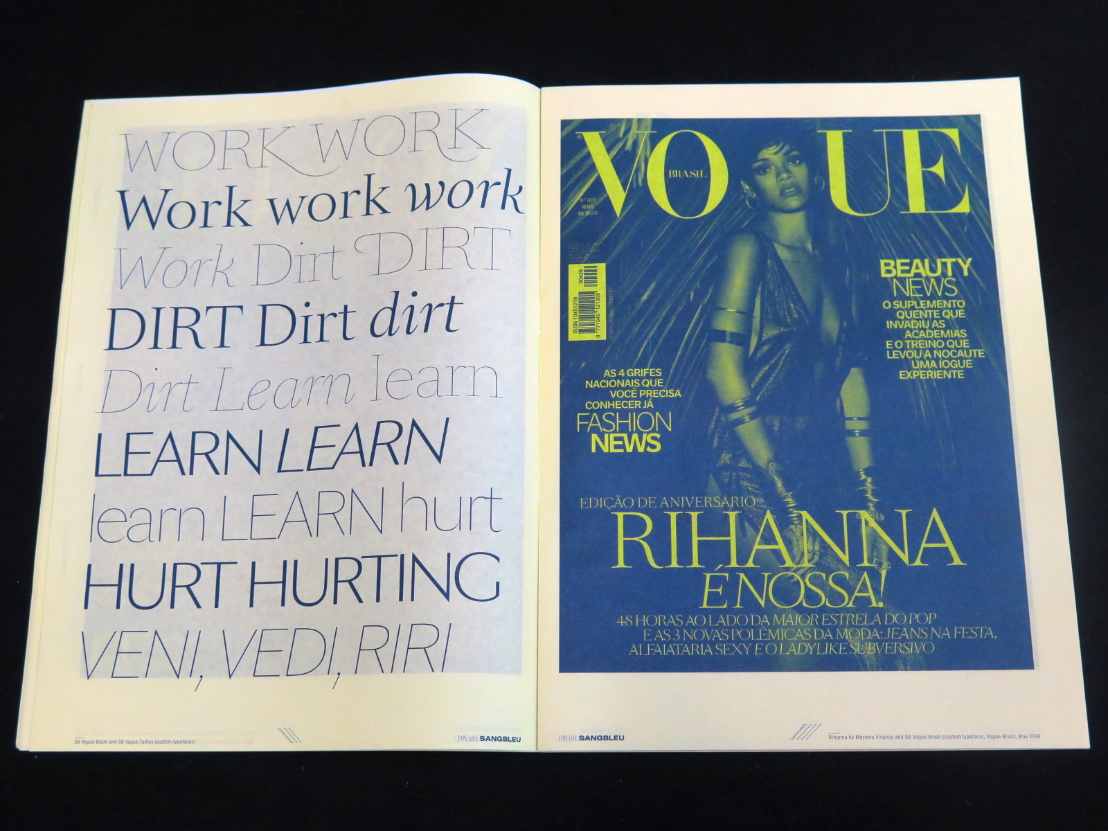
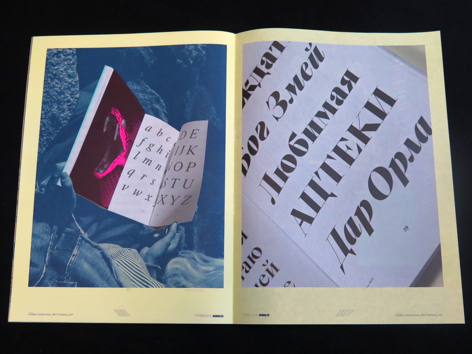
At the heart of this issue is Sang Bleu – the name both of a typeface and of a creative agency. Over the past decade, the two have built a legacy together. Shown are fonts that debuted in the Sang Bleu magazine, some of which later were released by Swiss Typefaces, and others that remained private. Custom typefaces designed for Vogue appear next to the experimental script variant SangBleu Snakes, followed by a stunning guest contribution from the Paris-based Studio Jimbo. Type Life #2 is made perfect by an introduction to the all-new SangBleu typeface and the accompanying printed book that showcases its 5 collections and 45 styles, released in October 2017.


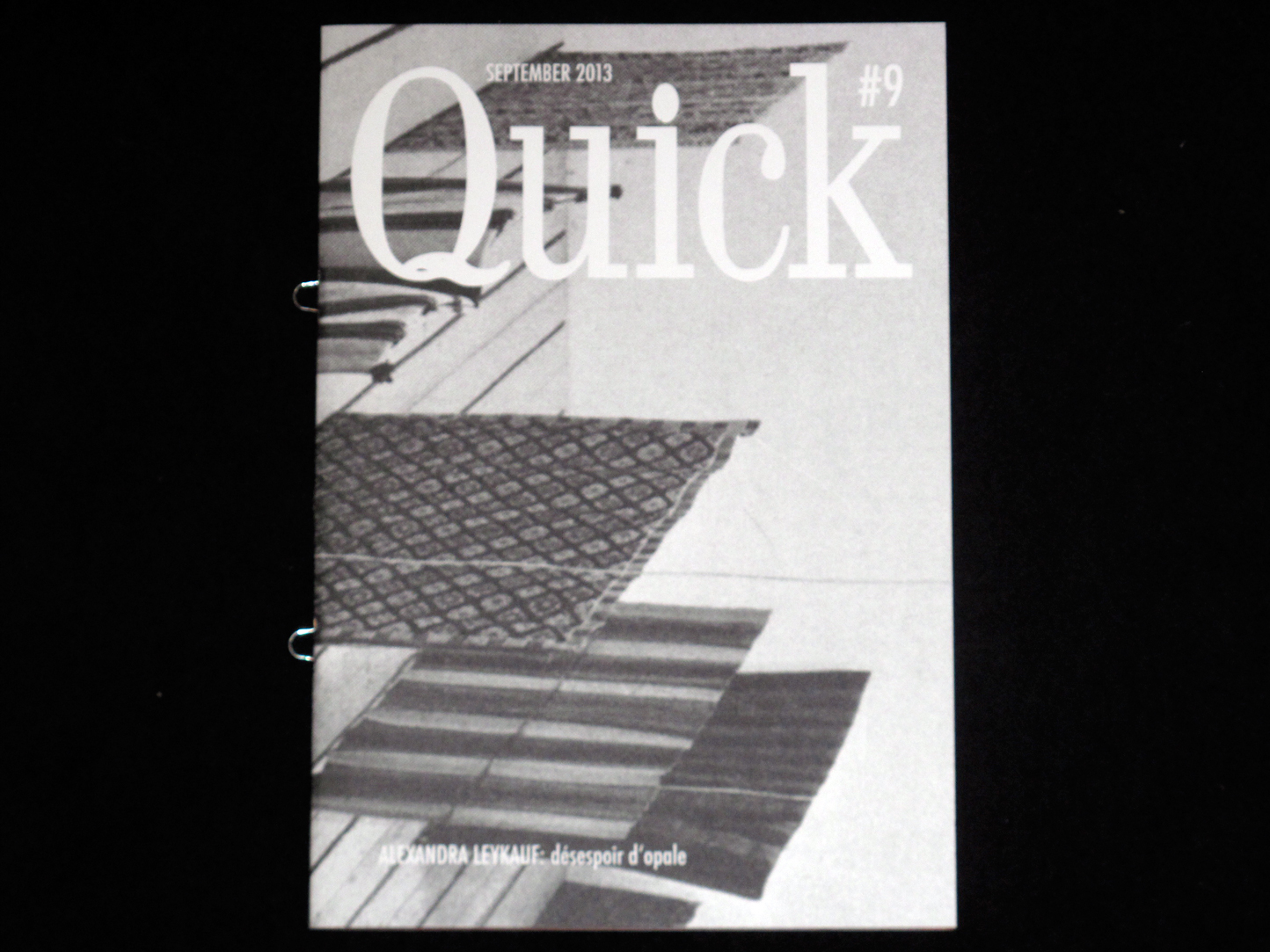
Publisher: SWTY Publishing, 2017
Language: English
Pages: 36
Size: 23.5 x 32 cm
Binding: Softcover, loop staples
Printing: Offset, 6 Pantone colors
Printed in Switzerland


Buy it

Calendar 2016. Maximage. Jonas Voegeli. ZHdK

Posted in graphic design, printmaking, typography, workshop on February 4th, 2016
Tags: , ,

Calendar 2016-Maximage-MottoCalendar 2016- Maximage-Motto 1Calendar 2016-maxmage-mottoCalendar 2016- Maximage-Motto 5 Calendar 2016- Maximage-Motto 4Calendar 2016-maximage-motto 10 Calendar 2016-maximage-motto 9Calendar 2016- Maximage-Motto 8 calendar 2016-maximage-motto 7

Produced during a workshop held by Maximage at the University of the Arts Zurich, ZHdK. All lines were engraved manually on aluminum offset plates by the students:

Jaqueline John (January)
Ruben Brändli (February)
Tobias Leuenberger (March)
Rahel Preisig (April)
Kathrin Grossenbacher (May)
Dennis Ginsig (June)
Julia Felber (July)
Kerstin Barth (August)
Janina Hess (September)
Victoria Knabe (October)
Johannes Inauen (November)
Salome Grand (December)

Head: Jonas Voegeli
Tutors: Maximage
Print: Printoset
Paper: Munken Lynx
Edition of 250 copies

€15.00

buy it

In Darkness. A Collaboration by Brothers Kevin & Kristian Henson. Hardworking, Goodlooking. The Office of Culture & Design

Posted in graphic design, history, illustration, lifestyle, newsprint, photography, printmaking, writing on December 23rd, 2015
Tags: , , ,

In Darkness_Kevin and Kristian Henson_Hardworking, Goodlooking°The Office of culture and Design_Motto Books_1In Darkness_Kevin and Kristian Henson_Hardworking, Goodlooking°The Office of culture and Design_Motto Books_3In Darkness_Kevin and Kristian Henson_Hardworking, Goodlooking°The Office of culture and Design_Motto Books_4In Darkness_Kevin and Kristian Henson_Hardworking, Goodlooking°The Office of culture and Design_Motto Books_5In Darkness_Kevin and Kristian Henson_Hardworking, Goodlooking°The Office of culture and Design_Motto Books_6In Darkness_Kevin and Kristian Henson_Hardworking, Goodlooking°The Office of culture and Design_Motto Books_7In Darkness_Kevin and Kristian Henson_Hardworking, Goodlooking°The Office of culture and Design_Motto Books_8In Darkness_Kevin and Kristian Henson_Hardworking, Goodlooking°The Office of culture and Design_Motto Books_2In Darkness_Kevin and Kristian Henson_Hardworking, Goodlooking°The Office of culture and Design_Motto Books_9In Darkness_Kevin and Kristian Henson_Hardworking, Goodlooking°The Office of culture and Design_Motto Books_10In Darkness_Kevin and Kristian Henson_Hardworking, Goodlooking°The Office of culture and Design_Motto Books_11In Darkness_Kevin and Kristian Henson_Hardworking, Goodlooking°The Office of culture and Design_Motto Books_12In Darkness_Kevin and Kristian Henson_Hardworking, Goodlooking°The Office of culture and Design_Motto Books_13In Darkness_Kevin and Kristian Henson_Hardworking, Goodlooking°The Office of culture and Design_Motto Books_14


An Archive of International crust punk music, Filipino anarchist zines, Black and white punk aesthetics, anti-system philosophies, A descent into illness, a discourse on recovery

Published by Hardworking, Goodlooking

€78.00

Buy it


Printmaking by Ecal 2008-2014. Musée Jenisch Vevey – Cabinet cantonal des estampes. ECAL

Posted in printmaking on July 9th, 2015
Tags: ,

Printmaking_by_Ecal_2008-2014_Musee_Jenisch_Vevey_ECAL_motto_distribution_1Printmaking_by_Ecal_2008-2014_Musee_Jenisch_Vevey_ECAL_motto_distribution_9 Printmaking_by_Ecal_2008-2014_Musee_Jenisch_Vevey_ECAL_motto_distribution_8 Printmaking_by_Ecal_2008-2014_Musee_Jenisch_Vevey_ECAL_motto_distribution_7 Printmaking_by_Ecal_2008-2014_Musee_Jenisch_Vevey_ECAL_motto_distribution_2Printmaking_by_Ecal_2008-2014_Musee_Jenisch_Vevey_ECAL_motto_distribution_6 Printmaking_by_Ecal_2008-2014_Musee_Jenisch_Vevey_ECAL_motto_distribution_5 Printmaking_by_Ecal_2008-2014_Musee_Jenisch_Vevey_ECAL_motto_distribution_4 Printmaking_by_Ecal_2008-2014_Musee_Jenisch_Vevey_ECAL_motto_distribution_3 Printmaking_by_Ecal_2008-2014_Musee_Jenisch_Vevey_ECAL_motto_distribution_10 Printmaking_by_Ecal_2008-2014_Musee_Jenisch_Vevey_ECAL_motto_distribution_11Printmaking_by_Ecal_2008-2014_Musee_Jenisch_Vevey_ECAL_motto_distribution_12 Printmaking_by_Ecal_2008-2014_Musee_Jenisch_Vevey_ECAL_motto_distribution_13

Printmaking by ECAL offers an inventory of the entire lithographic and silkscreen editions published by ECAL between 2008 and 2014. It gathers critical texts on the one hand about the history of the publishing activities within ECAL and also the role played by the multiple and printed art for those built ECAL in the 1990s and those who are graduates.

80 color illustrations

€26.00

Buy it

Raster Editions – Janek Simon, Michał Kaczyński, Billy Gallery.

Posted in Editions, printmaking on December 7th, 2013
Tags: , , ,

janek_simon_raster_editions_motto_01janek_simon_raster_editions_motto_02janek_simon_raster_editions_motto_3

Janek Simon. Raster Editions.

2013
Cover: hand, felt-tip pen drawing, pasted dots
Inside: 14 postcards
Print run: 100 numbered and signed copies

Buy it

SZCZESLIWICE_raster_editions_motto_01SZCZESLIWICE_raster_editions_motto_04SZCZESLIWICE_raster_editions_motto_02SZCZESLIWICE_raster_editions_motto_03

SZCZĘŚLIWICE. Michał Kaczyński. Raster Editions.

Cover: cotton paper with letterpress printing
Inside: 2 postcards (offset print on linen paper), folder with photographs
Print run: 100 numbered and signed copies

Buy it

on_important_things_raster_editions_motto_01on_important_things_raster_editions_motto_3on_important_things_raster_editions_motto_04

On Important Things. Billy Gallery. Raster Editions.

Cover: screenprint, different color versions
Inside: set of 6 postcards
Print run: 100 numbered and signed copies

Buy it

More from Raster Editions

Quick #9 – Alexandra Leykauf: désespoir d’opale.

Posted in magazines, printmaking, stencil printing on October 5th, 2013

Quick-9_Alexandra-Leykauf_motto_01Quick-9_Alexandra-Leykauf_motto_02Quick-9_Alexandra-Leykauf_motto_03Quick-9_Alexandra-Leykauf_motto_04Quick-9_Alexandra-Leykauf_motto_05Quick-9_Alexandra-Leykauf_motto_06

Quick #9 – Alexandra Leykauf: désespoir d’opale.

Quick Magazine #9
September 2013
32 pages
21 x 14,5 cm
4 colour stencil print

Price: €7

Buy it

It’s Nice That – Issue #5

Posted in graphic design, illustration, magazines, Motto Berlin store, painting, photography, printmaking, sculpture, typography, writing on April 6th, 2011


The fifth issue of our magazine, released on 17 March 2011 includes 128 pages of advertising-free content, documenting the best of the work recently featured on the site, alongside a series of never previously published interviews and features with, and by, current practitioners.

Content includes features written by Adrian Shaughnessy, Tony Hayward, Trevor Jackson and Justin Taylor; a visual feature by Letman and Qiu Yang; and interviews with Erwin Wurm, Matt Pyke, Isabella Rozendaal, Wilford Barrington and Rob Ryan.

128 pages, 27.5 x 21 cm

€15

Buy

The last supper 2011 by Marcus Uhr

Posted in Motto Berlin store, photography, printmaking, writing, Zines on March 25th, 2011
Tags: ,

The last supper 2011 by Marcus Uhr

20,4 x 14,5 cm / 48 pp.
. Original Linocuts
. Laserdruck
. Auflage 300

Published by Lubok Verlag

D 15 €
Buy: orders@mottodistribution.com

Karel Martens: Printed Matter / Drukwerk (3rd reprint)

Posted in Editions, graphic design, history, Motto Berlin store, printmaking, typography, writing on December 19th, 2010
Tags: ,

img_0164img_01691img_0166

Printed Matter / Drukwerk, Karel Martens with Jaap van Triest and Robin Kinross

Revised and extended, third edition, 50 years of work.
Published by Hyphen Press

The work of Karel Martens occupies an intriguing place in the present European art-and-design landscape. Martens can be placed in the tradition of Dutch modernism – in the line of figures such as Piet Zwart, H.N. Werkman, Willem Sandberg. Yet he maintains some distance from the main developments of our time: from both the practices of routinized modernism and of the facile reactions against this. His work is both personal and experimental. At the same time, it is publicly answerable. Over the now 50 years of his practice, Martens has been prolific as a designer of books. He has also made contributions in a wide range of design commissions, including stamps, coins, signs on buildings. Intimately connected with this design work has been his practice as an artist. This started with geometric and kinetic constructions, and was later developed in work with the very material of paper; more recently he has been making relief prints from found industrial artefacts. This book looks for new ways to show and discuss the work of a designer and artist, and is offered in the same spirit of experiment and dialogue that characterizes the work it presents.

Out Of Print