Vilaine Fermière 2023. Tess Robin

Posted in graphic design, illustration, printmaking on December 22nd, 2022
Tags: , , , ,

The 2023 edition of the Vilaine Fermière calendars have the theme of ‘death gods’, with references to antique, medieval and modern representations of different demons throughout the world.

Each copy is riso printed and bound by hand. Each page has 2 colors and the cover has 3.

Order here

Who Can Afford To Be Critical? Alfonso Matos (Ed.). Set Margins’

Posted in graphic design, Theory, writing on December 20th, 2022
Tags: , , , , , ,

‘Critical Designers’ produced by an increasing number of design schools are prompted to address social, political and environmental issues through their practices. Yet, who can afford to continue such effort after graduation?

In a dynamic style holding multiple voices, “Who Can Afford To Be Critical?” discusses the limits that affordability, class and labour impose upon the educational promise of holding a ‘critical’ practice. Why do we tend to ignore the material and socioeconomic constraints that bind us as designers, claiming instead that we can be powerful agents of change? In fact, where does our agency lie?

Instead of focusing on the dream of ethical work under capitalism, could we, instead, focus first on designers’ own working conditions, targeting them as one immediate site for collective action? And can we engage politically with the world not necessarily as designers, but as workers, as activists, as citizens?

With contributions by Silvio Lorusso, J. Dakota Brown, Marianela D’Aprile, Evening Class, Somnath Batt, Danielle Aubert, Jack Henrie Fisher, Alan Smart, Greg Mihalko and DAE students 2021/2022.

Order here

Coll.#01. Martin Vácha, Daniel Quisek, Andrea Vacovská (Eds.). Displaay Type Foundry

Posted in graphic design, typography on December 14th, 2022
Tags: , , , , , , , , ,

Coll.#01 is the first comprehensive catalogue of Displaay’s current typeface collection. It is a guide to twenty typeface families as well as an insight into upcoming typefaces and custom projects. For bookworms, it can serve as a tour guide through the labyrinth of wikipedia topics that occupy our minds. Available with three different coloured edges, red, green and blue.

Displaay is an independent type foundry established in 2014 and based in Prague, Czech Republic.

Order here

Crass Goods i. Lulu (Hian-Fui Lim)

Posted in graphic design, illustration on October 2nd, 2022
Tags: , , , , ,

Crass Goods i is a two-part publication, a vibrating diversion, a mad passion and a way of not taking any important thing too seriously and taking some trivial matters much too seriously.

There are many things we are obsessed with. In the first issue, we documented the renovation of a 48-year-old 4-story Taiwanese house (my late grandparents’ house).

The documentation consists of two parts, ‘Crass’ and ‘Goods’. The ‘Crass’ part is a long newspaper-like print of size 14.6 x 50 cm. It contains construction comics documented during the renovation. The ‘Goods’ part is a tiny book of size 6.5 x 11 cm. It is a catalog-like edition of over 100 household goods found in a 48-year-old, 4-story Taiwanese house.

The theme of the construction process was picked for the ‘Crass’ part of the first issue for its crude, unrefined, unprocessed nature.

I was part of a complex process that challenged how my grandparents’ house could be imagined, lived and ordered differently. I was the designer and superintendent. The position gave me the opportunity to scrutinize the passive monumentality of the house’s self-conscious spatial differences, and to oversee and document every step of the construction process, from planning to completion. The comics were illustrated during my 10-day home quarantine in Taipei.

Ranging from furniture pieces and deity figures to postal stamps and professional tools, the ‘Goods’ part of the first issue features more than one hundred pieces, paying tribute to the house owners(my late grandparents) and the house that housed many years’ worth of objects.

I closely browsed and investigated their archives, the objects that I have been familiar with since childhood for a year or so. There are precious objects and excess belongings, all taking up time and space. There are memories evoked, some vague and fleeting, some sharp and searing. I see many of them as heterogeneous mediums capable of narrating multiple stories. Every view of an object is different. The pieces I chose were mostly based on one thing, a gasp of delight. I see myself as an uninvited(self-invited) curator, curating an exhibit based on the house owners’ collection. The curation is reserved yet cordial, ubiquitous yet unique.

For Crass Goods, each issue is a new geography that reformulates and redeploys. It is also a process of accumulation, corruption, and withdrawal. We seek something missing, miss something left behind. We are dwellers without the consent of the real owners. We curate, and hopefully, our collection could be your collection.

  1. Crass Goods i (crass)

14.6 x 50 cm
12 pages
Edition of 500 (numbered)
English
2022

  1. Crass Goods i (goods)

6.5 x 11 cm
144 pages (113 photographed objects, 5 illustrations)
Exposed Smyth-Sewn Hardcover
Edition of 300 (numbered)
English
2022

dig a hole (@da__h_)

Order here

Drown Good Drown. Various Authors. Type+Authorship

Posted in graphic design, typography, writing on September 2nd, 2022
Tags: , , , , , , ,

Is what is below the surface so fatal?

Becky posed this question in her piece, which speaks to a lot of what we’re trying to capture here in Drown, Good Drown.

In their own way, the writers expressed consciousness and subconsciousness immersed in empathy, stories with sentiment and hints of humor, sadness, and joy. These writings and drawings were made by us ArtCenter College of Design students in the summer of 2022.

Actually, Megan hates summer. As Megan says, “summer’s role is to forever choke and steal what life came after winter.”

She thinks June is okay.

Rachael gave us a downpour of thoughts, an imagistic stream of consciousness straight to our souls, and Sophia spoke in a tender melodic tone provoking a sense of coziness and the tension of intimacy.

While Ibrahim imagined life undersea as a telepathic realm of shadow twins.

Along with Constant’s honesty and vulnerability, we also got to share his quiet but bold humor reflected in his story.

We almost named the publication Esther Williams because of Natalia’s misfit mermaid tale, which inspired us to be who we really are.

My story of reminiscing leads to the end of the book leaving softhearted fragrances of nostalgia.

Me. Cringe.

Drown, Good Drown, I think, is most importantly a collaboration. We’re all so different. You’ll see. But our different perspectives are reflected in drawings and stories. We mish and mash our creative minds for a submersive experience for the reader more than any of us could accomplish on our own.

So we invite you to pour yourself a cool water on the rocks, snorkel through our creative minds, and drown in the world of our stories.

Trust me; it will be a good drown.

– The Editor

*
Type+Authorship is a multi-disciplinary class taught at ArtCenter College of Design in Pasadena, California. We conjure, discuss, and immediately write our way into a book of collective thematic interest and function within an aggregate studio environment where we design and produce a publication.

Order here

La Grida Loca. Maximage. ECAL (Lausanne University of Art and Design)

Posted in graphic design on July 31st, 2022
Tags: , , , , , ,

A tool for students and professional designers.

Order here

How to hum. Oliver – Selim Boualam. Lukas Marstaller. Butter Books.

Posted in graphic design on March 5th, 2022
Tags: , , , , , ,

How to Hum is a handy manual for amateur hummers. With hum poems, hum exercises and hum gestures, it invites you to experience your body in new ways.

Order here

Impulse – Volume 16 Number 1, 1990. Peter Day (Ed.). Impulse [b]

Posted in graphic design, magazines on November 23rd, 2021
Tags: , , , , , ,

impulse-volume-16-number-1-1990-peter-day-impulse-b-1 impulse-volume-16-number-1-1990-peter-day-impulse-b-2 impulse-volume-16-number-1-1990-peter-day-impulse-b-3 impulse-volume-16-number-1-1990-peter-day-impulse-b-4 impulse-volume-16-number-1-1990-peter-day-impulse-b-5 impulse-volume-16-number-1-1990-peter-day-impulse-b-6 impulse-volume-16-number-1-1990-peter-day-impulse-b-7 impulse-volume-16-number-1-1990-peter-day-impulse-b-8

Dedication:
During his brief editorship of Impulse magazine, Peter Day inspired us with his activism and advocacy for contemporary art. Peter died on May 29, 1990, just before this issue was to go to press. He wrote the dedication that follows:

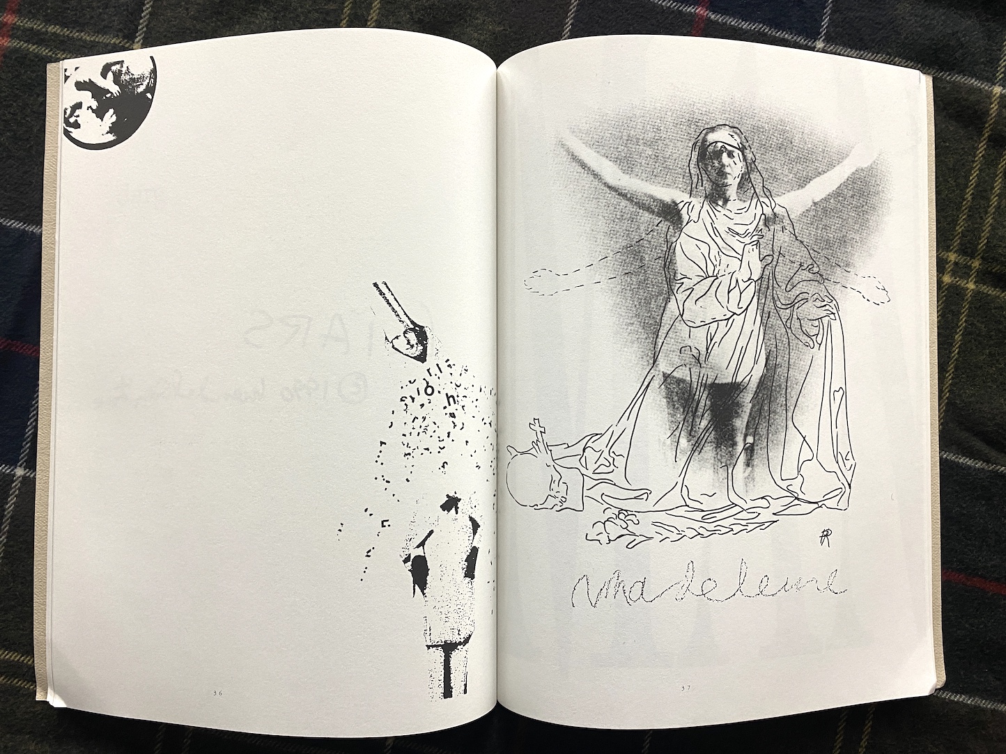
He wrote under variants of his forename: Shaunt Basmajian. Shant Basmajian. Sha(u)nt Basmajian. He died on January 25, 1990, aged thirty-nine, and this publication of one word works is dedicated to him.

He had promised to contribute to it, but never had time to submit a piece. In his self-effacing and humble way he would have apologized profusely for this.

Our personal acquaintanceship was short. We had talked on the telephone a couple of times and met twice. He was modest about his own work, overly so, and surprised that others were interested in it.

The last time we met he gave me a book, not one of his, but a collection of works by Marlene Mountain. It was inscribed: “To Brian from Marlene”. He said I should have it.

Sha(u)nt had been given the collection by his colleague Brian David J(o(h)n)ston. Her work was unknown to me. It was Pissed Off Poems and Cross Words (1986). She was a great poet, Shaunt said, someone overlooked and neglected. May day, 1990. l Peter Day

Introduction:
It has been a year since our last issue – and for us, like much of the world, it was a year of dramatic transitions and new beginnings.

Here, briefly, is the story: Last winter, after 15 years as the Executive Editor of Impulse, Eldon Garnet transferred his duties to Peter Day. Peter began selecting One Word Works from the many artists, writers, musicians and photographers featured in this special issue. His untimely death, in the midst of production several months later, threw the magazine into grief, shock and disarray. After much dedicated effort by long-time editors Brian Boigon, Judith Doyle and Carolyn White, the issue was recovered, bit by bit.

I accepted the Executive Editorship late last Fall. There was no question that Impulse would resume its publication with Peter’s One Word Works. It is presented not only with some pride, as a testimony to his vision and talent, but also as a reminder of the magazine’s resilience and collaborative nature.

During its 20 years of publication, Impulse has always stood for creativity and change – and this commitment will continue. To mark this new phase of revitalization and renewal, Associate Editor Gordon Lebredt and I have decided to rename the magazine. Beginning with our next issue, Impulse becomes M5V Magazine. Look for it in September.

–David Clarkson

Condition note: the cover might be in worn conditions due to its long-term storage

Order here

Not Human, Not Fly. Mao. Massacre

Posted in graphic design, politics, science on September 11th, 2021
Tags: , , , , , , ,

not_human_not_fly_an_essay_on_monstrous_posthumanism_mao.jpg_1not-human-not-fly-mao-massacre-9789893301593-2not-human-not-fly-mao-massacre-9789893301593-3not-human-not-fly-mao-massacre-9789893301593-5not-human-not-fly-mao-massacre-9789893301593-6not-human-not-fly-mao-massacre-9789893301593-8not-human-not-fly-mao-massacre-9789893301593-9not-human-not-fly-mao-massacre-9789893301593-10not-human-not-fly-mao-massacre-9789893301593-12not-human-not-fly-mao-massacre-9789893301593-12anot-human-not-fly-mao-massacre-9789893301593-13not-human-not-fly-mao-massacre-9789893301593-14not-human-not-fly-mao-massacre-9789893301593-15not-human-not-fly-mao-massacre-9789893301593-16not-human-not-fly-mao-massacre-9789893301593-17not-human-not-fly-mao-massacre-9789893301593-18

Not-human, Not-fly is a publication made of two books. One contains a study on the concept of the posthuman using David Cronenberg’s film The Fly as a starting point. It argues that the human-fly mutant in the film, Brundlefly, is not just another cautionary tale that invalidates deviations from conventional expressions of humankind. The creature is worthy of consideration both as an organism that functions on their own terms, beyond the features of humans and houseflies, and as a picture of Dorian Gray that reveals not some underlying immorality, but the terms for living in an age of systematic environmental destruction that has been called the Anthropocene. The second book is a work of fan fiction: it presents a series of fictional DNA sequence constructs belonging to Brundlefly, which create a narrative based on the genetic transformations that Brundlefly was subjected to, revealing the not wholly linear relations that connect humans, posthumans and houseflies.

Hugo Almeida is an artist (who goes by the name Mao) and postdoc researcher at the Interuniversity Center for the History of Science and Technology (CIUHCT), Faculty of Science and Technology, NOVA University of Lisbon, Portugal. He is an alumni of the Art & Science residency program of the IMéRA Foundation, Marseille (2016-2017), France and of the Saari Residence, KONE Foundation, Mynämäki, Finland (2016). He has been a postdoc at CIEBA, Faculty of Fine Arts of Lisbon University (2013-2016) and holds a PhD in Molecular Biology (2013, NOVA University of Lisbon), from his research at the Telomere and Genome Stability Laboratory, Instituto Gulbenkian de Ciência (IGC), Oeiras, Portugal. Mao normally exhibits and publishes with the art research collective and publishing label Massacre. His work has also been published by Chili Com Carne and Komikaze. He was a founding member of zine label Clube do Inferno (2012-2019).

Order here

Dear world you have made the persons slow. Elena Kaufmann. COISAS QUE MATAM

Posted in graphic design, politics on September 10th, 2021
Tags: , , , ,

dear-world-you-have-made-the-persons-slow-elena-kaufmann-coisas-que-matam-1 dear-world-you-have-made-the-persons-slow-elena-kaufmann-coisas-que-matam-2 dear-world-you-have-made-the-persons-slow-elena-kaufmann-coisas-que-matam-3 dear-world-you-have-made-the-persons-slow-elena-kaufmann-coisas-que-matam-4 dear-world-you-have-made-the-persons-slow-elena-kaufmann-coisas-que-matam-5 dear-world-you-have-made-the-persons-slow-elena-kaufmann-coisas-que-matam-6 dear-world-you-have-made-the-persons-slow-elena-kaufmann-coisas-que-matam-7 dear-world-you-have-made-the-persons-slow-elena-kaufmann-coisas-que-matam-8

Dear world you have made the persons slow uses the World Health Organization’s collected 2020 press statements about COVID-19 as its source material. Composed using blackout poetry, the project casts light on the ongoing and mostly unconscious consumption of online information. In reproducing the affect of online communication, these poems are both violently abridged and easy to consume.
In a world filled with transnational commercial chains, empathy and solidarity tend to stay local; the sudden violence of a worldwide pandemic paired with personal crises raises long overdue awareness for a more global concern for other subjects as well. Dear world you have made the persons slow contains potential further worldwide statements and there, they just need to be dis-covered.

Elena Kaufmann, born in 1992, is a contemporary artist based in Berlin, working primarily with poetry and language.

COISAS QUE MATAM (THINGS THAT KILL) is a label of the present, unleashed to publish sound and visual works afflicted by the now. If there are things that kill, there are also those that ignite and exhort. Since 2017, Stefanie Egedy and Simon Fernandes have been creating this circumstance between São Paulo and Berlin.

Order here