Kommando Otl Aicher. Alexander Negrelli. Jan van Eyck Akademie
Posted in graphic design, history, typography on January 27th, 2016Tags: Alexander Negrelli, Jan van Eyck Akademie, Kommando Otl Aicher, Otl Aicher
A book about the visual identity of the Olympic Games in 1972, about terrorists, their design, about war, gold medals, movies, sneakers, politics, maps, architecture, logos, pictograms and coloured dogs. And about Otl Aicher.
The chapters:
01 Preface
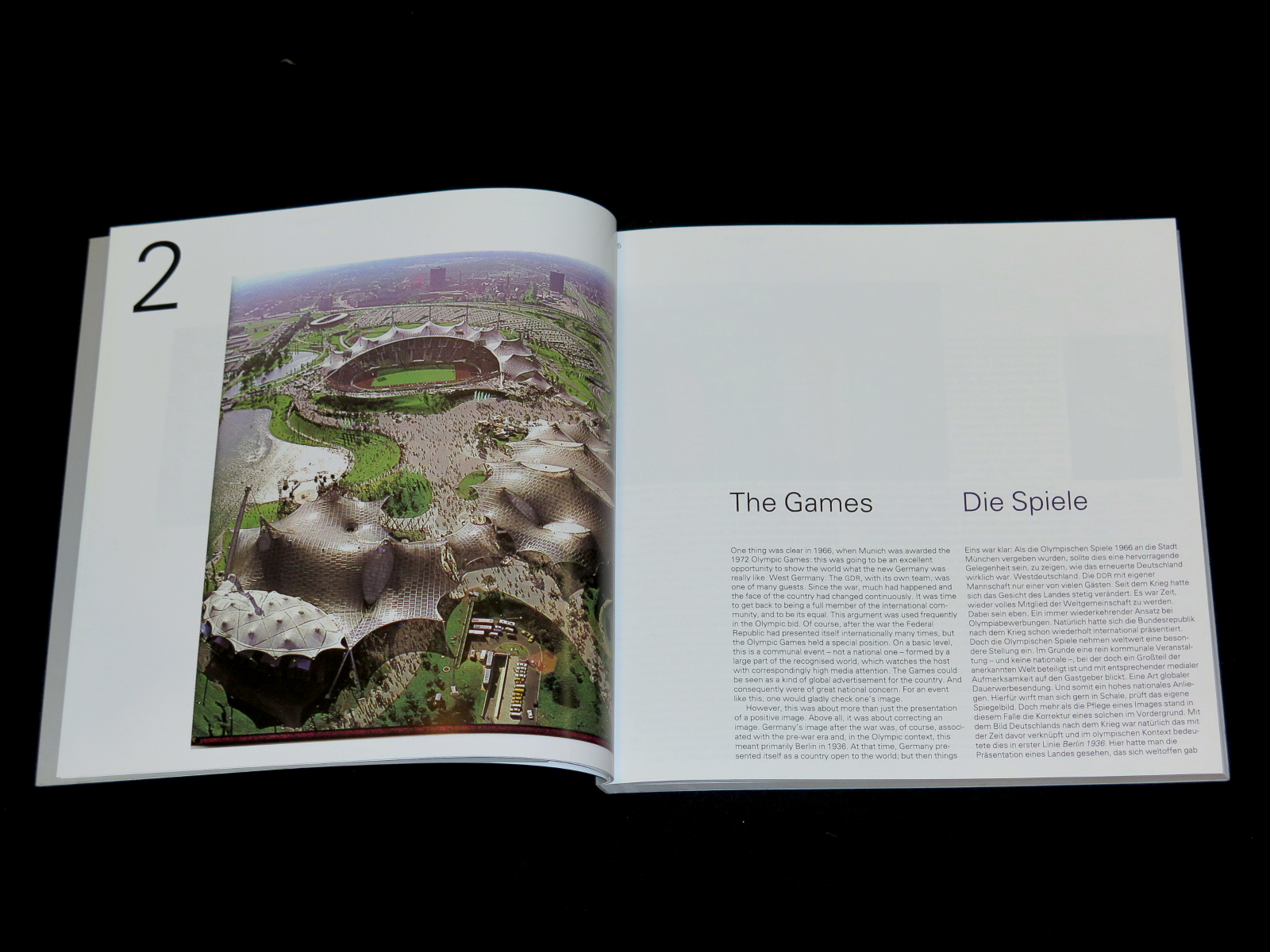
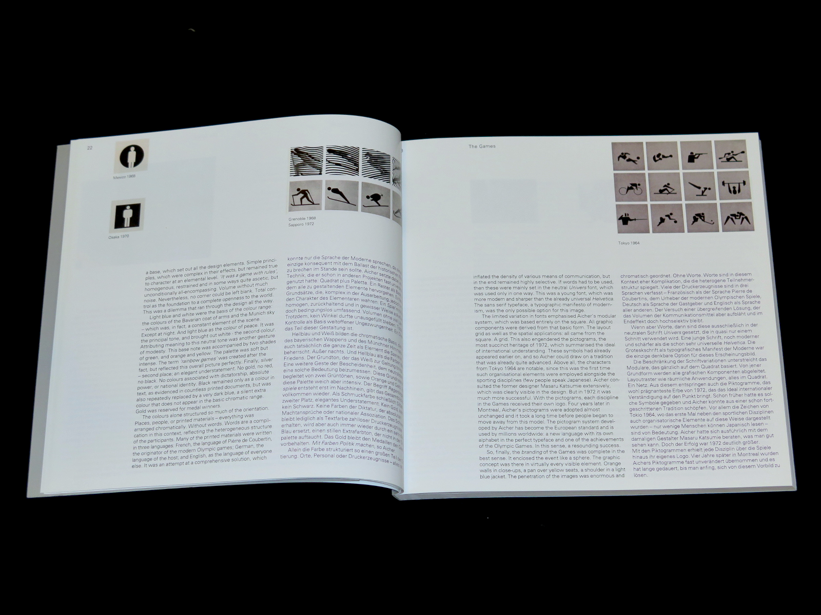
02 The Games
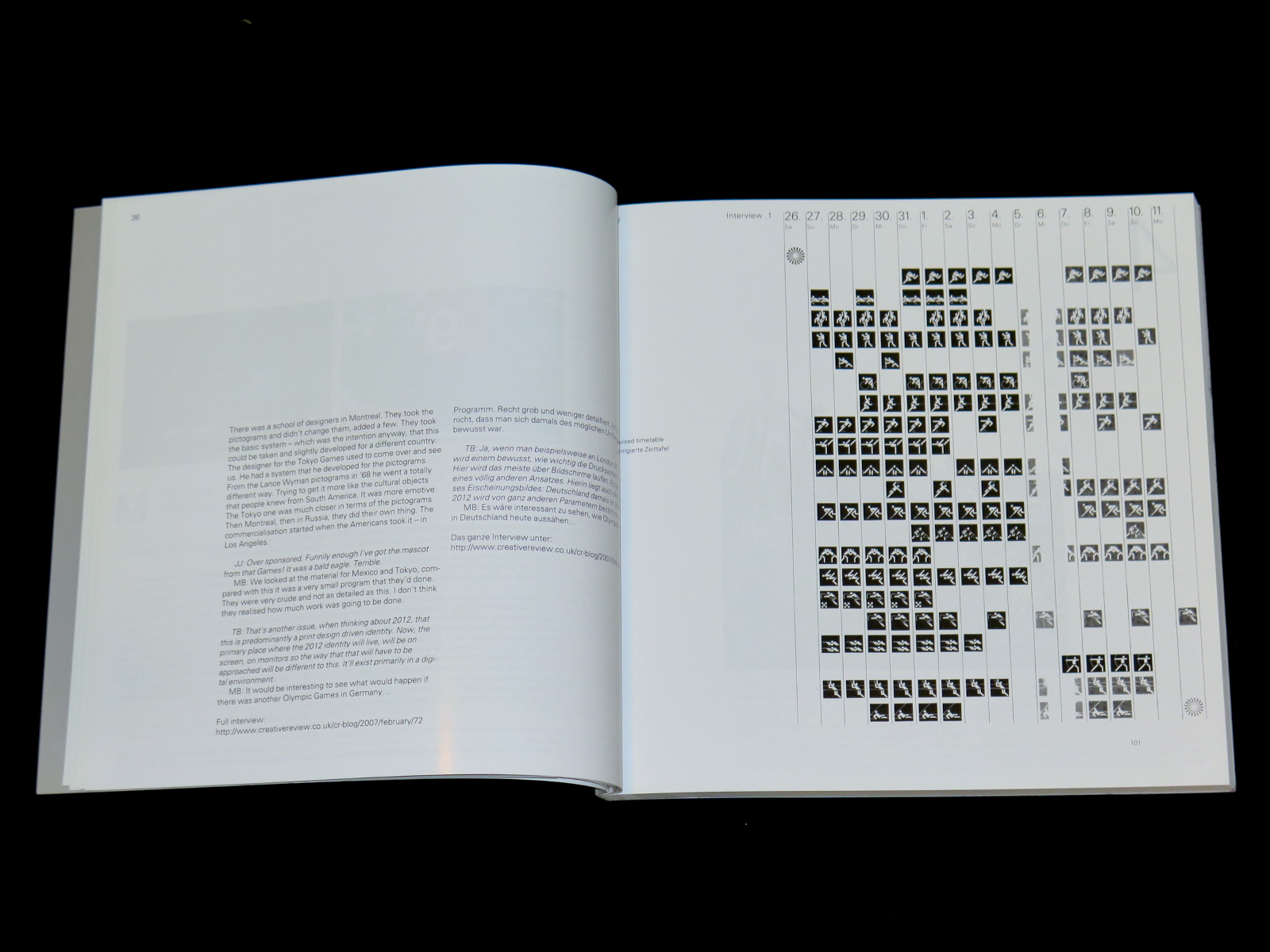
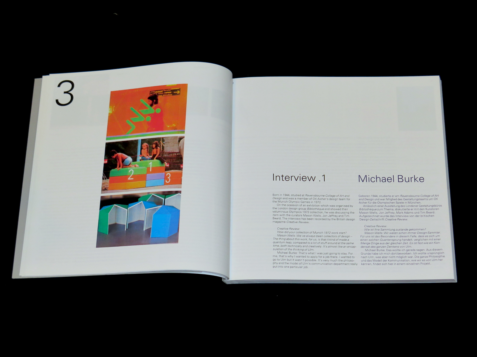
03 Interview .1 Michael Burke – Bibliothèque
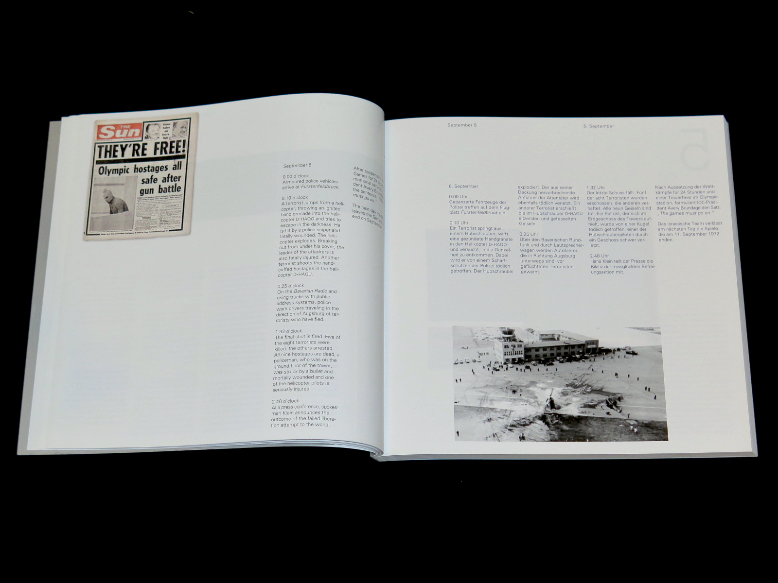
04 Sept. 5th
05 Otl Aicher
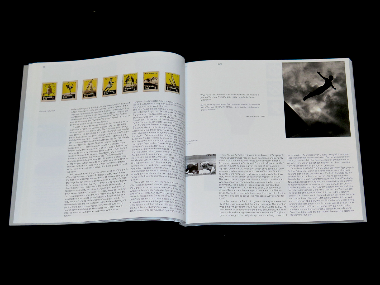
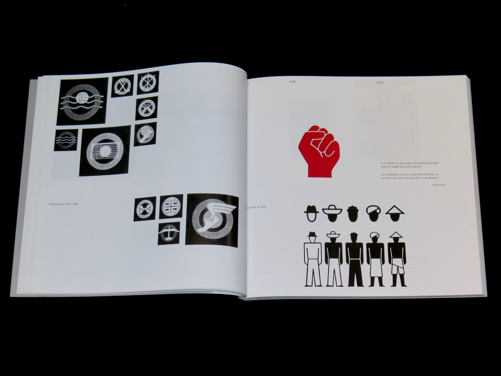
06 1936
07 Ulm
08 Lufthansa
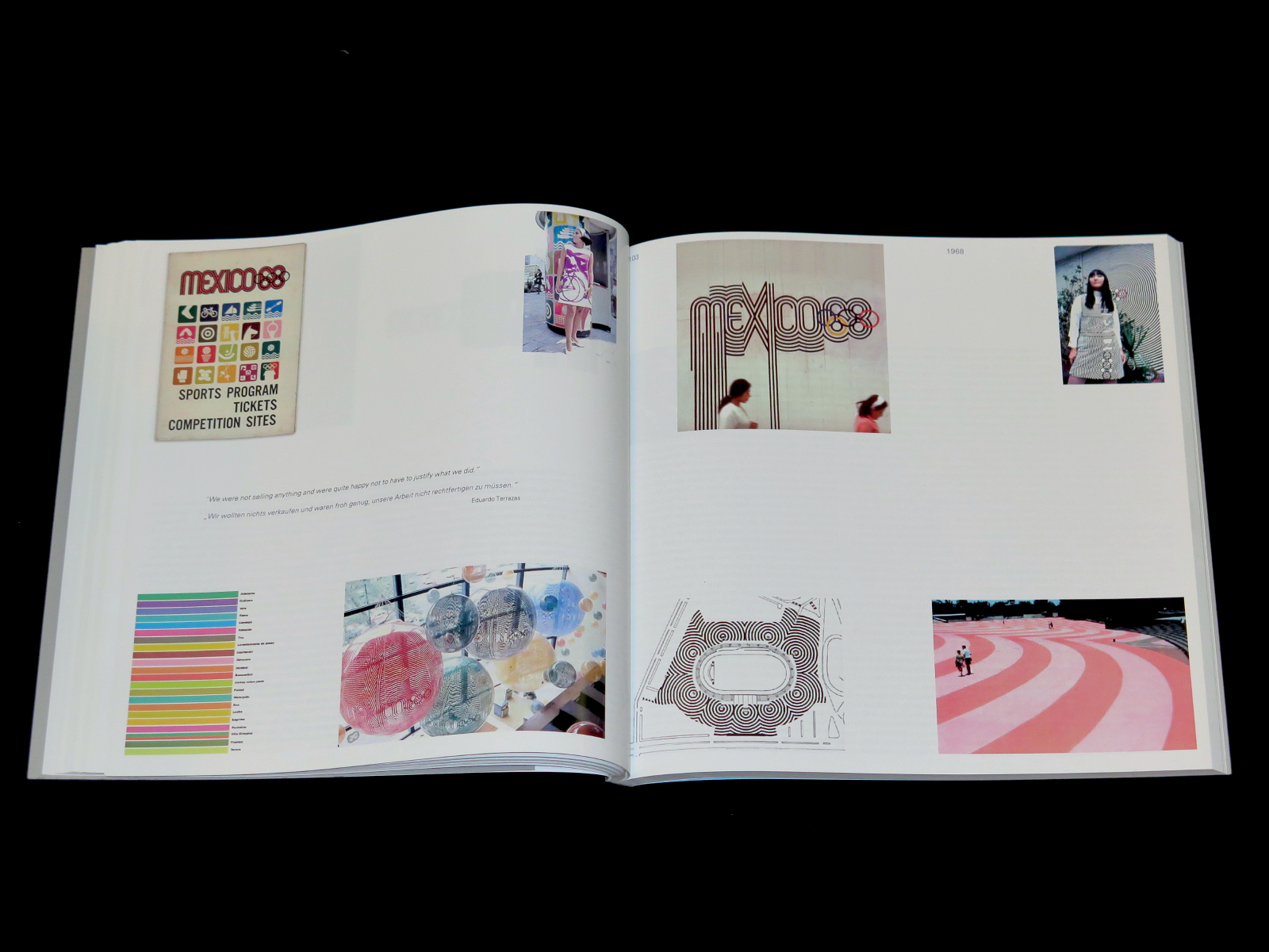
09 1968
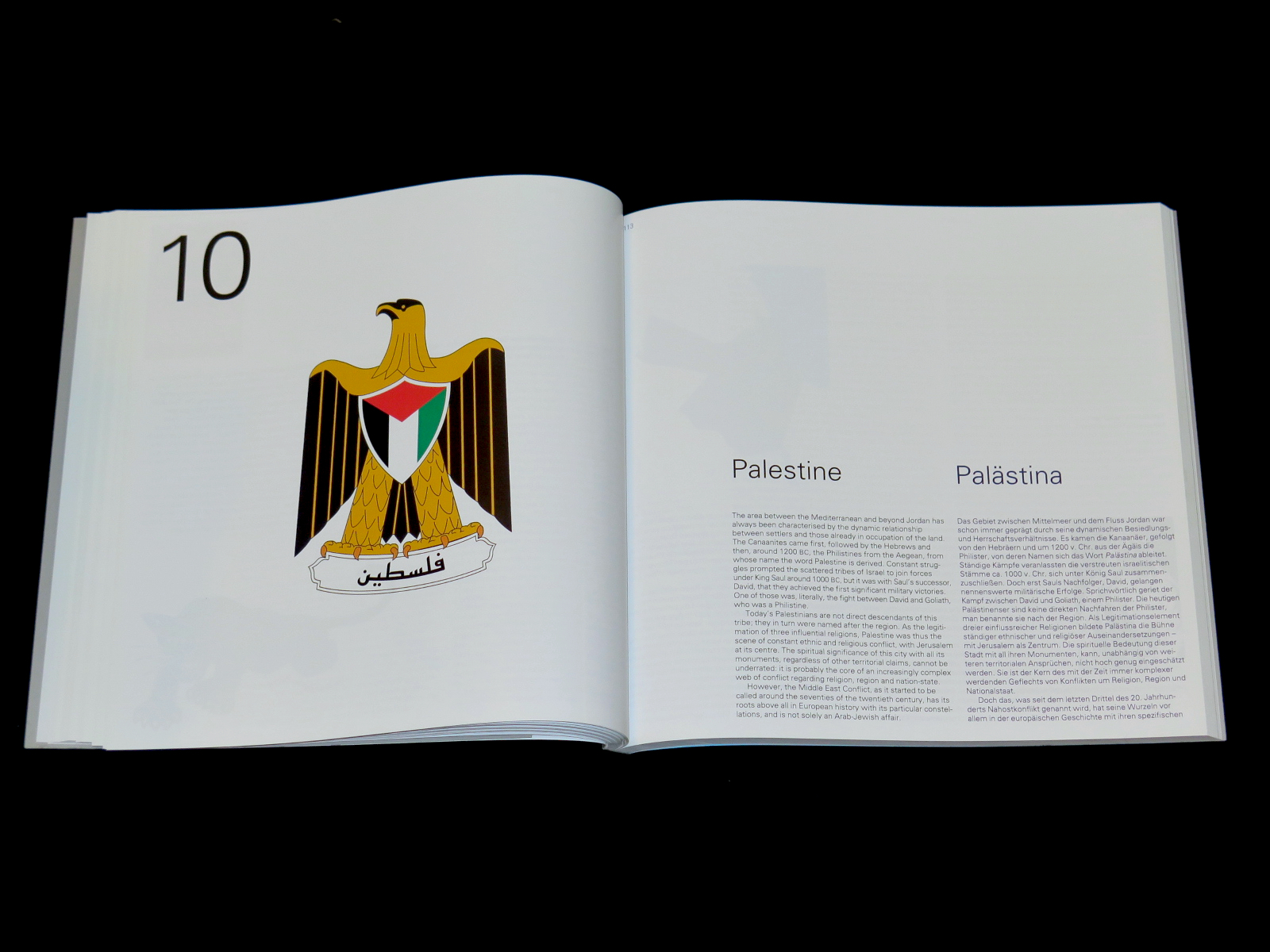
10 Palestine
11 Fedayeen
12 Interview .2 Prof. Rayan Abdullah
13 Munich
14 Spiral
15 Waldi
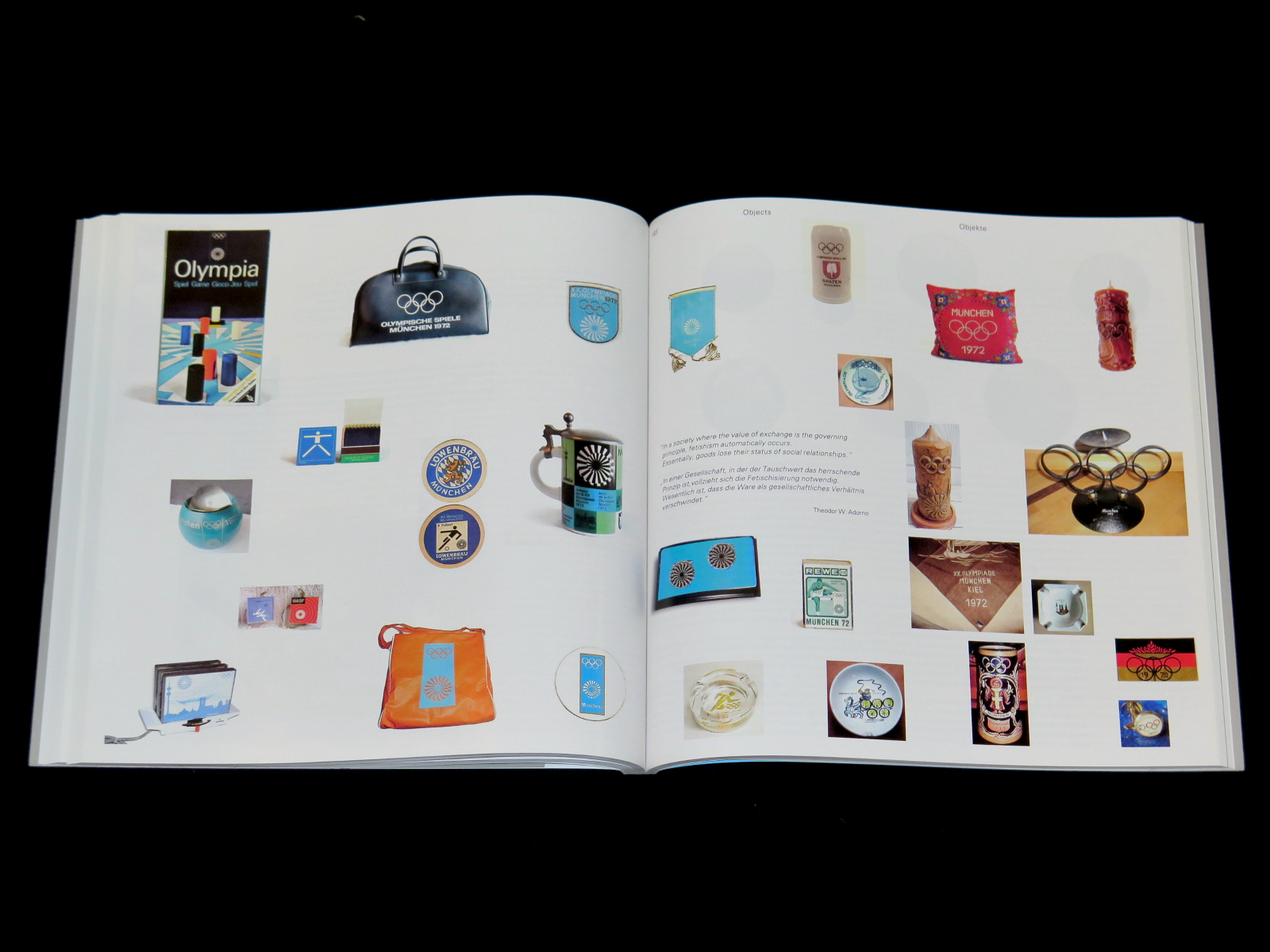
16 Objects
17 Others .1
18 Art
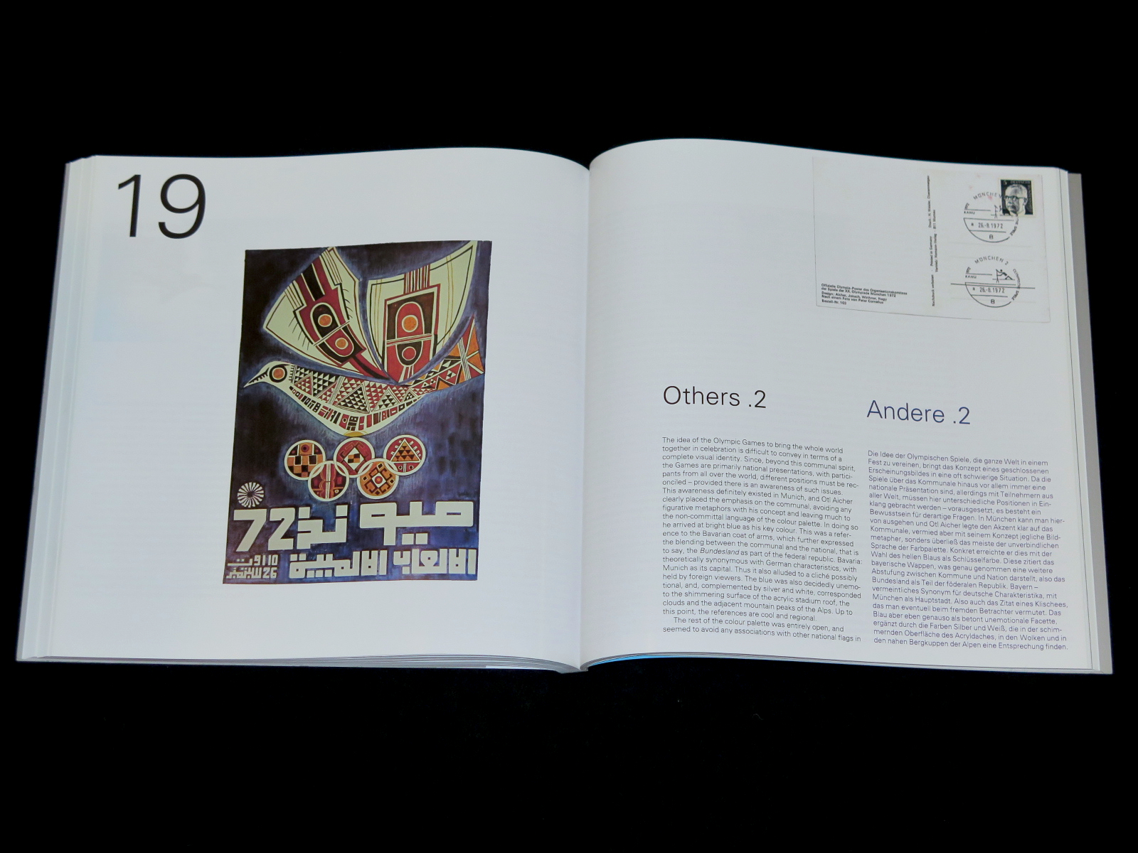
19 Others .2
20 Clothing
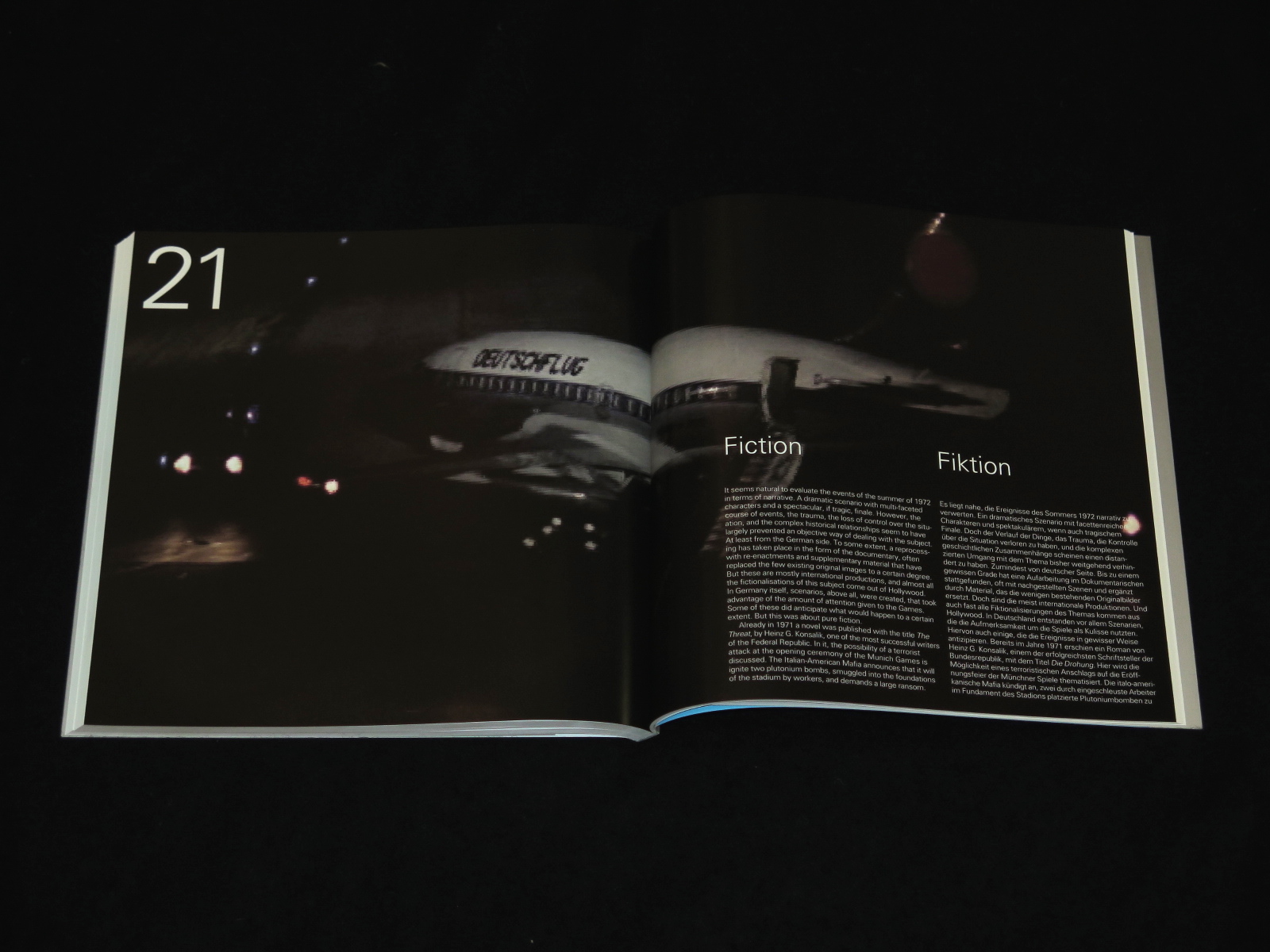
21 Fiction
22 Epilogue
23 Annex
+ foldout brochure with enclosed maps
€39.00