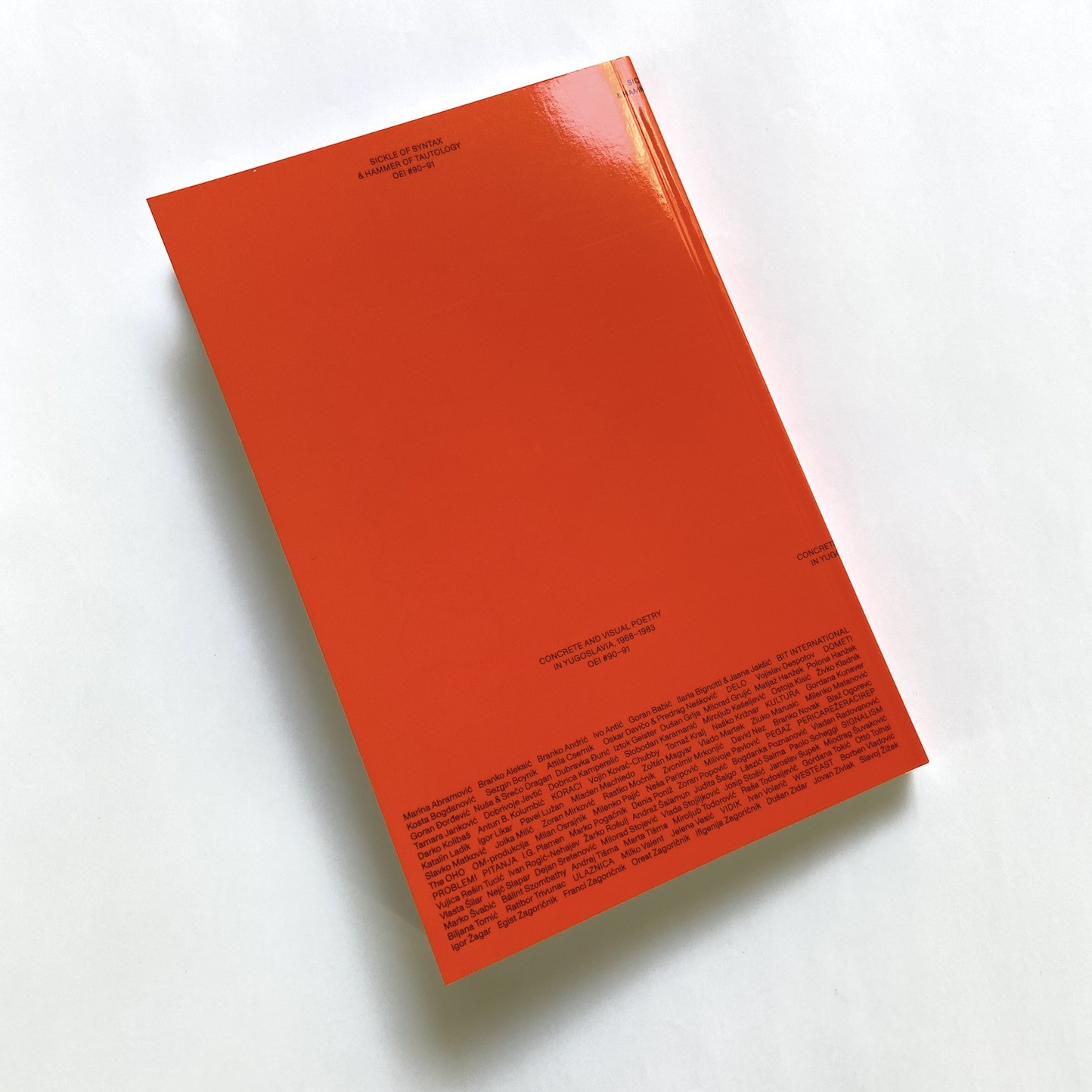
Capslock #2. Lost in Evolution. Roberto Rigon (Ed.). Capslock Magazine

Posted in graphic design, magazines, typography on May 31st, 2023
Tags: , , , , , , , , ,

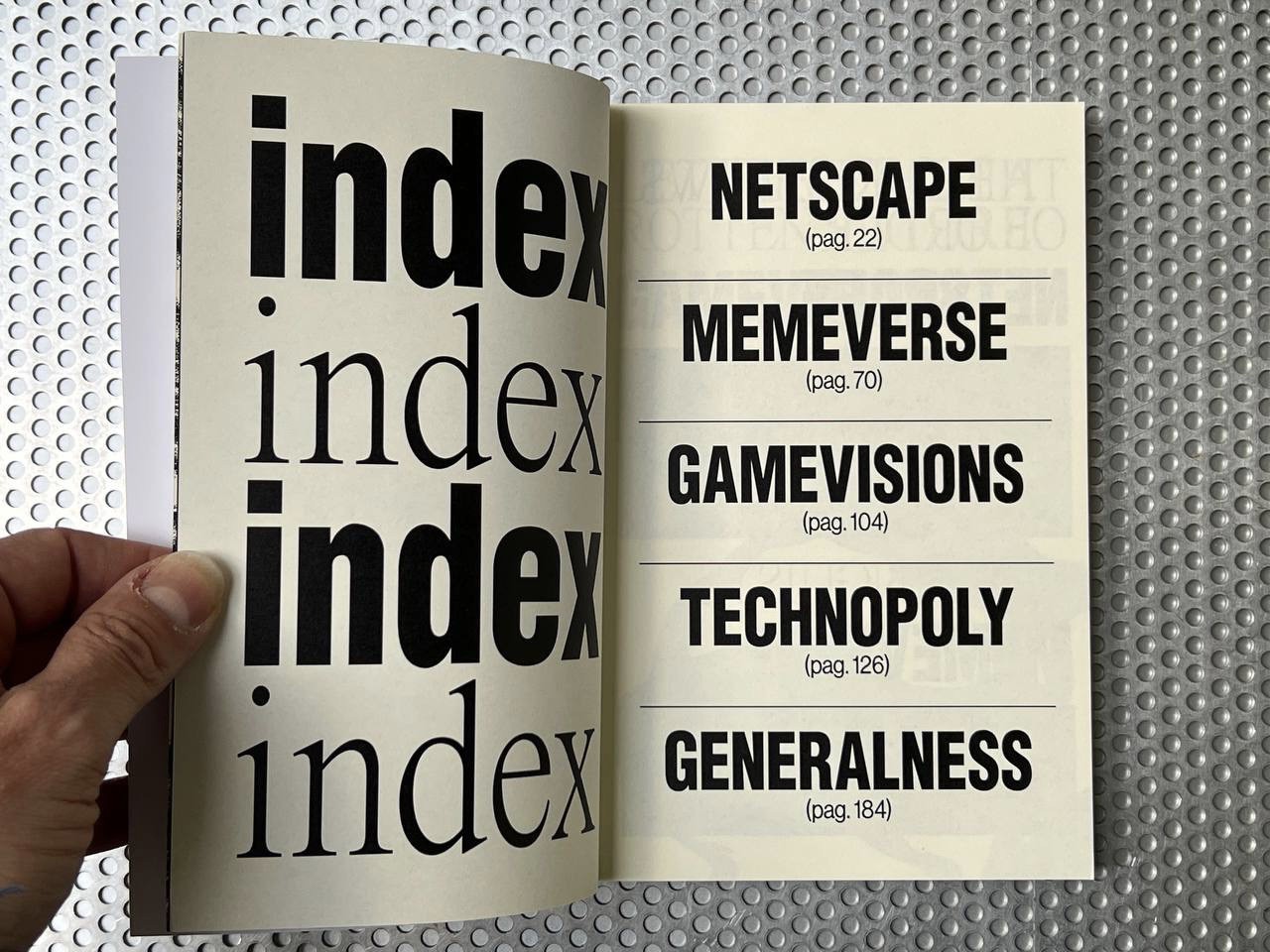
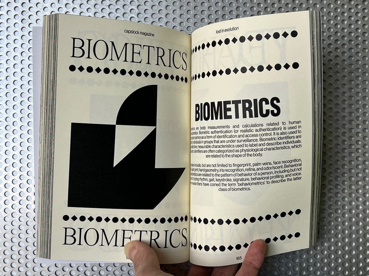
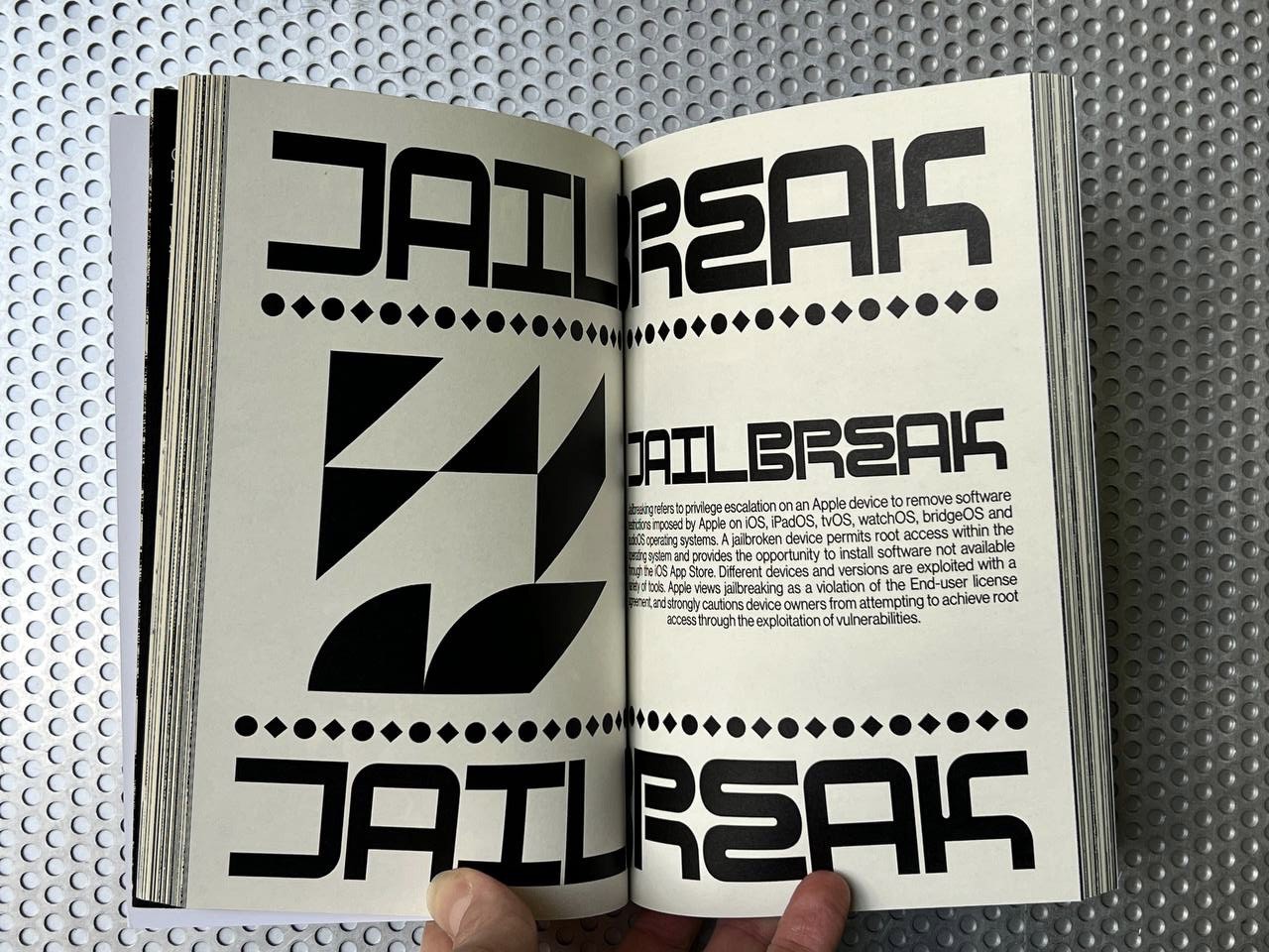
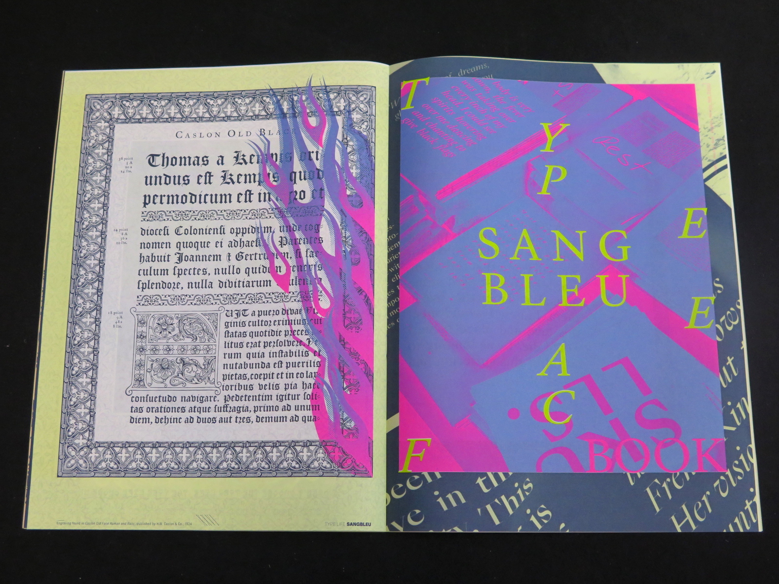
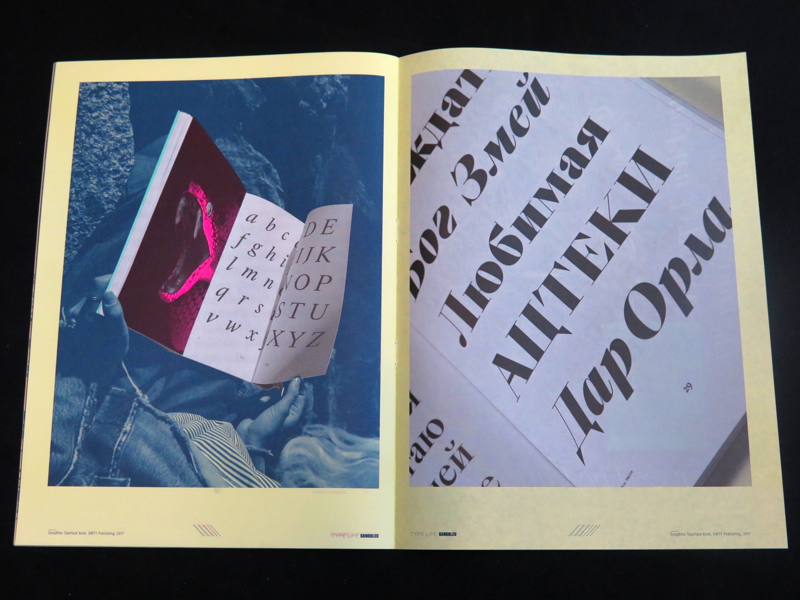
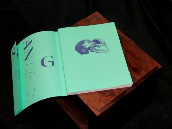
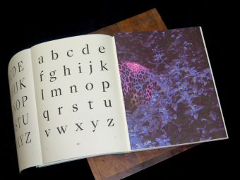
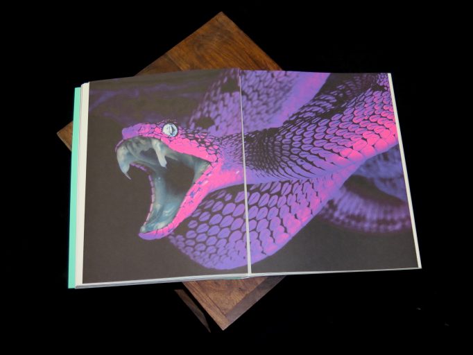
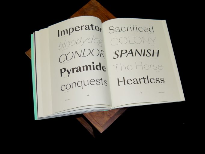
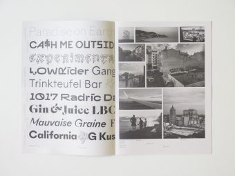
Lost In Evolution can be defined as a linguistic atlas. We collected more than 100 words that are redefining the times we live in, complete with their definition and explanation. These chapters are linked by a sci-fi novel that narrates the events of a post-apocalyp- tic future. This novel was written by us both using our human hands and with an Al-based text creator program. The final output is a cyborg-esque story where identity, language, and technology merge together in a tale that involves all of us, as part of humankind. Every term is associated with its respective Glyph, created from an algorithm-genera- ted graphic program we designed. We used an Al-image generator to create the graphics which introduce every chapter. The glyphs, combined with the Al-generated artworks, create the visual language that got Lost In Evolution.

Capslock Magazine was officially born in 2018 starting from a common vision devel- ped by a creative collective from the Vicenza area. This diverse team brings together graphic and product designers, DJs, and creatives who share a strong passion: the concept of the avant-garde, whether it can be tran- smitted to the context of technology, art, design, video games, and music. The goal of this project is to investigate every creative field from an innovative and te chronological point of view.

Order here

TECKEN – Lettres, Signes, Ecritures. Roberto Altmann, Ann-Marie Björklund, Eje Högestätt, Elisabeth Liljedahl (Eds.). Malmö Konsthall

Posted in Exhibition catalogue, poetry, typography, writing on February 24th, 2023
Tags: , , , , , , , , , , , , ,

Catalogue published in conjunction with the eponymous exhibition held at Malmö Konsthall from 22 March to 7 May, 1978.

Order here

Coll.#01. Martin Vácha, Daniel Quisek, Andrea Vacovská (Eds.). Displaay Type Foundry

Posted in graphic design, typography on December 14th, 2022
Tags: , , , , , , , , ,

Coll.#01 is the first comprehensive catalogue of Displaay’s current typeface collection. It is a guide to twenty typeface families as well as an insight into upcoming typefaces and custom projects. For bookworms, it can serve as a tour guide through the labyrinth of wikipedia topics that occupy our minds. Available with three different coloured edges, red, green and blue.

Displaay is an independent type foundry established in 2014 and based in Prague, Czech Republic.

Order here

Drown Good Drown. Various Authors. Type+Authorship

Posted in graphic design, typography, writing on September 2nd, 2022
Tags: , , , , , , ,

Is what is below the surface so fatal?

Becky posed this question in her piece, which speaks to a lot of what we’re trying to capture here in Drown, Good Drown.

In their own way, the writers expressed consciousness and subconsciousness immersed in empathy, stories with sentiment and hints of humor, sadness, and joy. These writings and drawings were made by us ArtCenter College of Design students in the summer of 2022.

Actually, Megan hates summer. As Megan says, “summer’s role is to forever choke and steal what life came after winter.”

She thinks June is okay.

Rachael gave us a downpour of thoughts, an imagistic stream of consciousness straight to our souls, and Sophia spoke in a tender melodic tone provoking a sense of coziness and the tension of intimacy.

While Ibrahim imagined life undersea as a telepathic realm of shadow twins.

Along with Constant’s honesty and vulnerability, we also got to share his quiet but bold humor reflected in his story.

We almost named the publication Esther Williams because of Natalia’s misfit mermaid tale, which inspired us to be who we really are.

My story of reminiscing leads to the end of the book leaving softhearted fragrances of nostalgia.

Me. Cringe.

Drown, Good Drown, I think, is most importantly a collaboration. We’re all so different. You’ll see. But our different perspectives are reflected in drawings and stories. We mish and mash our creative minds for a submersive experience for the reader more than any of us could accomplish on our own.

So we invite you to pour yourself a cool water on the rocks, snorkel through our creative minds, and drown in the world of our stories.

Trust me; it will be a good drown.

– The Editor

*
Type+Authorship is a multi-disciplinary class taught at ArtCenter College of Design in Pasadena, California. We conjure, discuss, and immediately write our way into a book of collective thematic interest and function within an aggregate studio environment where we design and produce a publication.

Order here

Niza Guy / Bifurcated. Mitchell Syrop. 2nd Cannons Publications

Posted in typography on July 27th, 2021
Tags: , , ,

ed742a9d-f25c-4809-9e90-6e0f326567f3b717a44f-6ad6-4bc7-a7b9-99c3e2a17582 e3c00fd5-c7cd-4bb3-adde-7a7e811a718d  9e72c871-f0f6-4e65-b204-993e6325946a 71fcf466-fcc3-4d4b-91a1-51fe473cb862 500ba5b1-1946-4299-bafb-7d6ada7a0f28 a84fd822-695e-4bdd-9e19-d683e9b4b53e

Niza Guy / Bifurcated presents two text works by Mitchell Syrop. Each one follows the flow of an internal monologue from fatalistic to comic to mundane. Syrop’s idiosyncratic use of language and apparent stream-of-consciousness writing contrast with a rhythmic cadence he invokes through structural formulas and tactical page breaks. Viewed in succession, the two texts set up a dialectical tension between the artist’s public and private personas to produce a hypnotic self-portrait that is at once familiar and subjective.

Edition of 400

Order here

OEI # 90-91: Sickle of Syntax & Hammer of Tautology. Concrete and Visual Poetry in Yugoslavia, 1968–1983. Sezgin Boynik (Ed.). OEI editör

Posted in poetry, typography on March 17th, 2021
Tags: , , , , ,

oei-90-91-sickle-of-syntax-hammer-of-tautology-concrete-and-visual-poetry-in-yugoslavia-1968-1983-sezgin-boynik-ed-oei-editor-9789188829092-1 oei-90-91-sickle-of-syntax-hammer-of-tautology-concrete-and-visual-poetry-in-yugoslavia-1968-1983-sezgin-boynik-ed-oei-editor-9789188829092-2oei-90-91-sickle-of-syntax-hammer-of-tautology-concrete-and-visual-poetry-in-yugoslavia-1968-1983-sezgin-boynik-ed-oei-editor-9789188829092-6oei-90-91-sickle-of-syntax-hammer-of-tautology-concrete-and-visual-poetry-in-yugoslavia-1968-1983-sezgin-boynik-ed-oei-editor-9789188829092-5 oei-90-91-sickle-of-syntax-hammer-of-tautology-concrete-and-visual-poetry-in-yugoslavia-1968-1983-sezgin-boynik-ed-oei-editor-9789188829092-3 oei-90-91-sickle-of-syntax-hammer-of-tautology-concrete-and-visual-poetry-in-yugoslavia-1968-1983-sezgin-boynik-ed-oei-editor-9789188829092-4 oei-90-91-sickle-of-syntax-hammer-of-tautology-concrete-and-visual-poetry-in-yugoslavia-1968-1983-sezgin-boynik-ed-oei-editor-9789188829092-7

OEI # 90-91: Sickle of Syntax & Hammer of Tautology offers the first English language overview of the history of concrete and visual poetry production in socialist Yugoslavia between 1968 and 1983. By focusing on mass-produced examples of concrete poetry, this publication presents these poetic experiments as organically linked to social movements, critical theories, and youth cultural revolutions. In his extensive introduction, Sezgin Boynik, the guest editor of this special issue of OEI, discusses concrete and visual poetry in socialist Yugo-slavia as an uneven and combined development, and emphasizes its confrontational and organizational aspects. By means of interviews, translations, reproductions, and theoretical and historical statements, OEI # 90-91 offers a picture of a very lively scene of concrete and visual poetry in Yugoslavia, which unfortunately is not as recognized interna-tionally as it would deserve. Hoping that OEI # 90-91 could contribute to this task in a substantial way, we present episodes from the early years of OHO formation and its complex theories of words and things; an interview with Rastko Močnik on programmed art and political formalism; militant polemics of Goran Babić; Signalist contradictions; subjective structural devices of Judita Šalgo; zaum experiments of Vojislav Despotov; detective meta-texts of Slavoj Žižek; poetic self-management studies of Vujica Rešin Tucić; a feminist historicisation of Ažin school for experimental poetry; democratisation of visual poetry by Westeast; selections from special issues of the journals Pitanja, Problemi, Ulaznica, Dometi, Delo, Koraci, Vidik, Pegaz, and many other materials translated here for the first time and presented in one publication.

Order here

Type Life Issue #2. Swiss Typefaces. SWTY Publishing.

Posted in graphic design, magazines, Motto Berlin store, newsprint, printmaking, typography on February 2nd, 2018
Tags: , , ,

Type_Life_2_Swiss_Typefaces_Motto_1Type_Life_2_Swiss_Typefaces_Motto_2.2Type_Life_2_Swiss_Typefaces_Motto_4Type_Life_2_Swiss_Typefaces_Motto_5Type_Life_2_Swiss_Typefaces_Motto_6Type_Life_2_Swiss_Typefaces_Motto_7Type_Life_2_Swiss_Typefaces_Motto_8Type_Life_2_Swiss_Typefaces_Motto_9

The second issue of Type Life brings a cornucopia of visual inspiration. Swiss Typefaces presents insights into their cosmos of style, fonts, and fashion. This is the only place where you’ll find both Rihanna and Rudolf Koch, and where photos of contemporary art and streetwear are framed by engravings from the Caslon foundry. Type Life doesn’t make many words, and instead shows plenty of letterforms. Printed in six Pantone colors, it features mirrored words, slanted letters, gradients and all the other things your design prof wouldn’t approve of.

At the heart of this issue is Sang Bleu – the name both of a typeface and of a creative agency. Over the past decade, the two have built a legacy together. Shown are fonts that debuted in the Sang Bleu magazine, some of which later were released by Swiss Typefaces, and others that remained private. Custom typefaces designed for Vogue appear next to the experimental script variant SangBleu Snakes, followed by a stunning guest contribution from the Paris-based Studio Jimbo. Type Life #2 is made perfect by an introduction to the all-new SangBleu typeface and the accompanying printed book that showcases its 5 collections and 45 styles, released in October 2017.


Publisher: SWTY Publishing, 2017
Language: English
Pages: 36
Size: 23.5 x 32 cm
Binding: Softcover, loop staples
Printing: Offset, 6 Pantone colors
Printed in Switzerland


Buy it

SangBleu Typeface. SWTY Publishing

Posted in graphic design, Motto Berlin store, typography on November 22nd, 2017
Tags: ,

sangbleu_motto_1sangbleu_motto_2sangbleu_motto_3sangbleu_motto_4sangbleu_motto_5sangbleu_motto_6sangbleu_motto_8sangbleu_motto_7


On the occasion of the launch of the SangBleu typeface, Swiss Typefaces issues a book for lovers of the printed letterform. On 128 pages, “SangBleu Typeface: The King, His Court, The Explorer & The Gift” celebrates cutting­edge typography in general and the SangBleu fonts in particular. Devised as a collector’s item, it provides a unique combination of design and content: at the heart of the publication is a novella by Daniela Party, specifically written for this purpose. The book starts off with illustrations of a skull and a beheaded female warrior, followed by serpents and an Aztec ghost figure. This dark and savage imagery sets the atmosphere. Giant initials, printed in loud pink, lead into the book like drumbeats in the jungle – S – B – G – U… The title page presents the names of the five collections that form the SangBleu typeface: Empire, Kingdom, Republic, Versailles, Sunrise. Each family is displayed on a spread of 20 pages, in a layout that was freely inspired by a type specimen for Caslon Old Face from 1924. The sample pages emulate all kinds of text types, from novels and magazines to drama and poetry, in sizes big and small. Some pages feature large headlines or block quotes in italics. Others show off spectacular drop caps and strongly contrasting sizes or weights. Designers interested in seeing the Cyrillics do not miss out either. The scope and versatility of the SangBleu collection is exhibited in its entirety. All text is taken from Daniela Party’s novella. Set in the late 17th century, an era of absolutism, superstition, and colonialism, it narrates the story of Meztli, an indigenous Mexican woman with extrasensory powers. Captured by French explorer La Salle, she is sent as a gift to Louis XIV, the Sun King – a gift that would set off a series of macabre events involving witchcraft, lust, envy, and death. Designed by Swiss Typefaces, the SangBleu Typeface book was printed in five colors, four of them Pantone spot colors including metallic and neon inks, and is further enriched by a special binding with several fold­out pages – all made in Switzerland.


Buy it

Type Life Issue #1: Special Lab. Swiss Typefaces.

Posted in graphic design, typography on August 16th, 2017
Tags: ,

Type Life Issue #1_Special Lab. Swiss Typefaces_Motto books_2017_1Type Life Issue #1_Special Lab. Swiss Typefaces_Motto books_2017_2Type Life Issue #1_Special Lab. Swiss Typefaces_Motto books_2017_3Type Life Issue #1_Special Lab. Swiss Typefaces_Motto books_2017_4Type Life Issue #1_Special Lab. Swiss Typefaces_Motto books_2017_5Type Life Issue #1_Special Lab. Swiss Typefaces_Motto books_2017_6Type Life Issue #1_Special Lab. Swiss Typefaces_Motto books_2017_7


Type Life
Issue #1: Special Lab

The inaugural issue is a special about the Lab. In this Research & Development department, we explore new ideas for future fonts. Two of the most recent additions to the Lab are showcased here. The first one named BRRR is a playful wide Grotesk with a great deal of disruptive details. A spin-off from Simplon Mono, it was initially created to design a poster series for Swiss artist Simon Paccaud. KRSNA started out as a custom version of NewParis Skyline, made for two vinyl record sleeeves by Geneva-based musician Grace Core. This experimental typeface abandons the convention of a continuous baseline and introduces a three-storey space where the letters can sit at the top, center or bottom, with the remaining space filled by bars and spikes. The resulting word images are captivating patterns with logo-like qualities. Type Life reveals how BRRR and KRSNA came into being by depicting preliminary sketches, evolutionary steps, and photos of experiments made during trips. Reproductions of the very first applications show the fonts in context.

An underlying theme in Type Life #1 is the confrontation of opposites. Systematic typography is interspersed with footloose lettering, accurate vector shapes are shown side by side with drippy comic blackletter. Highbrow clashes with subculture when an icon of the Swiss International Style gets remixed with graffiti. Past meets present also in the typeface designs that always and inevitably are contextualized in history. The digital is contrasted with the analog, the local with the cosmopolitan, the abstract with the personal. On a formal level, all of this is represented by the combination of uncoated newsprint and glamorous spot colors. The minimal but nevertheless unique color palette featuring Pantone neon pink and yellow along with silver and black is a defining element of the publication’s identity.


BUY IT

Calendar 2016. Maximage. Jonas Voegeli. ZHdK

Posted in graphic design, printmaking, typography, workshop on February 4th, 2016
Tags: , ,

Calendar 2016-Maximage-MottoCalendar 2016- Maximage-Motto 1Calendar 2016-maxmage-mottoCalendar 2016- Maximage-Motto 5 Calendar 2016- Maximage-Motto 4Calendar 2016-maximage-motto 10 Calendar 2016-maximage-motto 9Calendar 2016- Maximage-Motto 8 calendar 2016-maximage-motto 7

Produced during a workshop held by Maximage at the University of the Arts Zurich, ZHdK. All lines were engraved manually on aluminum offset plates by the students:

Jaqueline John (January)
Ruben Brändli (February)
Tobias Leuenberger (March)
Rahel Preisig (April)
Kathrin Grossenbacher (May)
Dennis Ginsig (June)
Julia Felber (July)
Kerstin Barth (August)
Janina Hess (September)
Victoria Knabe (October)
Johannes Inauen (November)
Salome Grand (December)

Head: Jonas Voegeli
Tutors: Maximage
Print: Printoset
Paper: Munken Lynx
Edition of 250 copies

€15.00

buy it