FFF (Filipino Folk Foundry). The Office of Culture and Design. Hardworking, Goodlooking.
Posted in graphic design, newsprint, typography on December 22nd, 2015Tags: Birk Marcus Hansen, Catherine Leigh Schmidt, Dante Carlos, Kristian Henson, Lobregat Balaguer, Niko Spelbrink, Veronica Grow
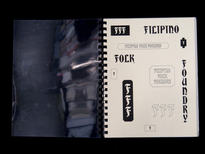
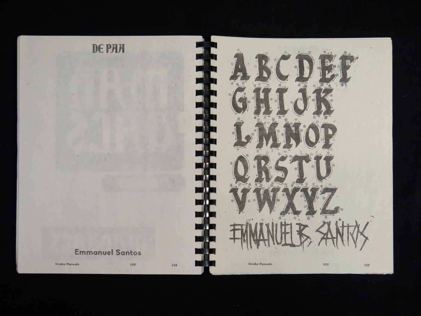
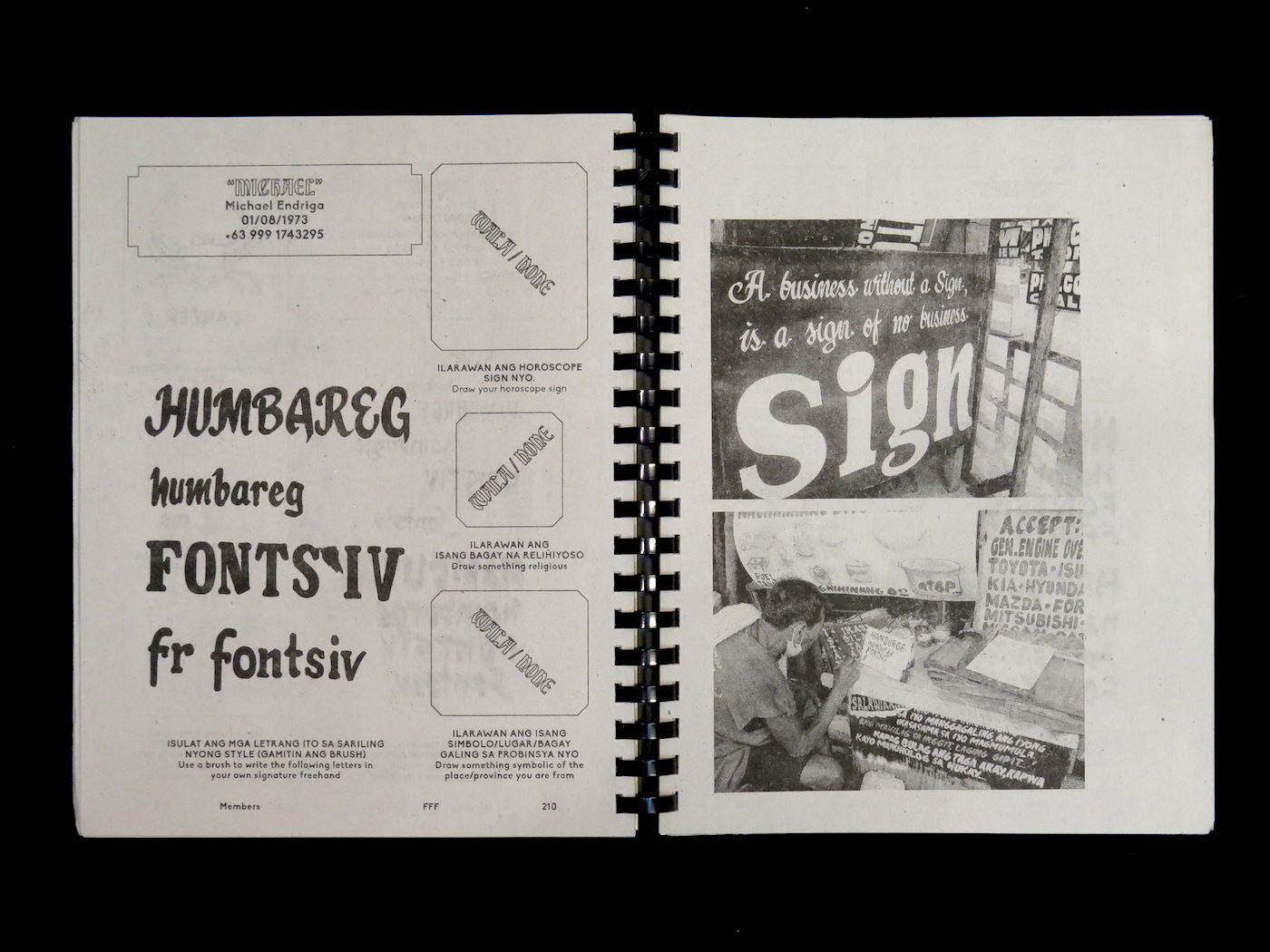
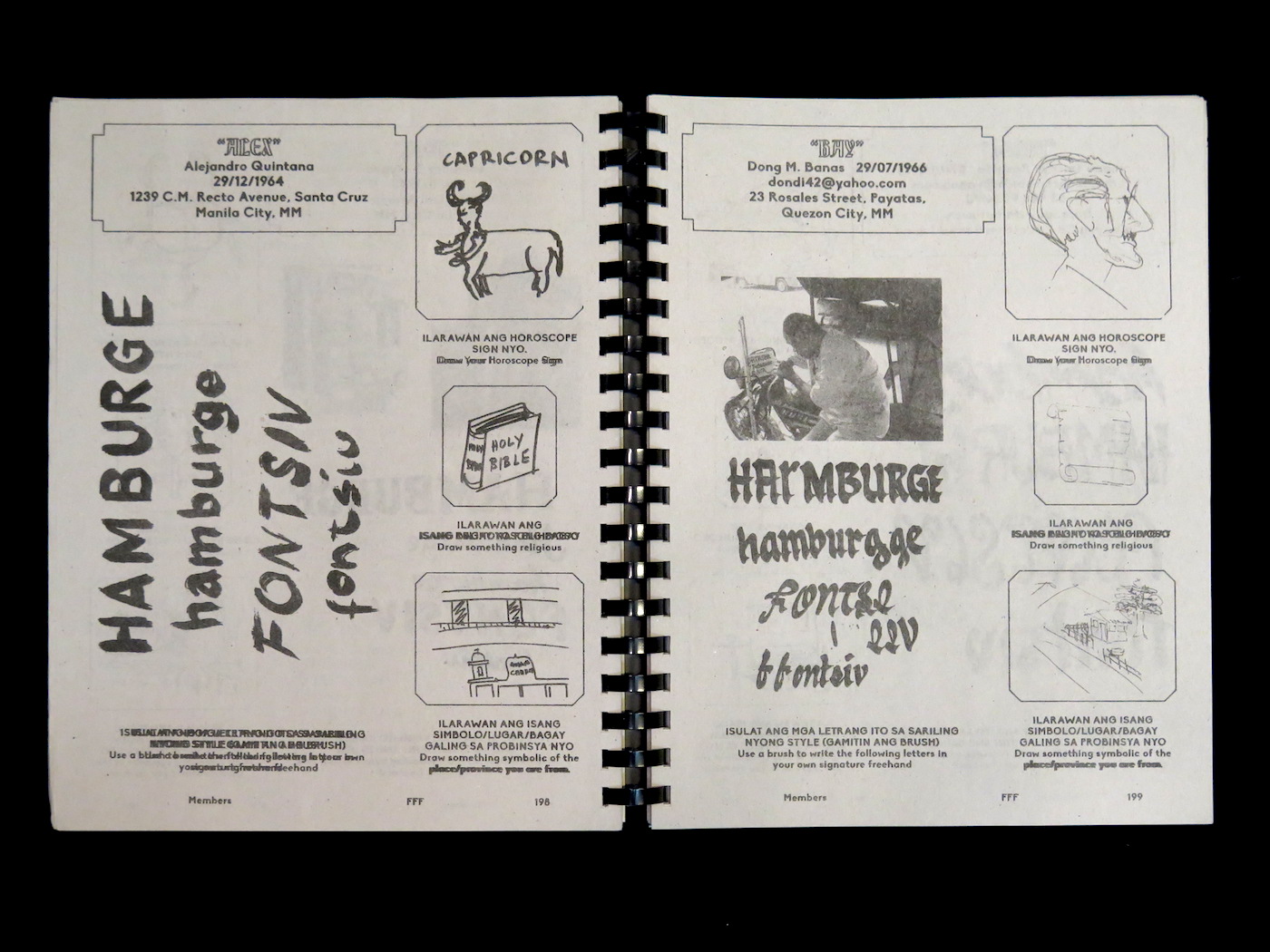
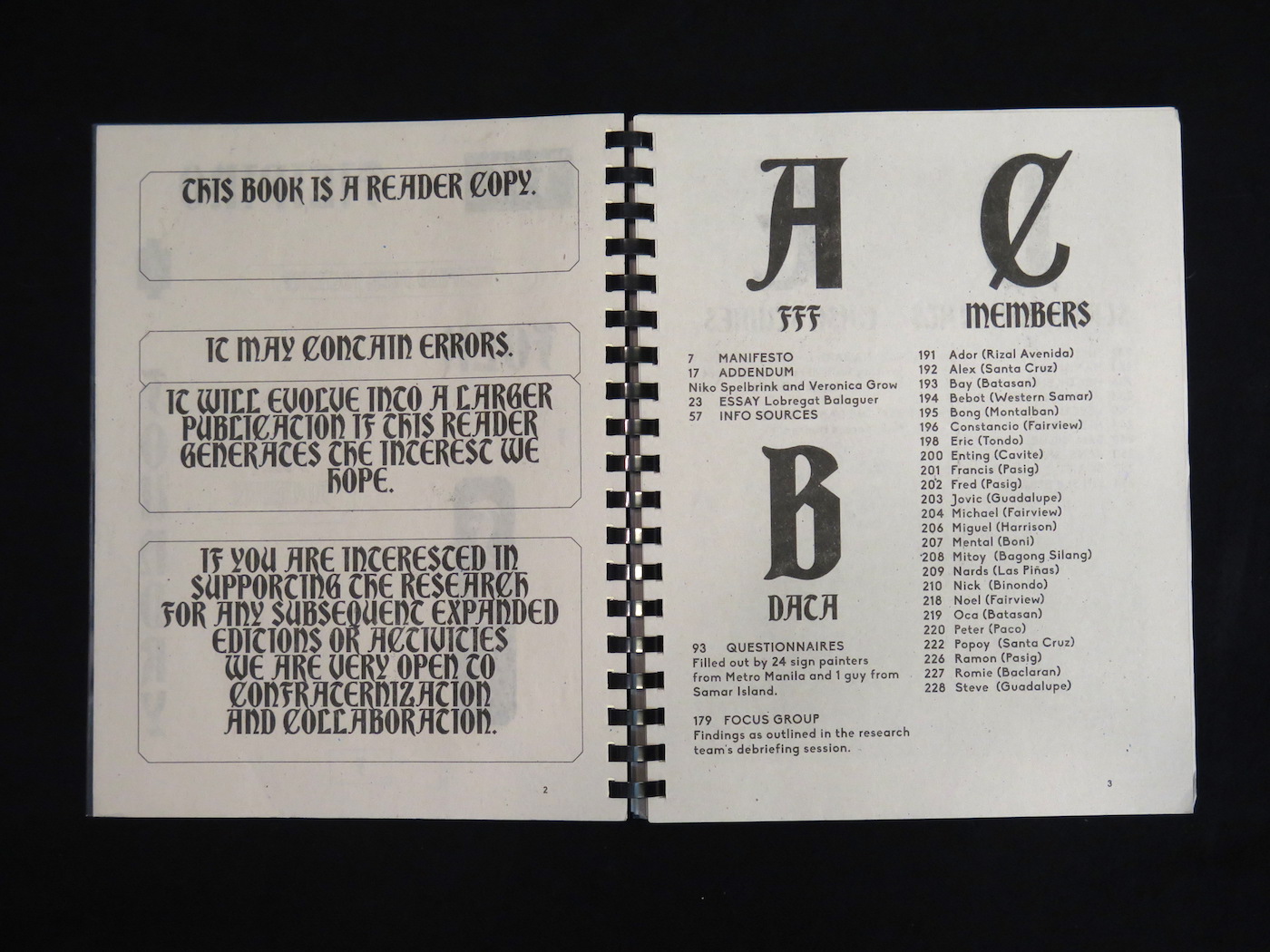
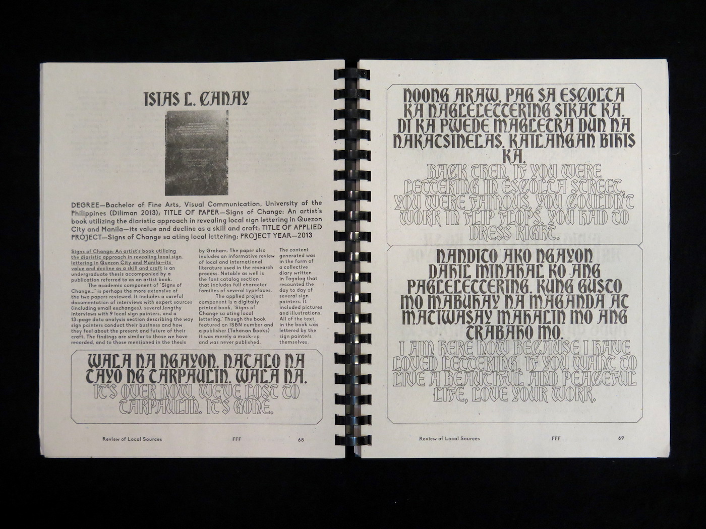

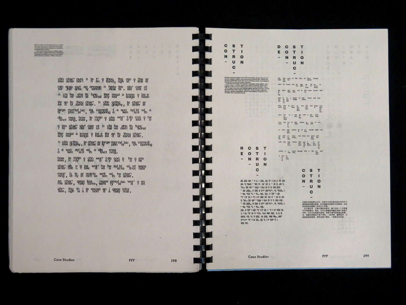
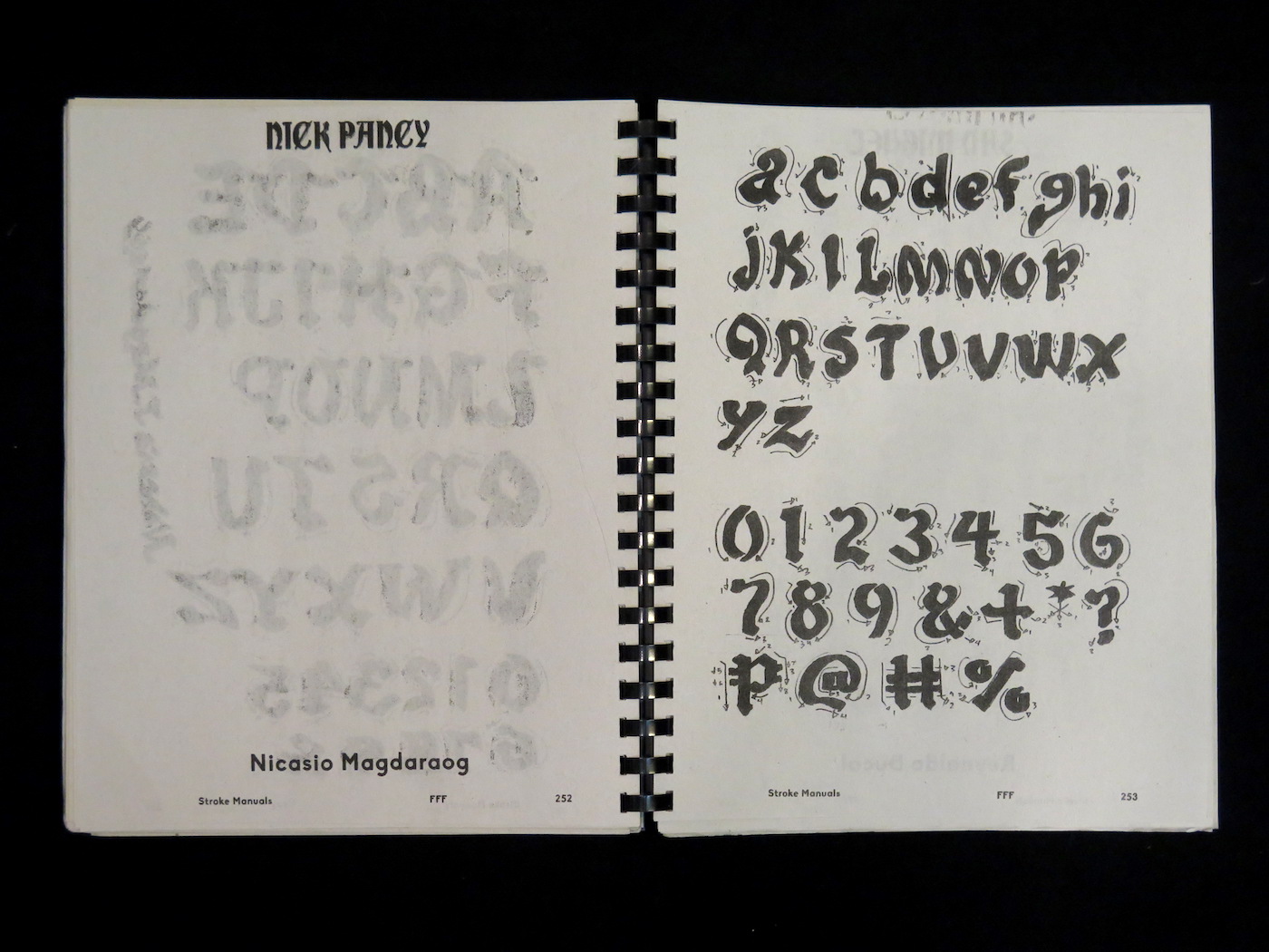
A pseudo-scientific research publication on sign painting in the Philippines. Contains graphic and text questionnaires filled out by 24 sign painters from Metro Manila and Samar Island. Includes over 10 stroke manuals as well as a series of writings on typography and culture. These include: a manifesto on slow vs. fast typography by Lobregat Balaguer (PH/ES), Veronica Grow (AU) and Niko Spelbrink (NL); an essay exploring identity politics and graffiti writing in the Philippines; and two special, syndicated case studies focused on indigenous type construction. The case studies are: “Nagari: Learning to Make Writing for Indian’s Biggest Script” by Catherine Leigh Schmidt (US) and “The Babel Issue” by Birk Marcus Hansen (DK), a bilingual typography experiment that combines Chinese and Roman characters.
Design by Dante Carlos and Kristian Henson.
Published by Hardworking, Goodlooking
€55.00