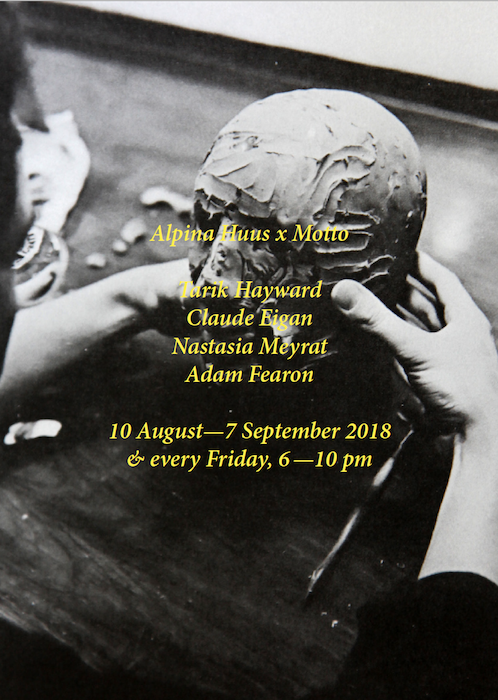
Andrew James Paterson at Motto. 11.10.2018
Posted in Events on October 8th, 2018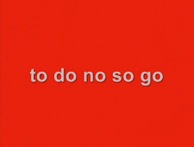
Toronto-based interdisciplinary artist Andrew James Paterson will be presenting a programme of writing and video at Motto on Thursday Oct.11 at 7pm. Paterson will read from his novel Not Joy Division (pub. Impulse B., Toronto) and his artist’s monograph Collection Correction (Kunstverein Toronto and Mousse Publishing), as well as screen a few of his language-based video works.
—
Andrew James Paterson is a Toronto-based interdisciplinary artist working with video, film, performance, painting, music, critical and fictional writing. His videos have shown locally, nationally and internationally for three and a half decades. Much of his art in various media references tensions between bodies and technologies including language; as well as anarchic impulses played against formalist tendencies. His videos, films, and performances have been programmed in Seoul, Bangalore, Amsterdam, Salzburg, Buenos Aires, New York City, Montreal, and Toronto… among other international centres. Between 1977 and 1982, he was the prime vocalist and writer for the Toronto post-punk band The Government. In 2016 he launched an artist’s book Collection/Correction, published by Kunstverein Toronto and Mousse Publishing Milan. In 2018 he released a novelette titled Not Joy Division, published by Impulse B of Toronto.