Le catalogue et ses hybrides / The Catalog’s Mongrels. Charlotte Cheetham. officeabc.
Posted in graphic design on March 27th, 2013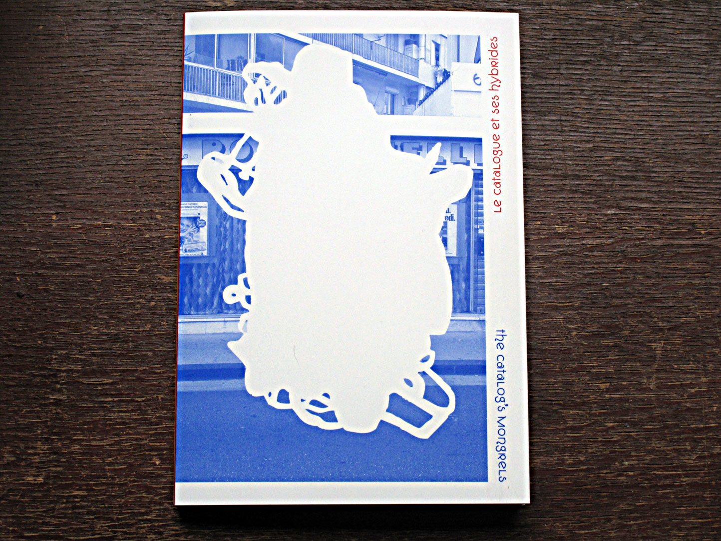
Le catalogue et ses hybrides / The Catalog’s Mongrels. Charlotte Cheetham. officeabc.
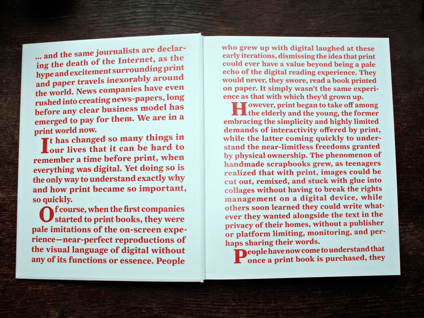
Le catalogue et ses hybrides / The Catalog’s Mongrels is a proposal of one possible way to document/trace the same name exhibition.
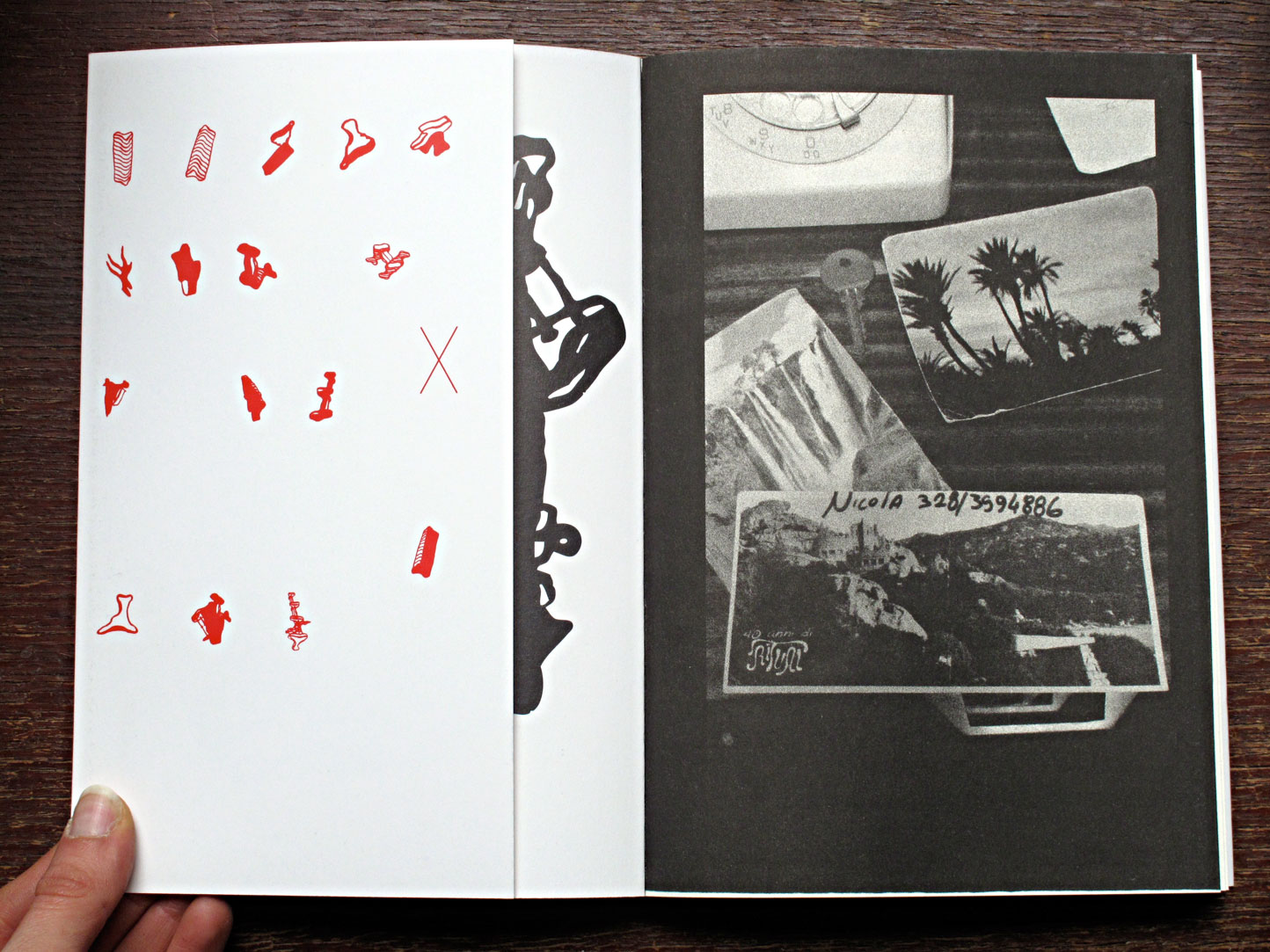
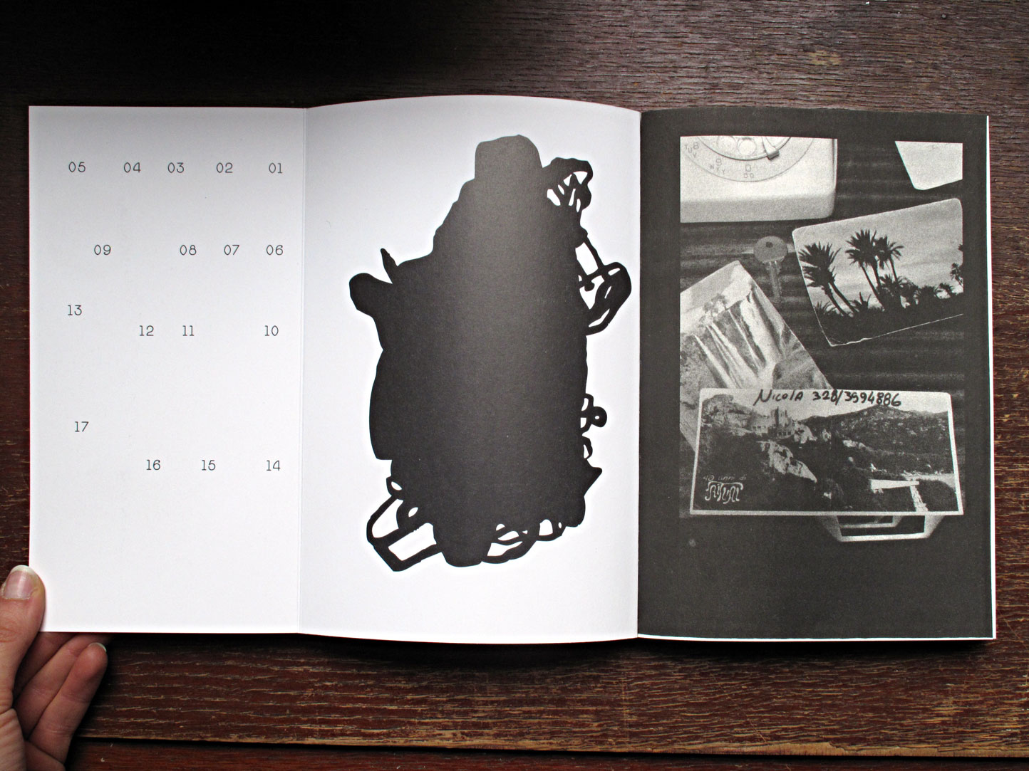
The exhibitions The Catalog and its hybrids – curated by Charlotte Cheetham – introduced publishing projects reflecting the diversity of publications that are associated with the exhibition context… The catalog of the project, designed by officeabc, tries to embody its own statement…
These printed sites of encounter – a format of interaction between an art space (art center, gallery, museum…), a curator, an artist, a graphic designer, a theorist… – question, particularly, the potential of the book object to be an alternative to the exhibition space.
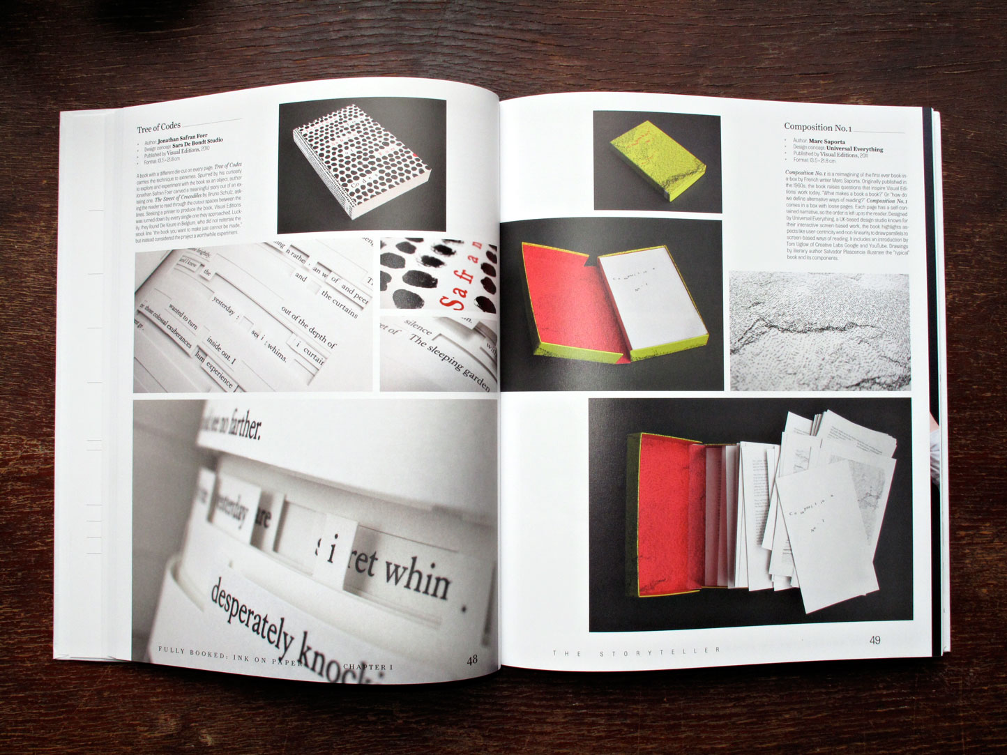
From a documental object – the catalogue – to a composite printed form – the artist book – some of these publications offer a more complex treatment of the documentation of artistic production and curatorial practices.
A source, trace or extension of the ephemeral, each of these printed experiences, which are reactivated at each new reading, constitute an alternative space of living memory, a new context for the existence of a work of art.
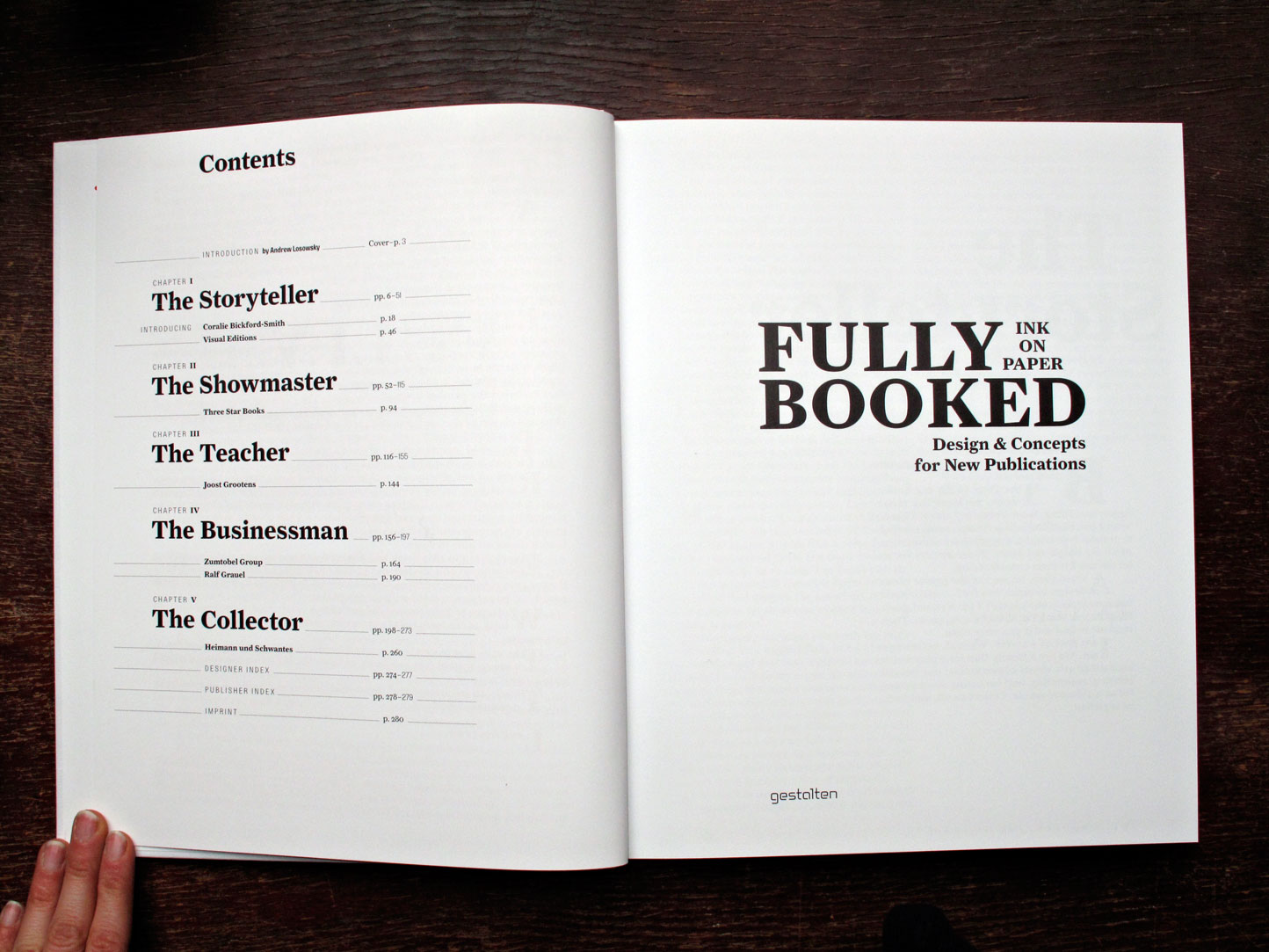
Content:
– Introduction & Promenade (Charlotte Cheetham)
– A kind of bibliography The Catalog and its hybrids
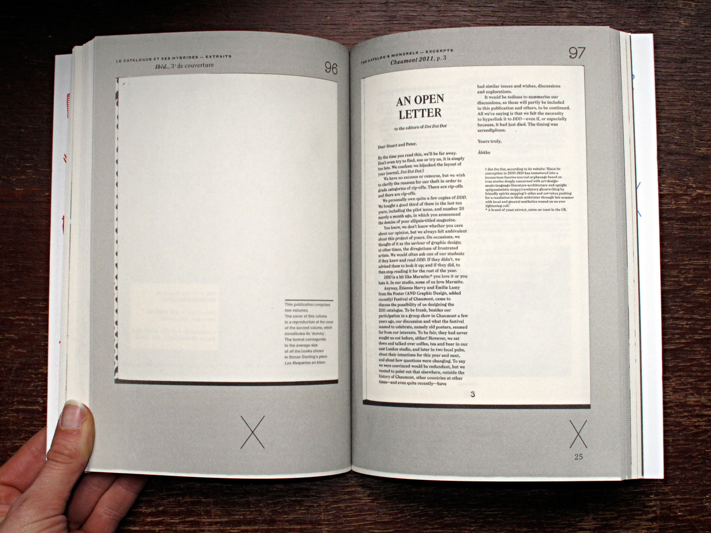
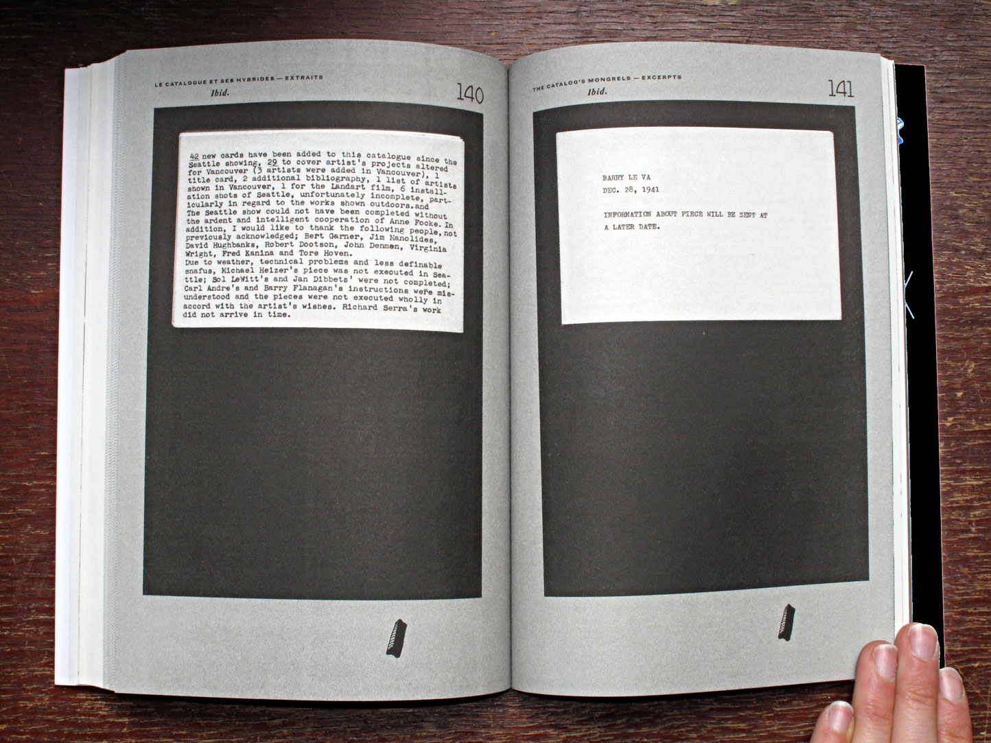
– An extract of the The Catalog and its hybrids collection
– Seth Siegelaub: to exhibit, to publish… (Jérôme Dupeyrat)
– A case of tic, tac, toe et Notes about a flyer (officeabc)
Extra
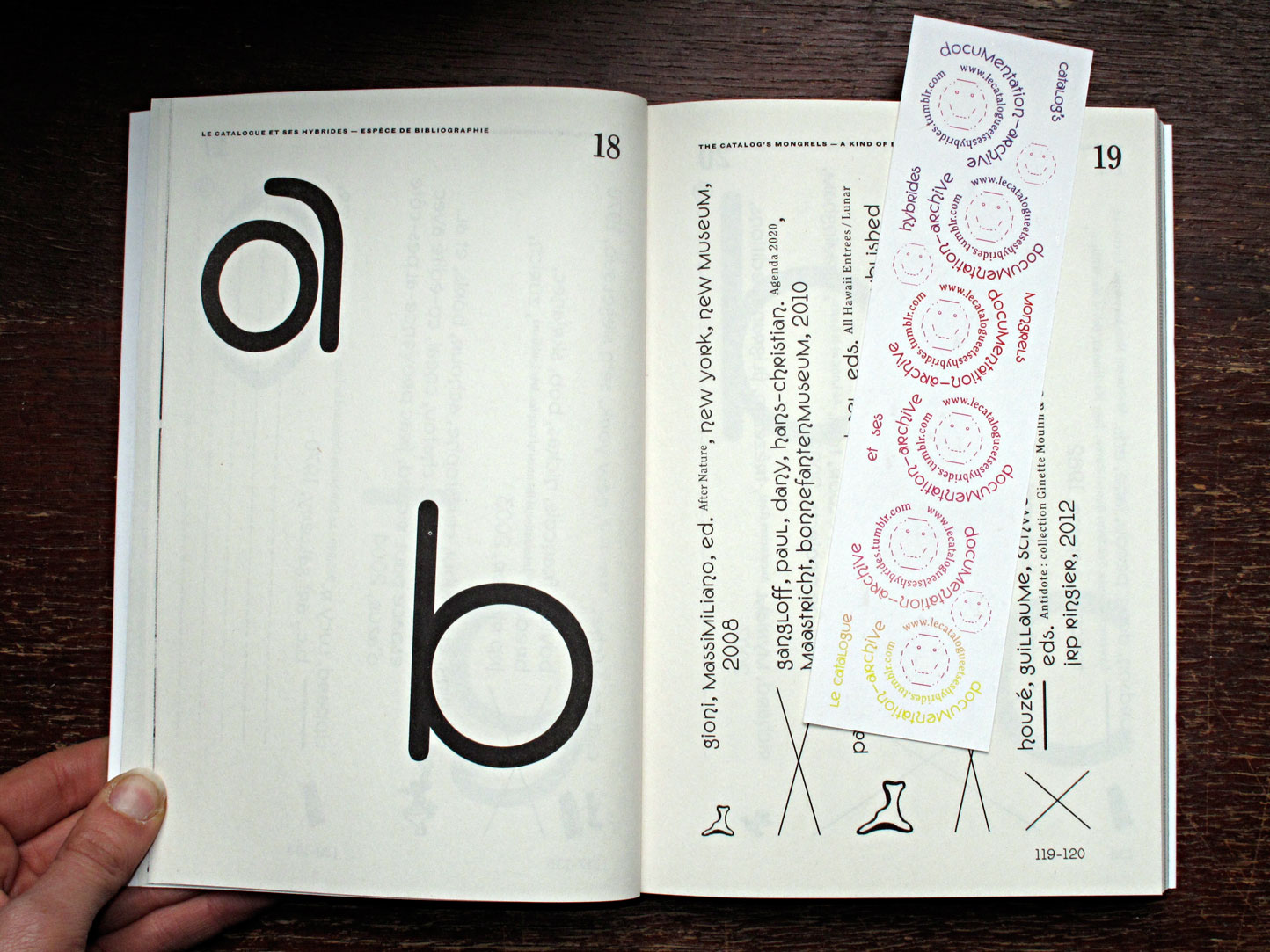
• a tumblr bookmark
• sticker Museum of Museum
• cards “teaser/clue to a catalogue”
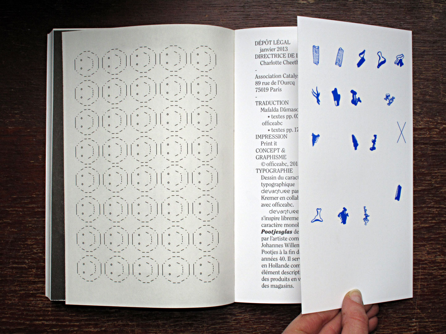
Design: officeabc
Typography: Devanture par Sarah Kremer
Translation: Mafalda Dâmaso & officeabc
Print: Print it