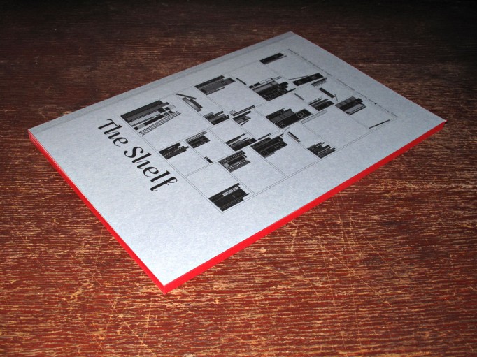
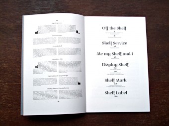
The Shelf Journal #2. Shelf-Publishing.
Posted in graphic design, magazines, typography on February 8th, 2013Tags: book design, Derek Birdsall, Maximilien Vox, Mirko Borsche, publishing, Stanley Morison
The Shelf Journal #2. Shelf-Publishing.
In this issue:
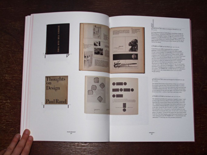
Derek Birdsall, Interview. – Books which affected the career and life of the famous British book designer.
Stanley Morison & Maximilien Vox, A Frenchman’s view of British typography and vice-versa.
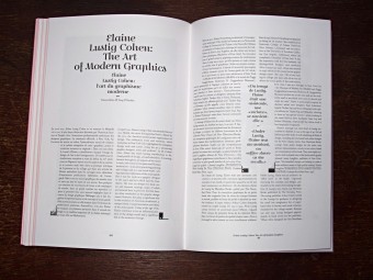
Patricia Belen & Grey D’Onofrio, Elaine Lustig Cohen: The Art of Modern Graphics.
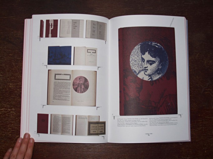
The “club of clubs”, Culture Club – Discussion about French book clubs.
Sebastien Hayez, Four Aces. – Modernism development of graphic design through four design magazine’s issue number 1.
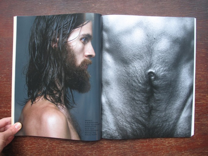
Hugo Hoppmann & Mirko Borsche, The Designing Art Director – Conversation.
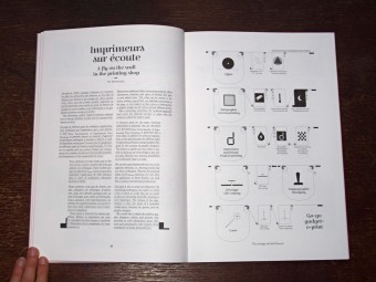
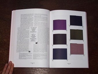
The Shelf Journal, A fly on the wall in the printing shop. – Report on printing techniques, supported by examples.
About The Shelf:
“Why start a paper journal about books at a time when the internet is calling into question the average Westerner’s innate materialism, and at a time when the price of a book-as-object puts off devotees of free knowledge on the net? What is becoming of bound volumes today – that foundation of our society, those keepers of our history?
With the dematerialisation of editorial content, the practice of design within books is taking on an even more important dimension. Whether insignificant objects or works of art in their own right, books create through their different forms and stories a unique bond with those who read, consult and own them. This almost physical connection was the reason for creating The Shelf Journal.
Part place of worship and reflection for paper lovers, part experimental platform for designers, typographers and other graphic designers, The Shelf Journal explores the essence of our libraries’ charm: the limitless variations in form of this unique object.”
122 pages
English and French
ISBN: 9782954065618
D 20€

