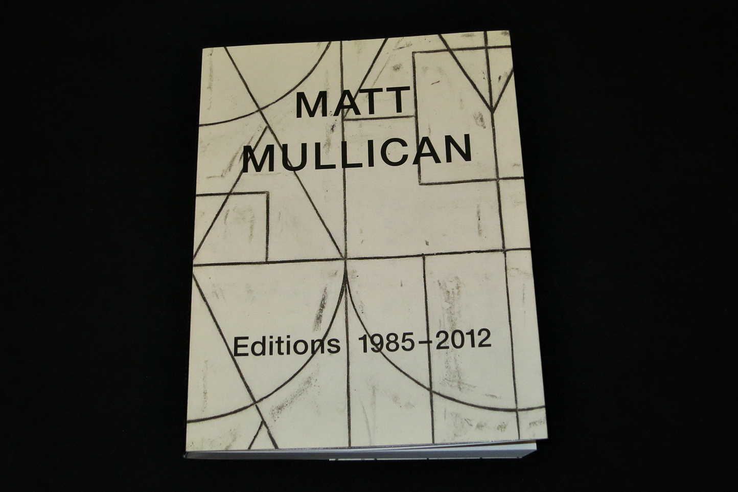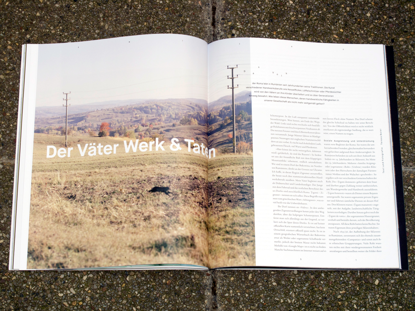

»nicht jetzt!« #4. Studierende des Department Design der HAW Hamburg.
»nicht jetzt!« wird von Studierenden des Departments Design der HAW Hamburg geschrieben, fotografiert, illustriert und gestaltet. Nach den preisgekrönten Heften »Kinder«, »Geld« und »Geschmack« beschäftigt sich die vierte monothematische Ausgabe mit dem »Teilen«. Das Thema war gleichzeitig Arbeitsmodus der Redaktion, die von Prof. Stefan Stefanescu betreut wird: Im Selbstversuch begann sie mit Teilhabe an fast allen Arbeitsprozessen und endete in Arbeitsteilung.
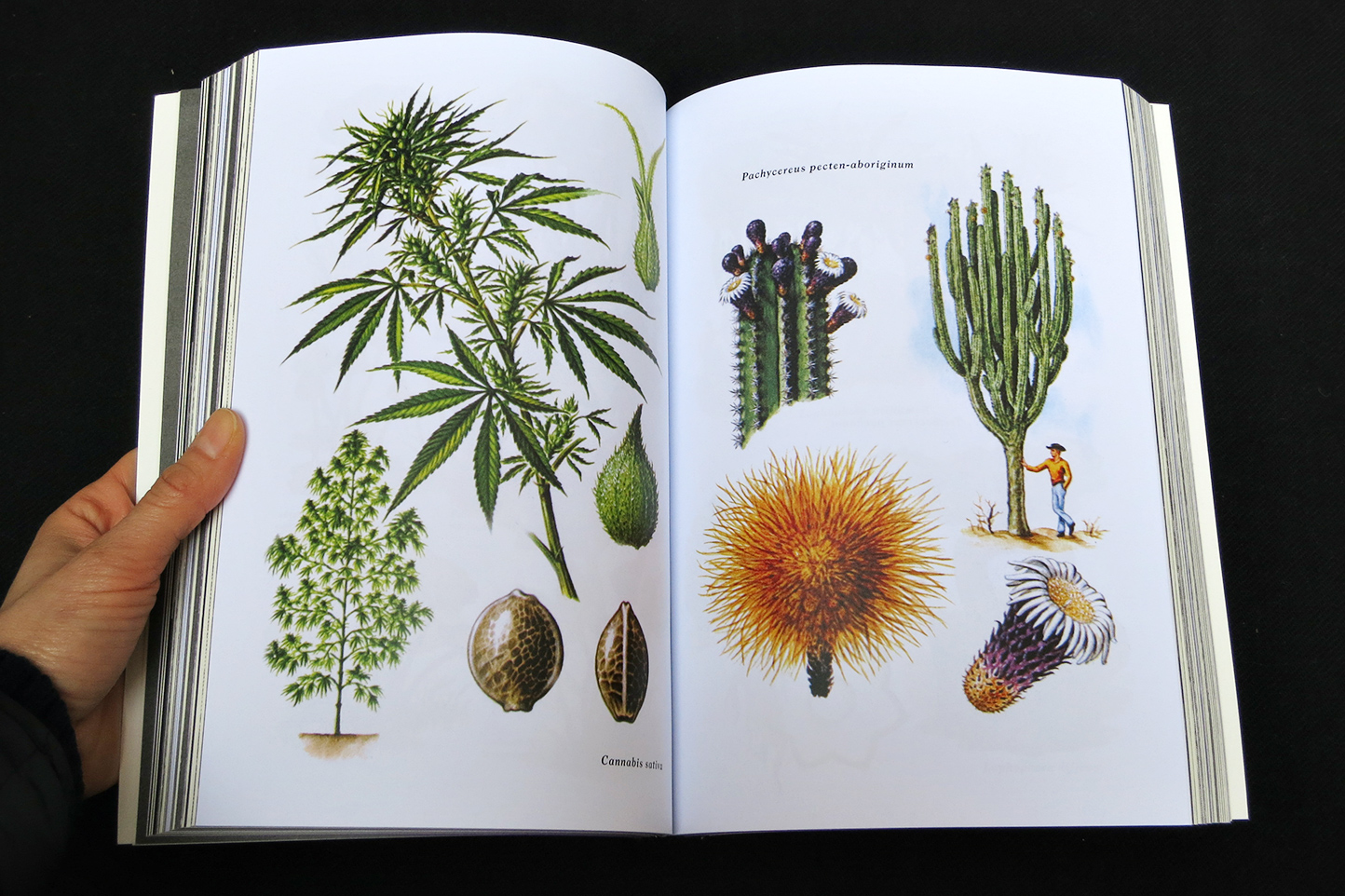
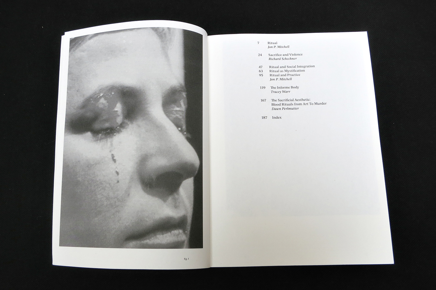
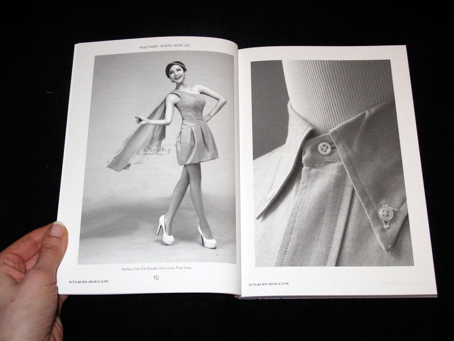
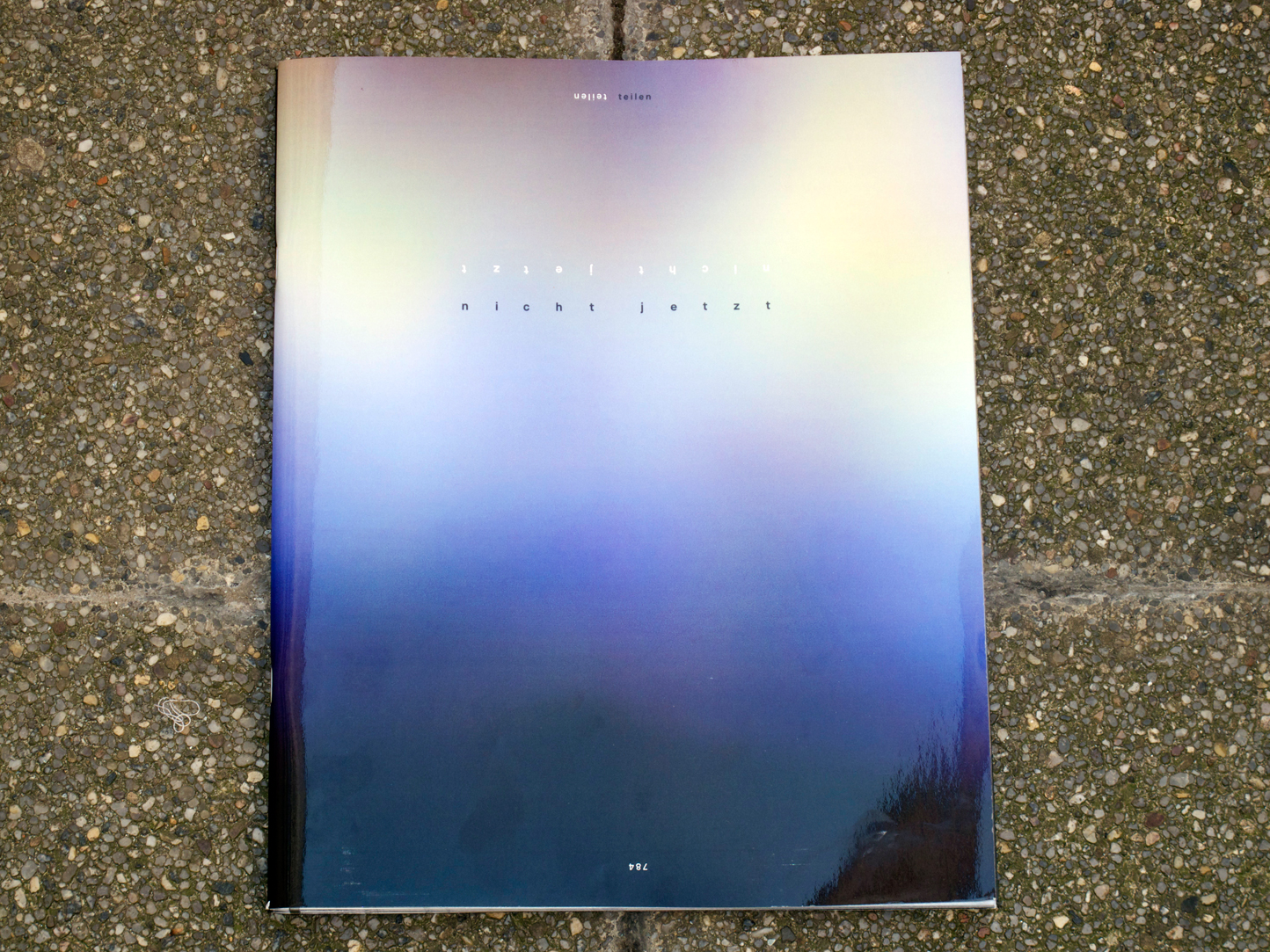
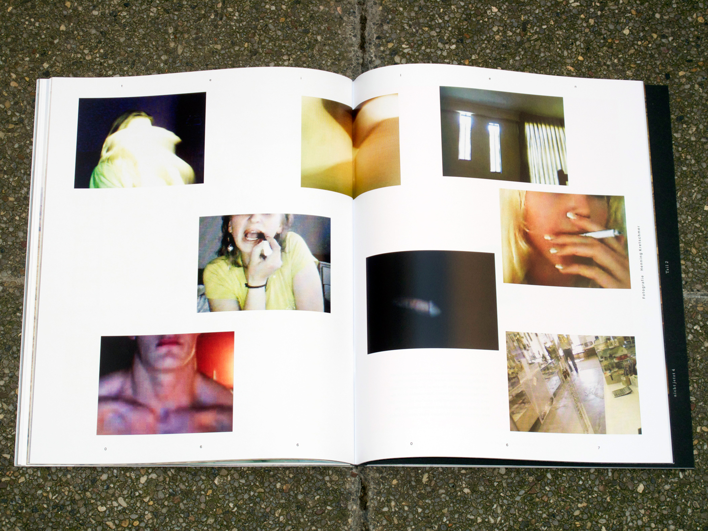
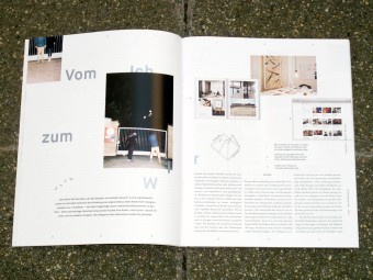
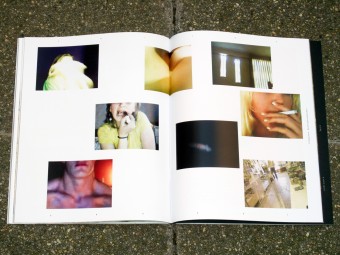
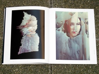
Das deutsche Wort »Teilen« beinhaltet zwei sehr unterschiedliche Bedeutungen, die das 168-seitige Doppelheft in die Themen »share« und »split« teilen. Unter »share« findet sich etwa ein Gemeinschafts-Interview mit Designer-Kollektiven. Es geht aber auch um Orte, an denen Sexualpartner oder Zärtlichkeiten geteilt werden. Um den Begriff »split« kreist das zweite Heft mit Beiträgen über Elitenbildung durch Samen-Banking, über den Alltag in der religiös geteilten Stadt Sarajevo und über den einer »Banane«, wie Deutsch-Chinesen in China genannt werden.
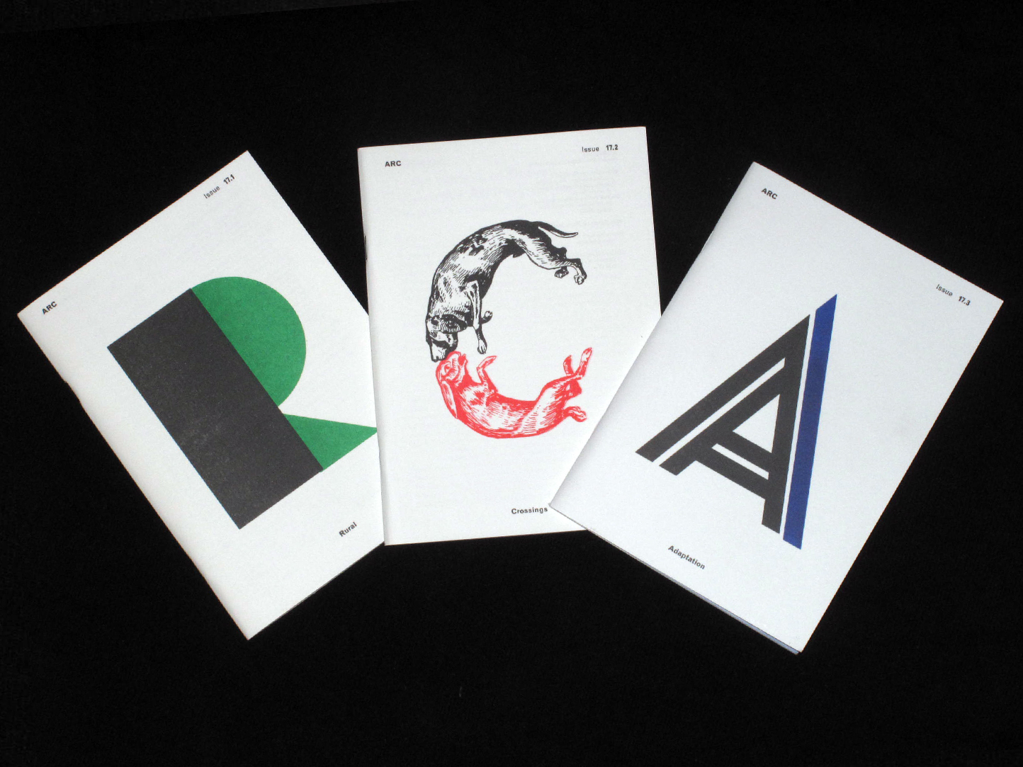
Die Titelseiten der Hefte, 784 unterschiedliche und nummerierte Einzelstücke, ergeben zusammen¬gesetzt ein knapp 60 Quadratmeter großes Bild, das eine embryonale Zellteilung zeigt. Zur Release-Party am 9. Juli im Hamburger »Island« wurde dieses Bild in Gänze präsentiert, bevor seine Einzelteile in den Verkauf gingen.
Gestaltung: Studierende des Department Design der HAW Hamburg unter Betreuung von Prof. Stefan Stefanescu: Teresa Baier, Jasmin Baltres, Jennifer David, Fabian Greve, Søren Koswig, Janina Lentföhr, Dom Odenkirchen, Anne Stiefel, Simon Weize, Jana Blumendeller, Merle Düpmeier, Justus Düsenberg, Christina Gnatzy, Peter Kaden, Ines Könitz, Lara Kothe, Hanna Osen
Herausgeber: Prof. Stefan Stefanescu im Auftrag der Fakultät DMI, HAW Hamburg
Veröffentlichung: Juli 2013
Umfang: 160 Seiten
Format: 24 x 30 cm
Sprache: Deutsch
Specials: Doppelheft, buchbinderisch verbunden. Sämtliche Cover sind Unikate, die zusammengesetzt ein großes Bild ergeben.
13 €
Buy it