Fully Booked: Ink on Paper, Design and Concepts for New Publications. Die Gestalten Verlag.

Posted in graphic design, typography on March 9th, 2013

fully_booked_gestalten_motto_01fully_booked_gestalten_motto_02fully_booked_gestalten_motto_03fully_booked_gestalten_motto_05fully_booked_gestalten_motto_06fully_booked_gestalten_motto_10fully_booked_gestalten_motto_07fully_booked_gestalten_motto_09fully_booked_gestalten_motto_11

Fully Booked: Ink on Paper, Design and Concepts for New Publications. Die Gestalten Verlag.

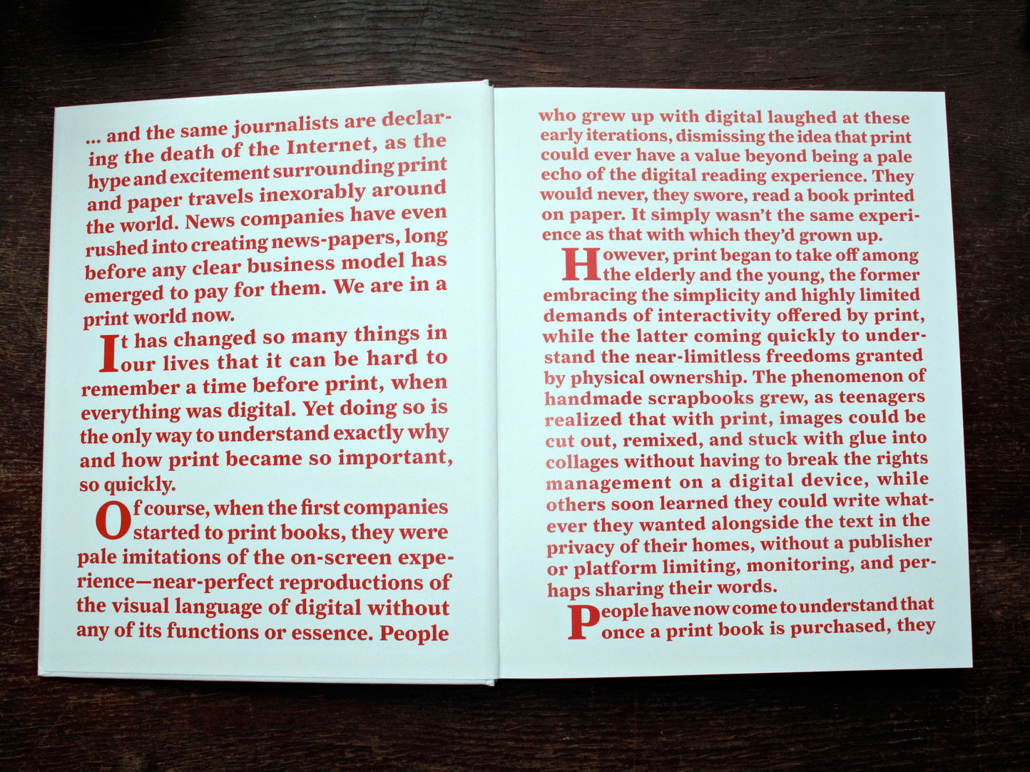
Fully Booked: Ink on Paper is a showcase of innovative books and other print products at the vanguard of a new era for printed publications—one that is likely to be the most exciting in their entire history.

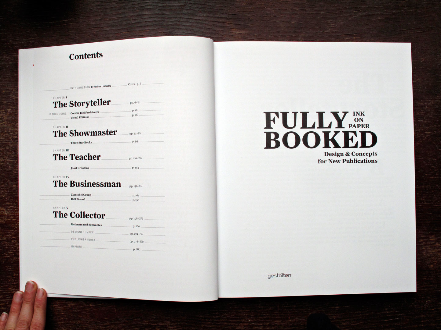
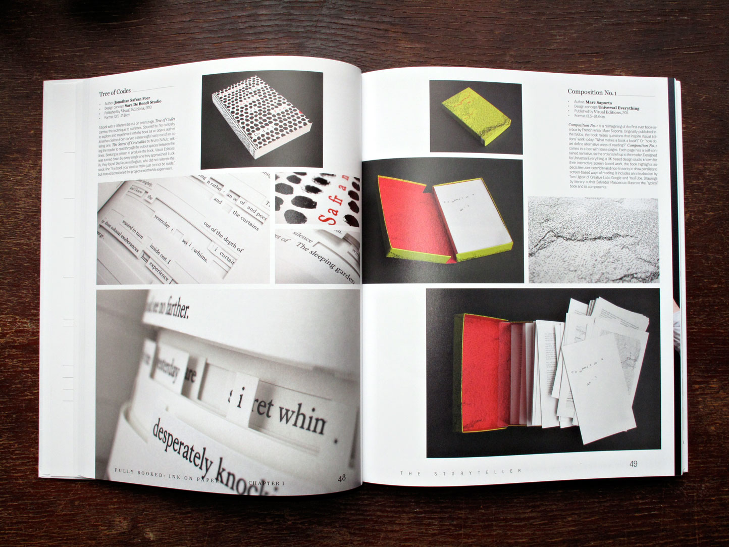
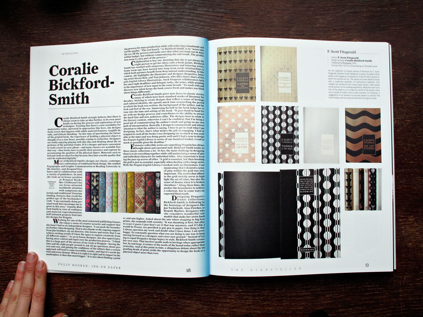
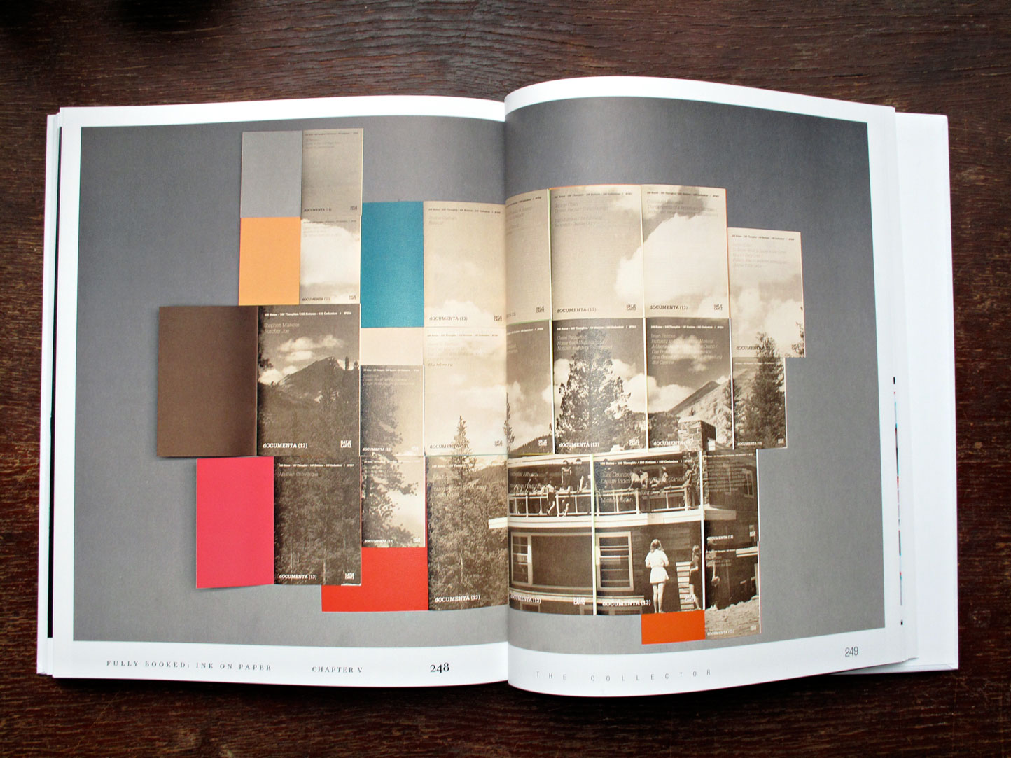
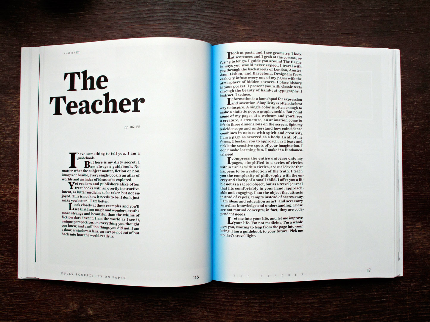
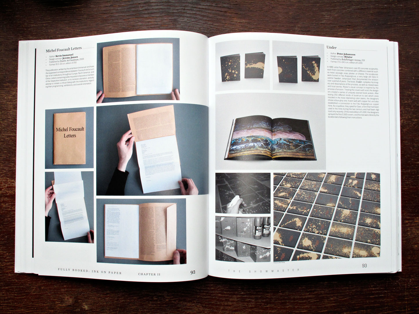
This book is structured into five chapters that each represent a key role that print plays today: The Storyteller, The Showmaster, The Teacher, The Businessman, and The Collector. From personal projects with the smallest print runs to premium artist books or brand publications, the selection of work presented here celebrates the tactile experience. Featuring innovative printing and binding techniques as well as radical editorial and design concepts, this work explores the distinctiveness of design, materials, workmanship, and production methods—and pushes their limits.

Editors: R. Klanten, M. Hübner, A. Losowsky
Release Date: February 2013
Credits: Preface and chapter introductions by Andrew Losowsky
Format: 24 × 30 cm
Features: 272 pages, full color, hardcover
Language: English
ISBN: 978-3-89955-464-9

Price: 44€

Buy it

The Shelf Journal #2. Shelf-Publishing.

Posted in graphic design, magazines, typography on February 8th, 2013
Tags: , , , , ,

the_shelf_motto_08the-shelf_motto_02the-shelf_2_motto_03the-shelf_2_motto_04the-shelf_motto_05the-shelf_motto_07the-shelf_motto_06

The Shelf Journal #2. Shelf-Publishing.

In this issue:

Derek Birdsall, Interview. – Books which affected the career and life of the famous British book designer.

Stanley Morison & Maximilien Vox, A Frenchman’s view of British typography and vice-versa.

Patricia Belen & Grey D’Onofrio, Elaine Lustig Cohen: The Art of Modern Graphics.

The “club of clubs”, Culture Club – Discussion about French book clubs.

Sebastien Hayez, Four Aces. – Modernism development of graphic design through four design magazine’s issue number 1.

Hugo Hoppmann & Mirko Borsche, The Designing Art Director – Conversation.

The Shelf Journal, A fly on the wall in the printing shop. – Report on printing techniques, supported by examples.

About The Shelf:

“Why start a paper journal about books at a time when the internet is calling into question the average Westerner’s innate materialism, and at a time when the price of a book-as-object puts off devotees of free knowledge on the net? What is becoming of bound volumes today – that foundation of our society, those keepers of our history?

With the dematerialisation of editorial content, the practice of design within books is taking on an even more important dimension. Whether insignificant objects or works of art in their own right, books create through their different forms and stories a unique bond with those who read, consult and own them. This almost physical connection was the reason for creating The Shelf Journal.

 Part place of worship and reflection for paper lovers, part experimental platform for designers, typographers and other graphic designers, The Shelf Journal explores the essence of our libraries’ charm: the limitless variations in form of this unique object.”

122 pages
English and French
ISBN: 9782954065618

D 20€

Buy it

Bulletins of The Serving Library #3. Sternberg Press.

Posted in typography, writing on September 7th, 2012
Tags: , , , , , , , , , , , , , , , ,


Bulletins of The Serving Library #3, Stuart Bailey, Angie Keefer, David Reinfurt (Eds.), published by Sternberg Press.

With contributions by Andrew Blum, Bruno Latour, Graham Meyer, Pierre-André Boutang, David Reinfurt, Chris Evans, Jessica Winter, Ian Svenonius, Angie Keefer, Francis McKee, Benjamin Tiven, Louis Lüthi, Dexter Sinister, and Laura Hoptman

This issue of Bulletins of the Serving Library doubles as a catalog of sorts to “Ecstatic Alphabets/Heaps of Language,” a group exhibition curated by Laura Hoptman at the Museum of Modern Art, New York, from May 6 to August 27, 2012. It is a *pseudo*-catalog in the sense that, other than a section of images at the back, it bears no direct relation to the works in the exhibition. Instead, the bulletins extend in different directions from the same title, and could be collectively summarized as preoccupied with the more social aspects of Typography.

D 10 €

Buy it

Hey Now! Jens Schildt. Colophon & Silver Fern Press.

Posted in typography on August 27th, 2012

Hey Now! Jens Schildt. Colophon & Silver Fern Press.

The second in a series of octavo-sized publications dedicated to the typographical “And” and “&, this is a representation of found ampersands, photographed by Mr. Shildt. Design by Jens Schildt and David Bennewith.

4.25″ x 6.75″
16 pages
Edition of 300

D 6€

Buy it

And. William H. Gass. Colophon & Silver Fern Press.

Posted in typography, writing on August 27th, 2012
Tags:

And. William H. Gass. Colophon & Silver Fern Press.

The first in a series of octavo-sized publications dedicated to the typographical “And” and “&,” this is a re-print of the literary critic’s famous 1986 essay on that essential conjunction. Design by Denise Bertschi with David Bennewith.

4.25″ x 6.75″
40 pages
Edition of 300

D 6€

Buy it

The Shelf Journal. Shelf – Published

Posted in graphic design, magazines, typography, writing on August 16th, 2012
Tags: ,

The Shelf Journal by Morgane Rébulard (ed). Shelf – Published

Why start a paper journal about books at a time when the internet is calling into question the average Westerner’s innate materialism, and at a time when the price of a book-as-object puts off devotees of free knowledge on the net? What is becoming of bound volumes today – that foundation of our society, those keepers of our history?
With the dematerialisation of editorial content, the practice of design within books is taking on an even more important dimension. Whether insignificant objects or works of art in their own right, books create through their different forms and stories a unique bond with those who read, consult and own them. This almost physical connection was the reason for creating The Shelf Journal.
Part place of worship and reflection for paper lovers, part experimental platform for designers, typographers and other graphic designers, The Shelf Journal explores the essence of our libraries’ charm: the limitless variations in form of this unique object.

Dual-language journal
108 pages, 21 x 31 cm

D 18 €

Buy it

Curwen Sans type specimen. An Endless Supply.

Posted in history, typography, writing on July 27th, 2012
Tags: , ,


Curwen Sans type specimen, Harold Curwen, An Endless Supply 2011

Curwen Sans was first drawn by Harold Curwen at the Curwen Press in 1911. Curwen died in 1949 and the Press went out of business in the 1980s, and his sans serif—pre-emptive of Johnston, Gill Sans, Kabel—has never been digitised. An Endless Supply have re-drawn the font from prints sourced at Cambridge University, and the specimen includes a critical history of the typeface as well as new writing about the processes of revival. The jacket design is a re-print of wallpaper printed by Curwen Press in 1927.

Produced as part of The Department of Overlooked Histories at Wysing Arts Centre.

D 20.50 €

Buy it

Reading Tests. Jack Henrie Fisher & Popahna Brandes. Jan van Eyck Academie.

Posted in poetry, typography, writing on July 20th, 2012
Tags: , ,

Reading Tests. Jack Henrie Fisher & Popahna Brandes. Jan van Eyck Academie.

A note about the words in the book – where they come from and what has happened to them.

Many of them, the ones on the right-side and the ones at the end, are “suspicious” words from Google Books, words from book scans which can’t be machine-read. Google offers these unreadable words as reversed Turing Tests to human readers in their project to digitize all the books in their digital library. These images of words have been gathered for this book in thousands of refreshes at the threshold to a PDF download. A human writer, in turn, has read the words for some rhythm of sense. In these tests she has rearranged them accordingly.The texts to the left are, in the first section, edited from a medium-sized dictionary used for dictionary attack, the machine procedure whereby every word of a dictionary is fired at an empty internet password field.

The second section alternates verso and recto pages from Freud’s “Mistakes in Reading and Slips of the Pen”. These pages have been submitted and resubmitted to an optical character recognition which rotates, stretches, and darkens pixels in order to bring the image closer to what might be recognized as a letter. When a recognition takes place, the image becomes a text and can be highlighted, underlined, crossed out, edited – formal actions which turn out to hinder a reading conversion the next time around. This recursivity may proceed to the point of invention – that is, a new letter is found or drawn by the reading software.

Raymond Williams’ essay “Means of Communication as Means of Production” is captured in the third section, erringly, as text, with all the mistakes this process must make from a low-resolution scan. A typographer has underlined some pertinent points within it.

At the end of the book, the suspicious, unreadable words are given over and over again to optical character recognition, alongside an interfering element – usually a curved line, the current standard for hindering spam-intending machine readers. These images, as well as whatever reading marks can follow from a recognition, are cut and straightened and moved around in each subsequent reading, on their way to becoming texts, but never completely assuming sense.

D 12 €

Buy it

Quick #6: Wolfgang Plöger

Posted in graphic design, typography on June 15th, 2012
Tags:

Quick #6: Wolfgang Plöger

Quick Magazine #6, April 2012

Wolfgang Plöger: Texas loud, Texas proud

3 colour stencil print

D 7€

Buy

About Graphic Design. Richard Hollis. Occasional Papers.

Posted in graphic design, typography, writing on June 13th, 2012
Tags: , , ,

About Graphic Design. Richard Hollis.

The book features a comprehensive selection of writings by renowned graphic designer, graphic design theorist and historian Richard Hollis, including interviews, essays, letters, articles, lectures and course outlines. About Graphic Design is densely illustrated with over 500 thumbnail images.

Edited by Richard Hollis
Designed by Richard Hollis with Pedro Cid Proença

D 19€

Buy