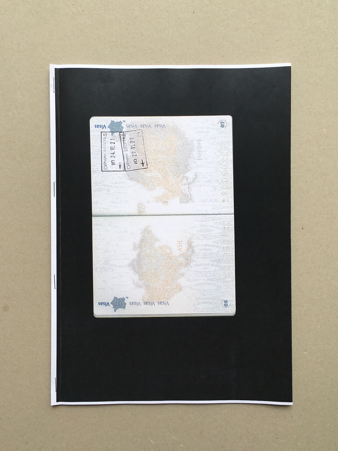
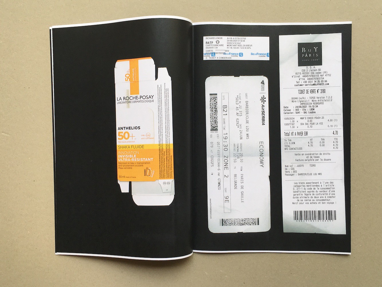
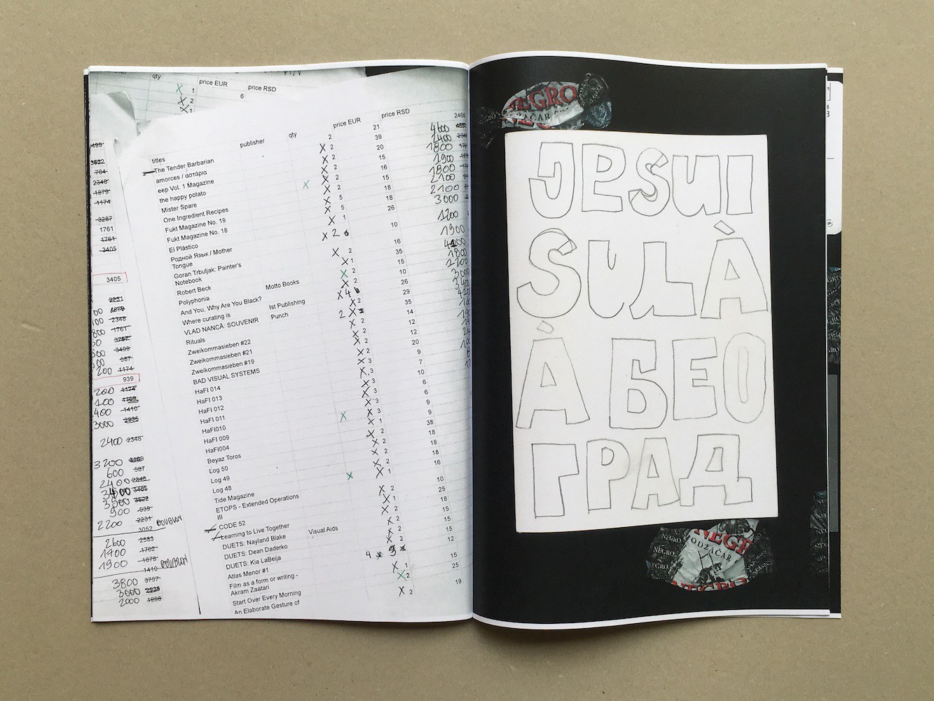
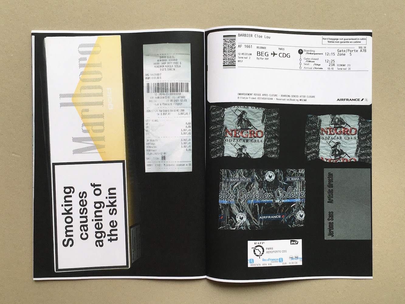
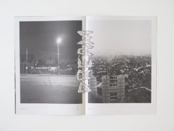
3 days in Belgrade. Cloé Barbier. Self published
Posted in graphic design, Zines on August 20th, 2021Tags: 3 days in Belgrade, Cloé Barbier


Image Generation, a work of research by Michel Egger, makes use of visual material found on the World Wide Web. Generated using Pinterest’s algorithm-driven search function, single images, ones that otherwise would never have come together, are put into a relationship. Formal associations and technological errors collide, allowing these duos to emerge. In parallel to this, words are used to translate the imagery into unsystematic, yet constantly internet-based information.
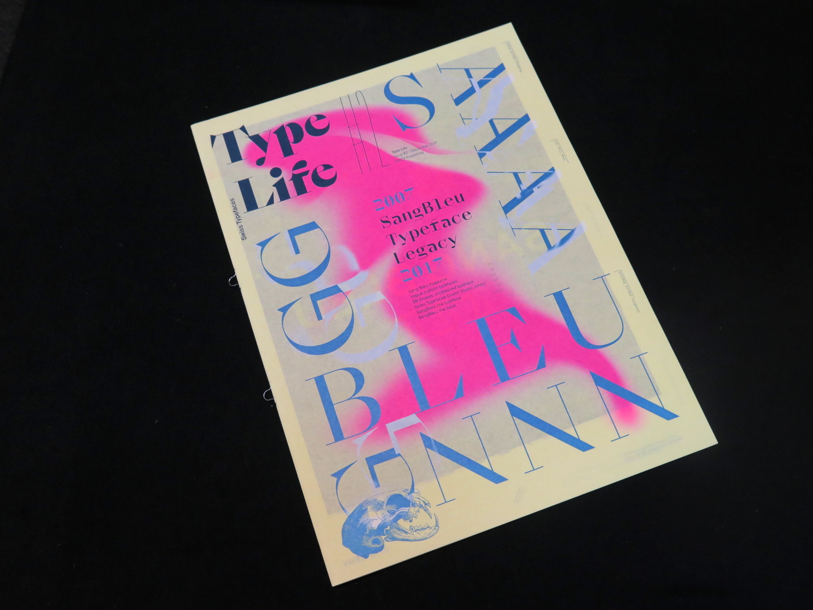
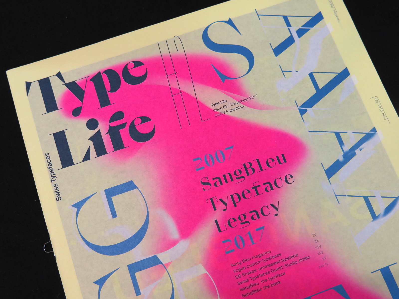


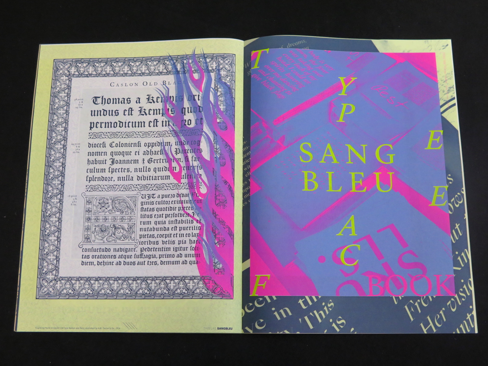
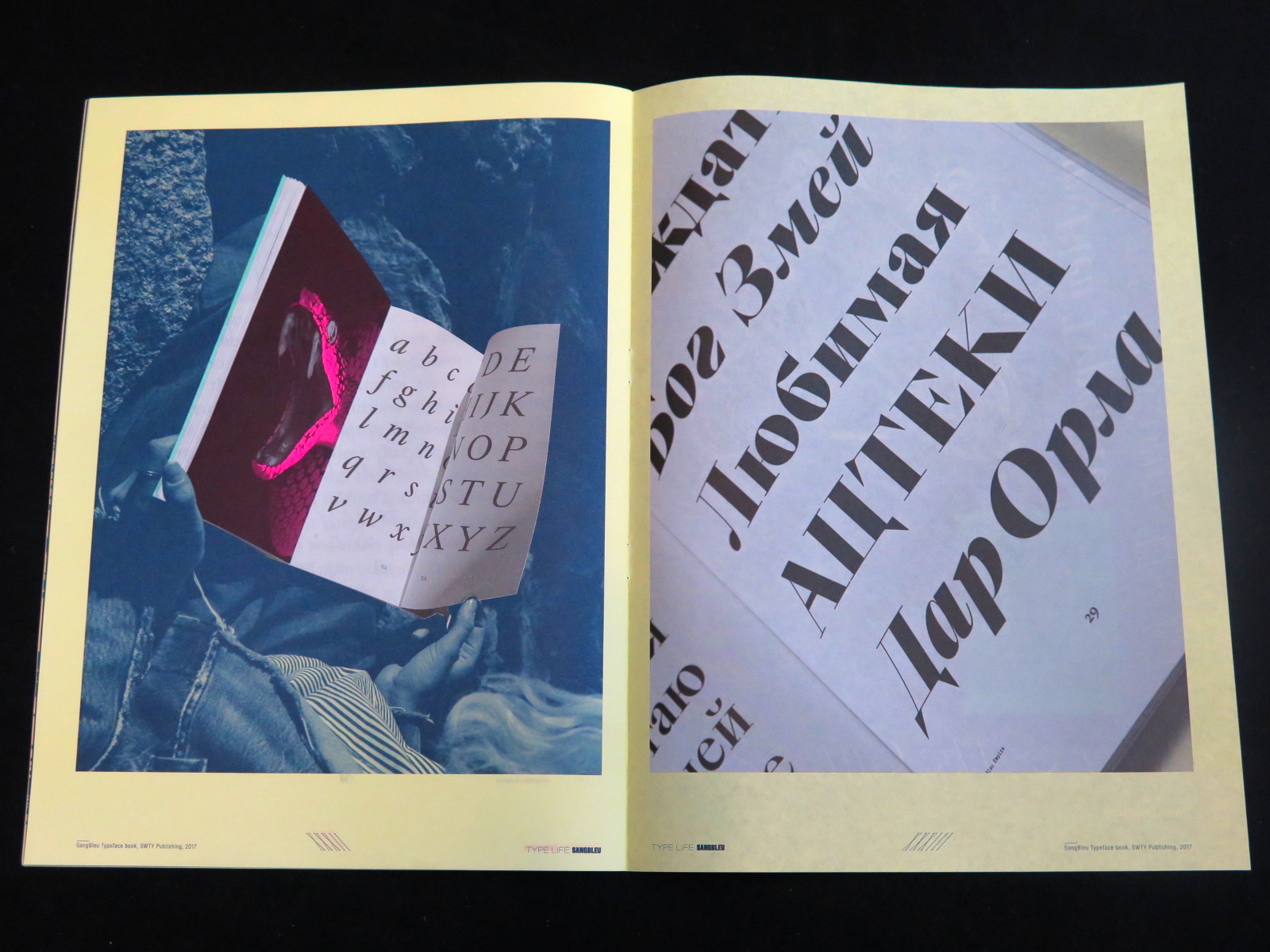
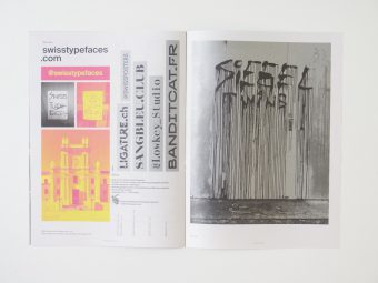
The second issue of Type Life brings a cornucopia of visual inspiration. Swiss Typefaces presents insights into their cosmos of style, fonts, and fashion. This is the only place where you’ll find both Rihanna and Rudolf Koch, and where photos of contemporary art and streetwear are framed by engravings from the Caslon foundry. Type Life doesn’t make many words, and instead shows plenty of letterforms. Printed in six Pantone colors, it features mirrored words, slanted letters, gradients and all the other things your design prof wouldn’t approve of.
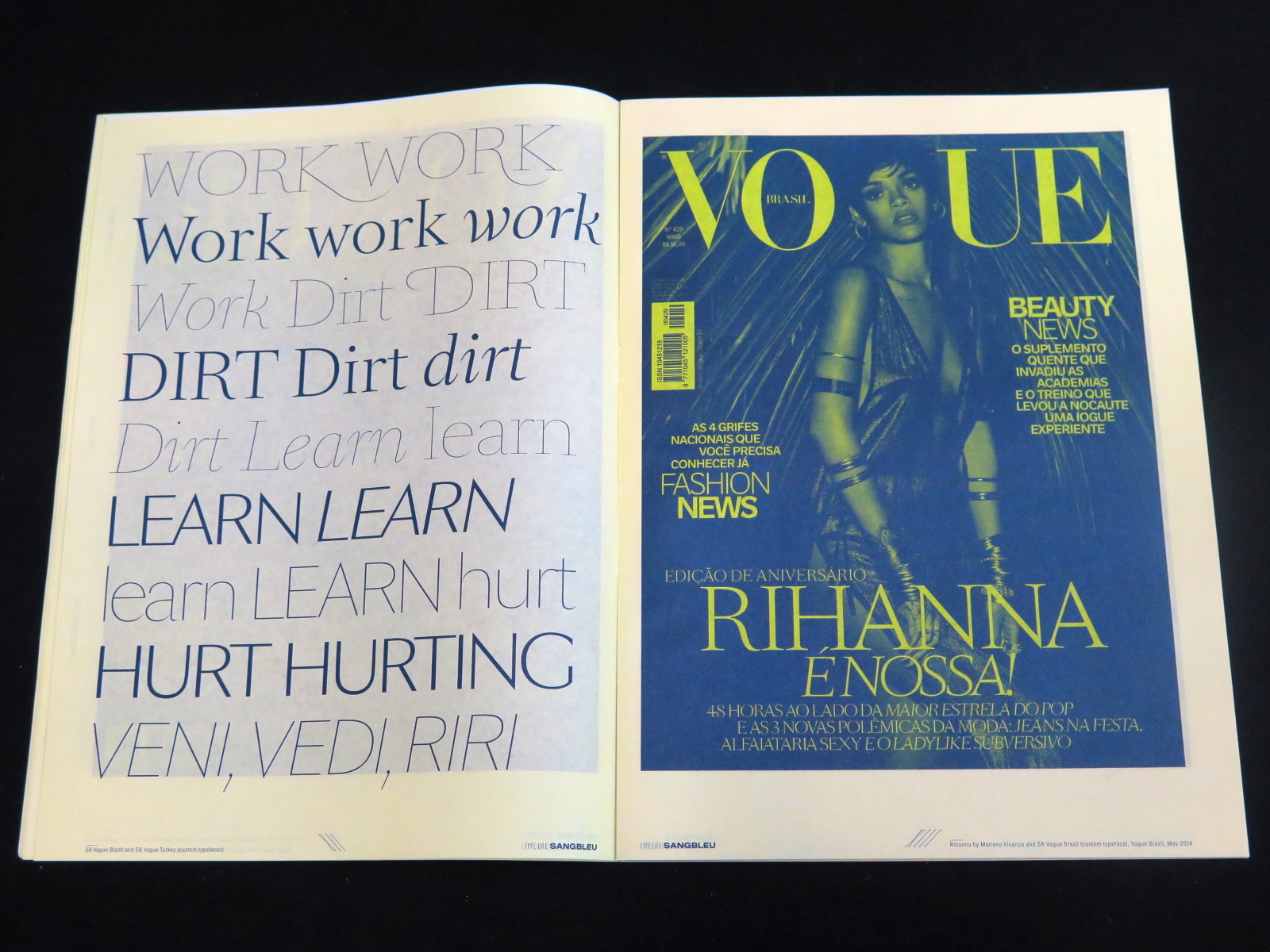
At the heart of this issue is Sang Bleu – the name both of a typeface and of a creative agency. Over the past decade, the two have built a legacy together. Shown are fonts that debuted in the Sang Bleu magazine, some of which later were released by Swiss Typefaces, and others that remained private. Custom typefaces designed for Vogue appear next to the experimental script variant SangBleu Snakes, followed by a stunning guest contribution from the Paris-based Studio Jimbo. Type Life #2 is made perfect by an introduction to the all-new SangBleu typeface and the accompanying printed book that showcases its 5 collections and 45 styles, released in October 2017.
Publisher: SWTY Publishing, 2017
Language: English
Pages: 36
Size: 23.5 x 32 cm
Binding: Softcover, loop staples
Printing: Offset, 6 Pantone colors
Printed in Switzerland
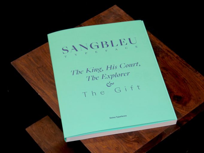
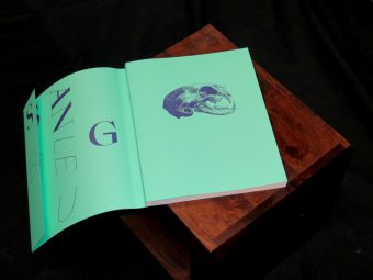
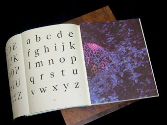
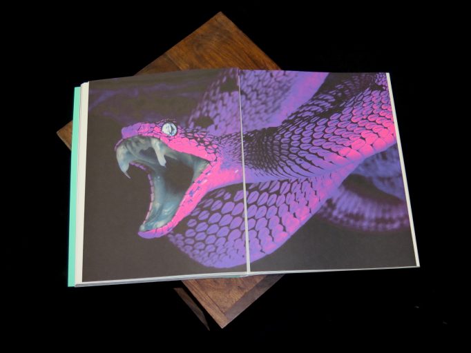
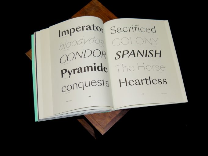
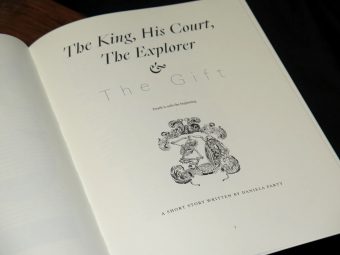
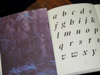

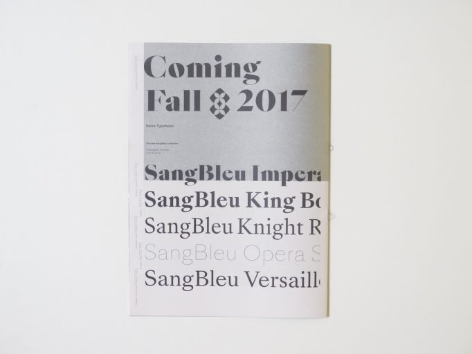
On the occasion of the launch of the SangBleu typeface, Swiss Typefaces issues a book for lovers of the printed letterform. On 128 pages, “SangBleu Typeface: The King, His Court, The Explorer & The Gift” celebrates cuttingedge typography in general and the SangBleu fonts in particular. Devised as a collector’s item, it provides a unique combination of design and content: at the heart of the publication is a novella by Daniela Party, specifically written for this purpose. The book starts off with illustrations of a skull and a beheaded female warrior, followed by serpents and an Aztec ghost figure. This dark and savage imagery sets the atmosphere. Giant initials, printed in loud pink, lead into the book like drumbeats in the jungle – S – B – G – U… The title page presents the names of the five collections that form the SangBleu typeface: Empire, Kingdom, Republic, Versailles, Sunrise. Each family is displayed on a spread of 20 pages, in a layout that was freely inspired by a type specimen for Caslon Old Face from 1924. The sample pages emulate all kinds of text types, from novels and magazines to drama and poetry, in sizes big and small. Some pages feature large headlines or block quotes in italics. Others show off spectacular drop caps and strongly contrasting sizes or weights. Designers interested in seeing the Cyrillics do not miss out either. The scope and versatility of the SangBleu collection is exhibited in its entirety. All text is taken from Daniela Party’s novella. Set in the late 17th century, an era of absolutism, superstition, and colonialism, it narrates the story of Meztli, an indigenous Mexican woman with extrasensory powers. Captured by French explorer La Salle, she is sent as a gift to Louis XIV, the Sun King – a gift that would set off a series of macabre events involving witchcraft, lust, envy, and death. Designed by Swiss Typefaces, the SangBleu Typeface book was printed in five colors, four of them Pantone spot colors including metallic and neon inks, and is further enriched by a special binding with several foldout pages – all made in Switzerland.
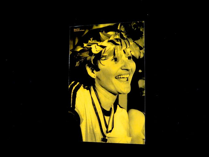
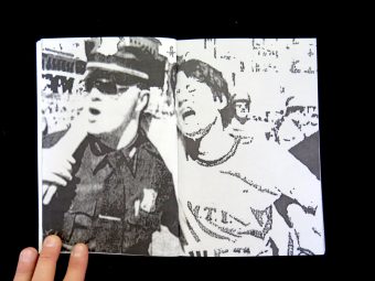
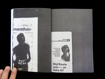
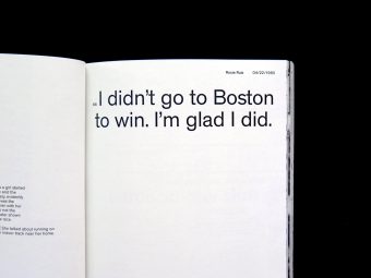
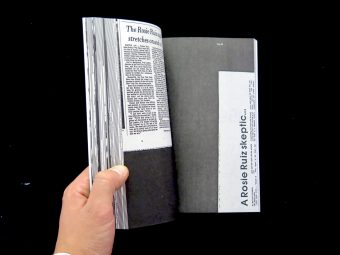
Rosie Ruiz was a non-professional runner who cheated during the 1979 New York City Marathon and the 1980 Boston Marathon.
This book relates the nine days of investigation and doubts which took place between april 22, the day of her victory in Boston, and april 30, the day her disqualification. During these nine days we discovered the testimonies of the protagonists of the case: Rosie, runners, winners, losers, the direction of the marathon and family. This story was a big buzz in the media. The reader gradually discovers all the elements of the story, like an inspector interviewing witnesses. Step by step, links and evidences are made and after 9 days of investigation the reader can determine whether yes or no Rosie Ruiz cheated during these two marathons.
T9 (short for ›text on 9 keys‹) is a predictive text technology developed in 1995. It was designed to optimize text entry on 3×4 numeric cell phone keypads commonly used at that time. On these standard 12-key layouts the number keys from ›2‹ to ›9‹ are assigned to a group of three to four letters each. In T9, a sequence of single keystrokes is matched against a stored dictionary. Words associated to the entered sequence of numbers are then presented to the user to choose from. Coincidentally and inherent to the working principle of T9, one sequence of keystrokes can potentially represent many different words. This guide book compiles an incomplete and subjective selection of these so-called ›textonyms‹ to be found in the English language. It exposes the collateral poetry, incidental truisms, and semantic comedy that are latently lurking in encoding and compression technologies like T9.
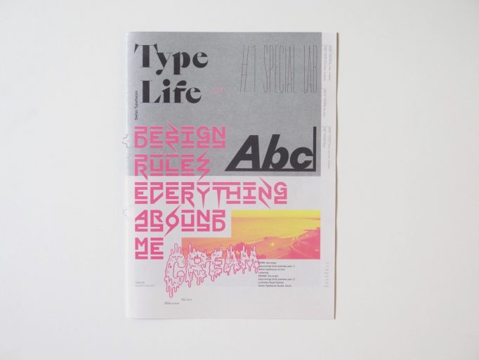
Type Life
Issue #1: Special Lab
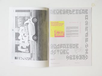
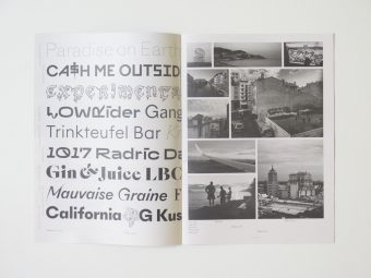
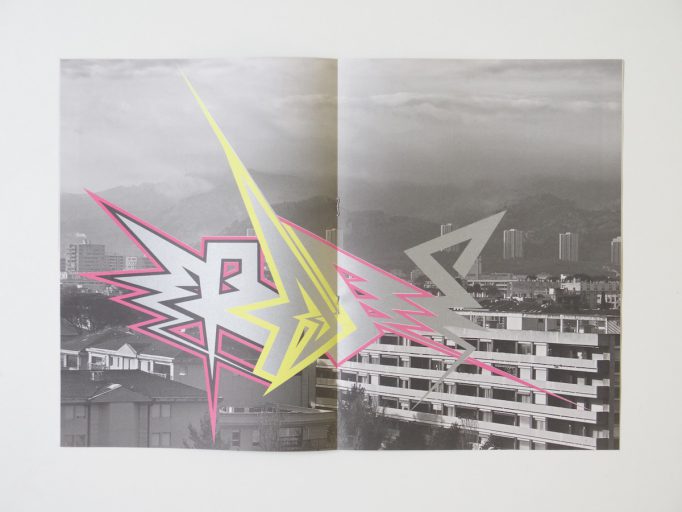
The inaugural issue is a special about the Lab. In this Research & Development department, we explore new ideas for future fonts. Two of the most recent additions to the Lab are showcased here. The first one named BRRR is a playful wide Grotesk with a great deal of disruptive details. A spin-off from Simplon Mono, it was initially created to design a poster series for Swiss artist Simon Paccaud. KRSNA started out as a custom version of NewParis Skyline, made for two vinyl record sleeeves by Geneva-based musician Grace Core. This experimental typeface abandons the convention of a continuous baseline and introduces a three-storey space where the letters can sit at the top, center or bottom, with the remaining space filled by bars and spikes. The resulting word images are captivating patterns with logo-like qualities. Type Life reveals how BRRR and KRSNA came into being by depicting preliminary sketches, evolutionary steps, and photos of experiments made during trips. Reproductions of the very first applications show the fonts in context.
An underlying theme in Type Life #1 is the confrontation of opposites. Systematic typography is interspersed with footloose lettering, accurate vector shapes are shown side by side with drippy comic blackletter. Highbrow clashes with subculture when an icon of the Swiss International Style gets remixed with graffiti. Past meets present also in the typeface designs that always and inevitably are contextualized in history. The digital is contrasted with the analog, the local with the cosmopolitan, the abstract with the personal. On a formal level, all of this is represented by the combination of uncoated newsprint and glamorous spot colors. The minimal but nevertheless unique color palette featuring Pantone neon pink and yellow along with silver and black is a defining element of the publication’s identity.
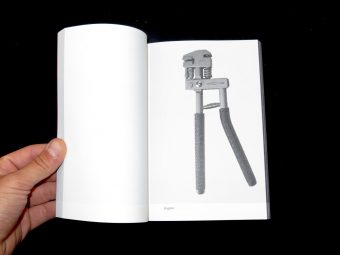
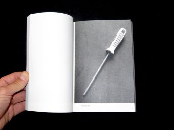
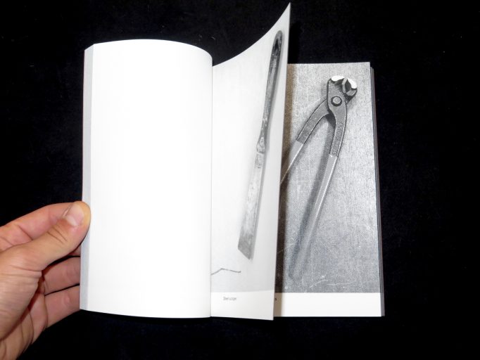
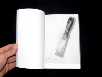
Tools collection and pictures by


This book was the last book publish with tradtionnal type setting by the Imprimerie National, printed on heavy paper.
Most of the work reproduced are printed in black, 2 colors (mainly black and red inks) or more as the Piet Zwart page printed in 3 colors (dark blue, red and yellow)
Jérôme Peignot is born in a family of typographer and type creator, his grand-father was the founder of was became Deberny-Peignot. This historical enterprise worked with Balzac and his father Charles had introduced photocomposition in France and directed the Editions des Arts et Métiers graphiques.
Jérôme Peignot is developping this poetry genre called Visual Poetry, Konkrete poetry or just “Typoésie” (Typoetry). What we called a game is the meeting of litterature with typographical art: searching the meaning of the world in the design of words.
This poetry appear with the help of various tools: from letters, to punctuation, numbers and notes, this anthology is divided into five parts: Typography, Visual poetry, figures, Painting, Music.
Typography: Zwart, Cassandra‘s Bifur, Lubalin, etc.
Visual poetry: Gomringer, Mon and Rühm (Germany). Pignatari and the Campos brothers (Brazil). Italian poets, British, Spanish and American enrich this pratice in a rebellious or advertising use. Peignot admits his fascination with work by Ockerse of Solt, Williams and Xisto
Poets: Dotremont Roubaud Crombie, etc.
Painters: Adam Dupuy, Falconet, Hains, Kolar and Melin, Duchamp, El Lissitzky, Magritte and Matisse.
Music: JS Bach, Gounod, Pobst, Ravel, Schoenberg, Webern.
Texts by Leiris, Cassandra, Guy Levis Mano, Raymond Gid, El Lissitzky, Pierre and Ilse Garnier, Excoffon, Dotremont … and Alexandre Sorel as regards music.
€34.00
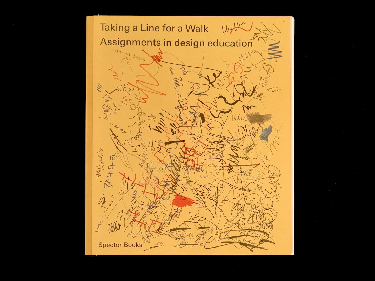
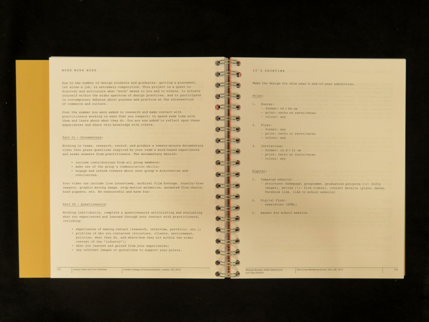
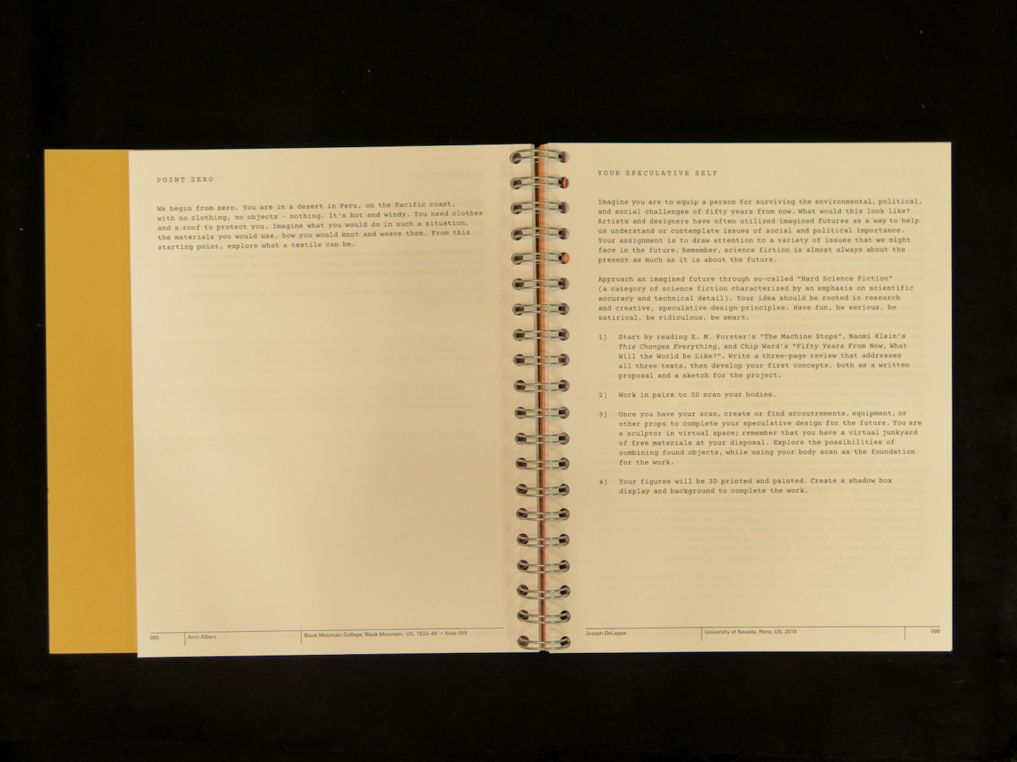
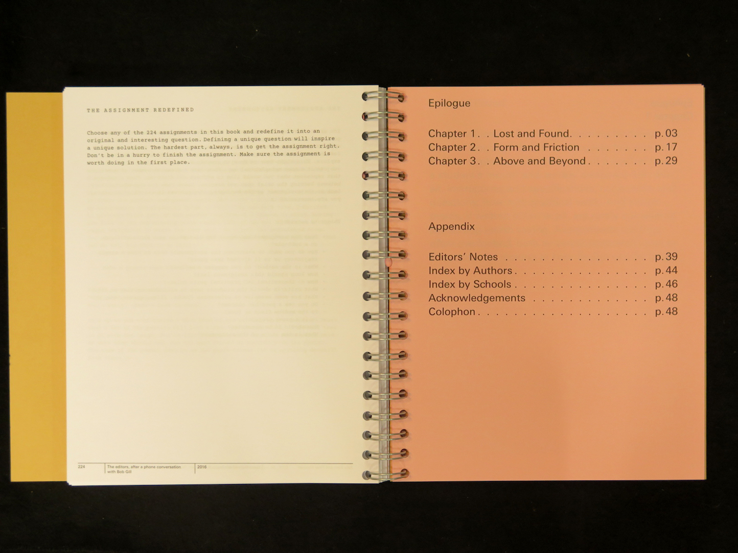
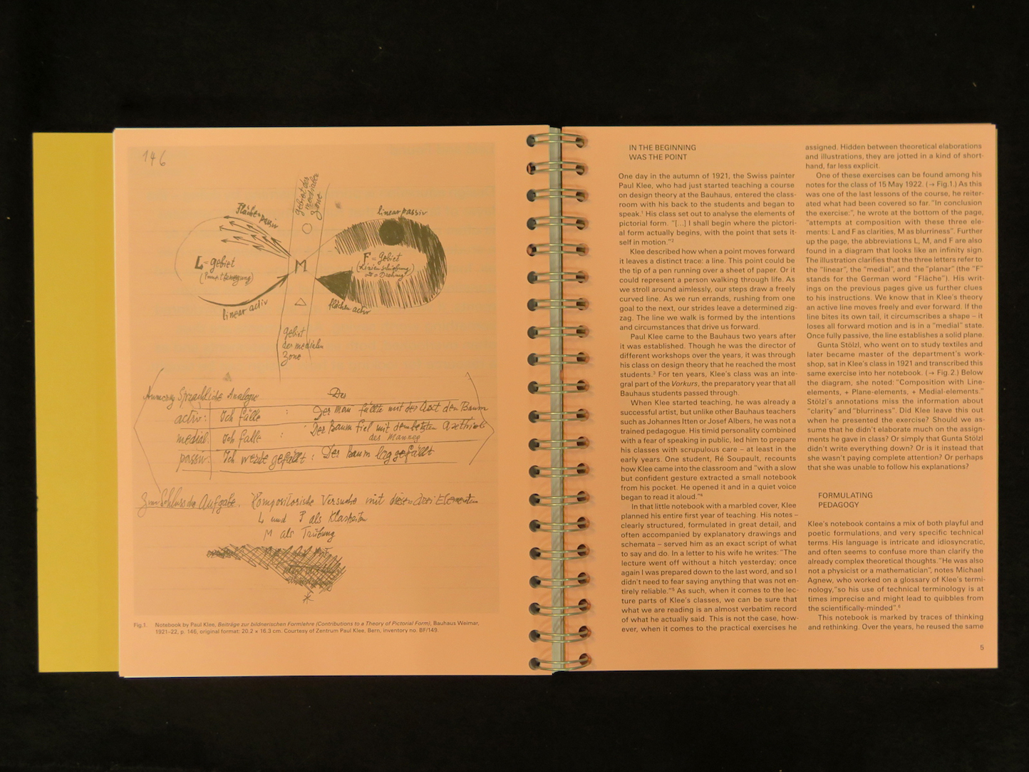
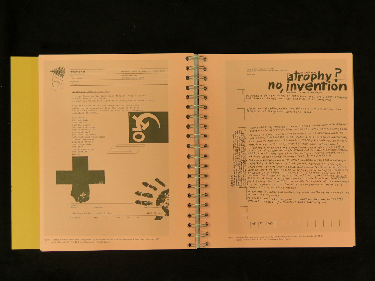
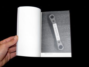
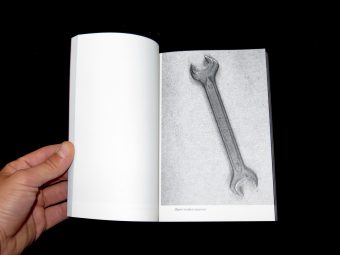
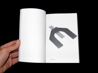
Assignments can give instructions, describe an exercise, present a problem, set out rules, propose a game, stimulate a process, or simply throw out questions. Taking a Line for a Walk brings attention to something that is often neglected: the assignment as a pedagogical element and verbal artefact of design education. This book is a compendium of 224 assignments, edited by Nina Paim and coedited by Emilia Bergmark. A reference book for educators, researchers, and students alike, it includes both contemporary and historical examples and offers a space for different lines of design pedagogy to converge and converse. An accompanying essay by Corinne Gisel takes a closer look at the various forms assignments can take and the educational contexts they exist within. Taking a Line for a Walk derived from an exhibition of the same name at the International Biennial of Graphic Design Brno 2014.
Taking a Line for a Walk
Nina Paim (ed.)
Spector Books
272 pages
22.5 x 25.5 cm
Softcover
34€