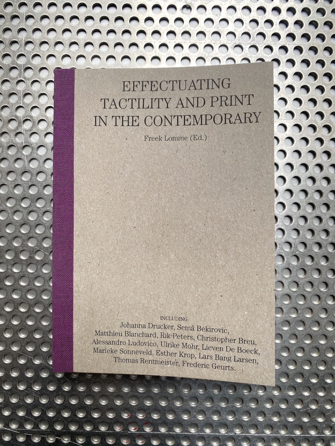
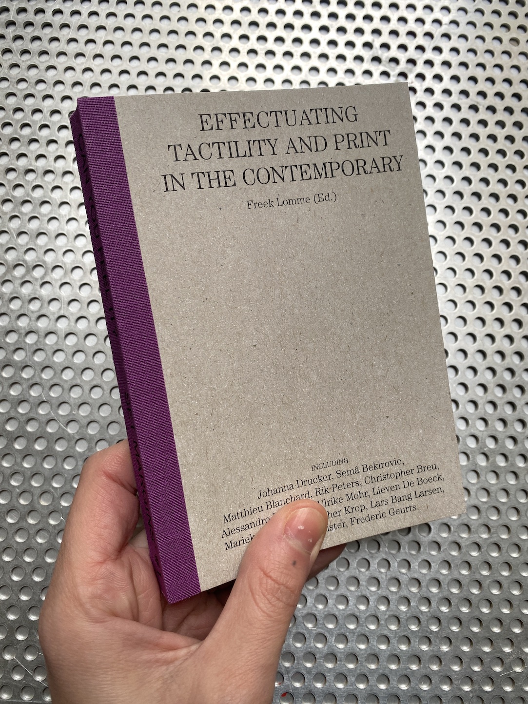
Can you feel it? Effectuating tactility and print in the contemporary. Freek Lomme (Ed.). Set Margins’

Posted in Uncategorized on December 16th, 2022
Tags: , , , , , , , , ,

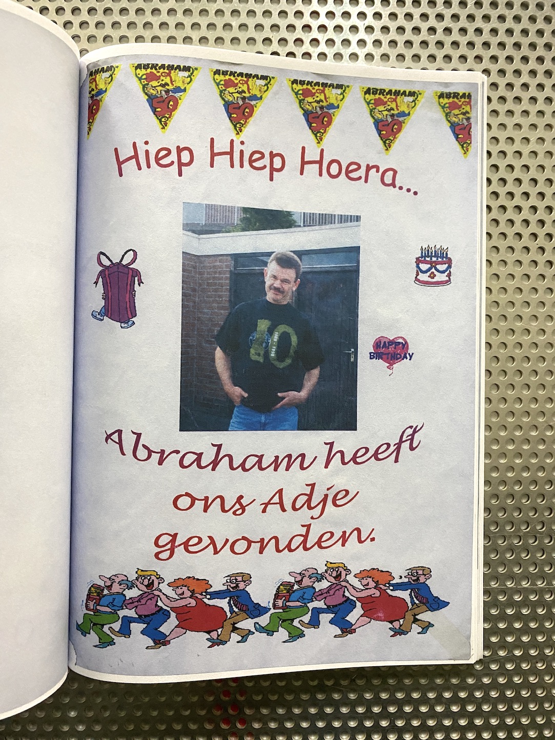
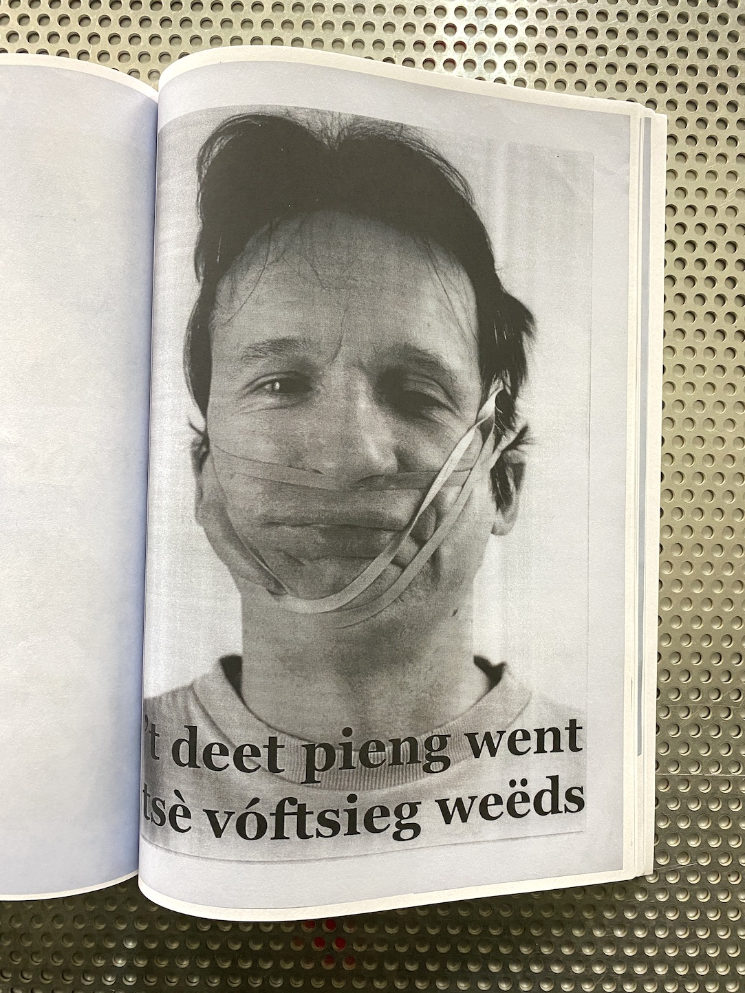
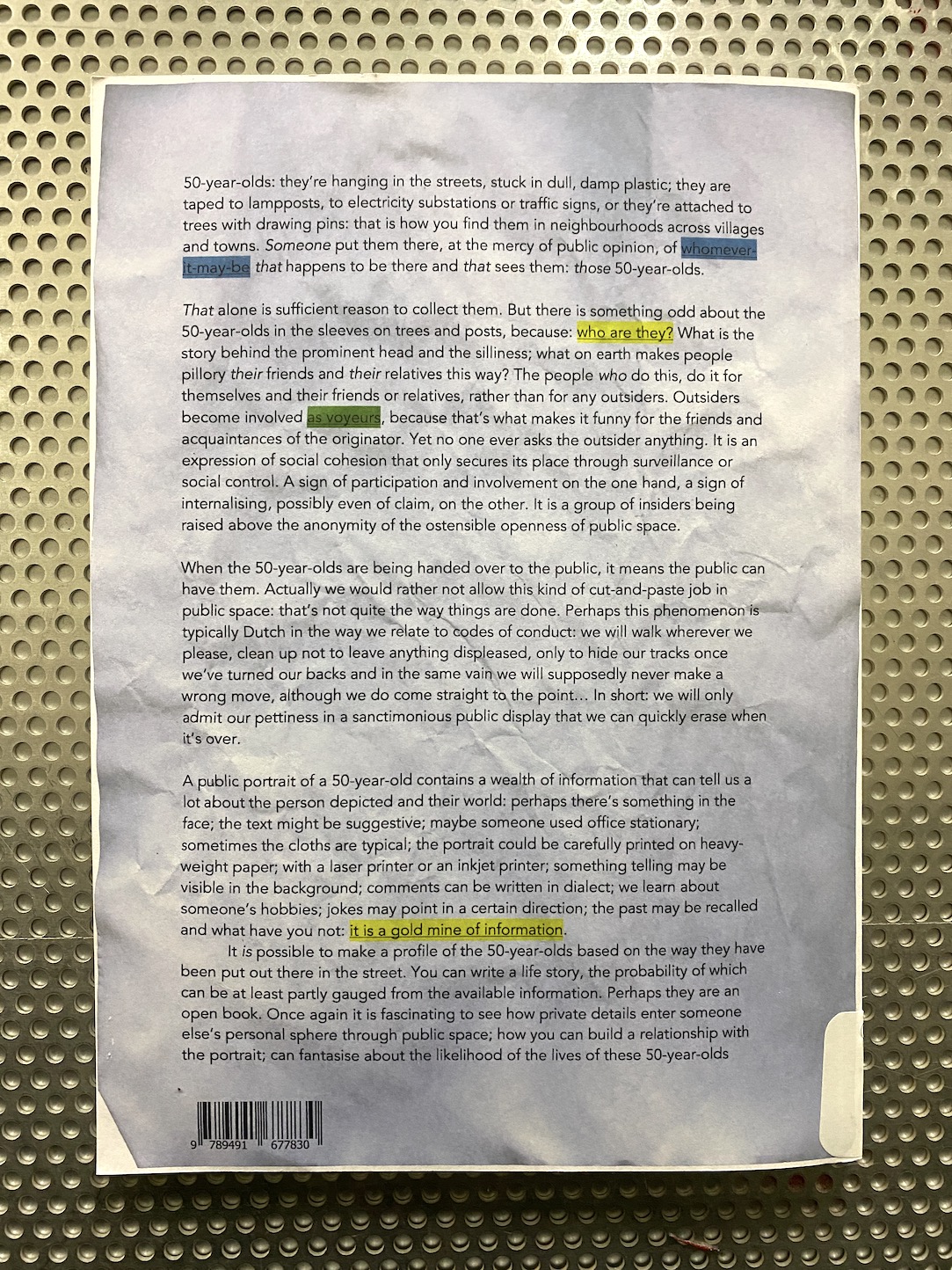
Hands reaching and feeling, noses sniffing, eyes scrolling: the magic at book shops and at book fairs is also very much a tactile one.

But what exactly is the tactile, in a world in which a rising technocracy exploits the designed environment we feel? Who authorizes and who writes, what tradition do we stand in and how can we touch base?

This reader explores how our interaction with printed matter affects us through theory, thoughts, and practices in the field of graphic design, materiality, philosophy, science and art.

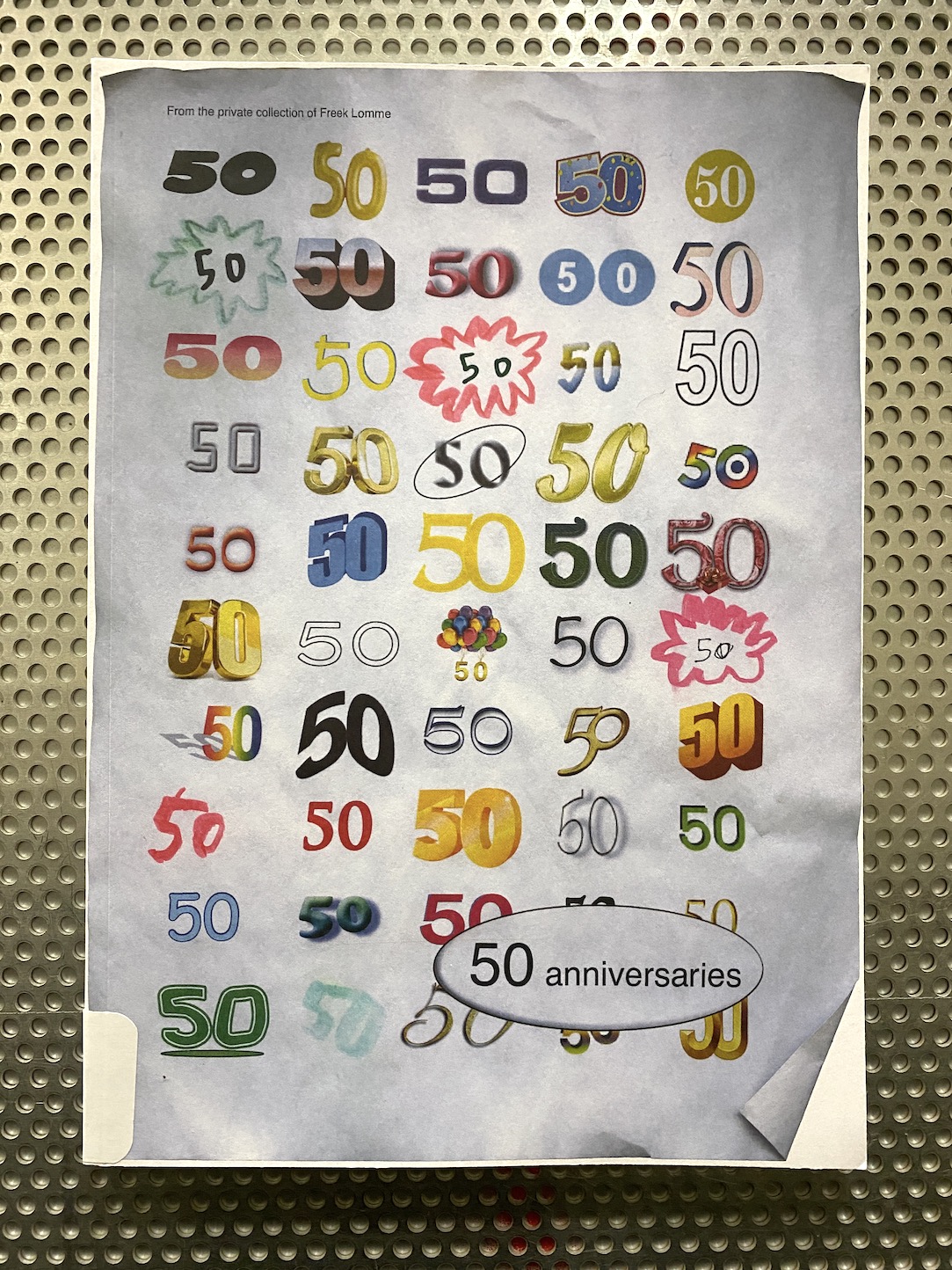
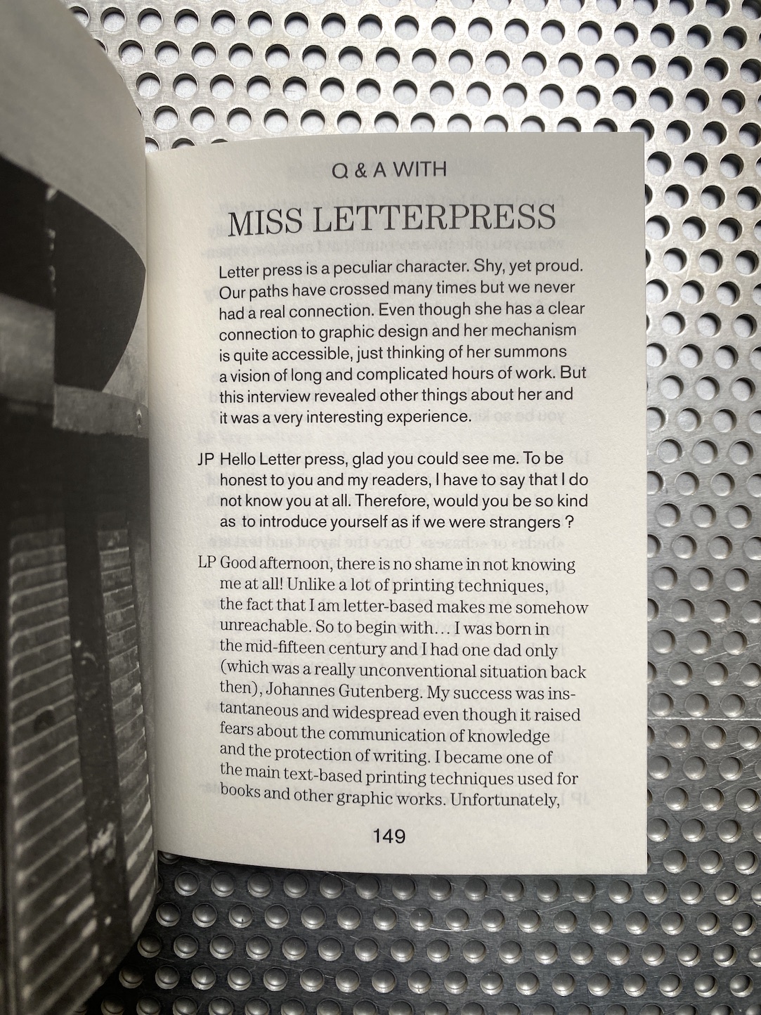
Although the core of this book rests upon theory and thoughts, with eight writings from scientists and philosophers to a paper-specialist and art writers, this book also compiles practice-based experiments by six international artists and includes animated introductions of printing techniques in the form of fictionalized characters.

Order here

50 anniversaries. Freek Lomme. Set Margins’

Posted in photography, poster, Zines on December 9th, 2022
Tags: , , , , , , , ,

50-year-olds: they’re hung up in streets, stuck in dull, damp plastic sleeves; they are taped to lampposts, to electricity substations or traffic signs, or they’re attached to trees with drawing pins.

This publication and exhibition explore the typically Dutch tradition of publicly displaying home made photo collages throughout streets and neighborhoods in celebration of a person’s 50th birthday.

Almost reminiscent of missing pet posters, amateur portrait photographs are distributed and displayed by being taped onto lamp posts and stapled to trees by friends or relatives, at the mercy of public opinion. Exposed to judgment and ridicule by friends, family and strangers, due to the usually demeaning nature of the photographs through unflattering holiday photos and the likes, individuals are exposed, raised out of anonymity and placed in the public eye.

To an extent the street becomes an exhibition space for the non art-oriented person. It’s a document of the democratisation of the public domain, through a tradition which allows artistic expression and experimentation for anyone, under the gaze of a watchful even if disengaged audience.

The presented collection of posters, possibly a study of non-intentional art under the scrutiny of the public eye, constitutes an archive and an ode to amateur, home made graphic design, made possible through the democratisation of artistic means and software such as word art, paint and clip art. A non-hierarchical demonstration of taste and aesthetic is catapulted into the streets and now gathered in the exhibition space. Perhaps involuntarily, the posters bear a sense of humour and irony to the rest of the on-looking public.

Order here

An Inquiry into Meaning and Truth (2nd Edition). Thomas Raat. Onomatopee.

Posted in graphic design, writing on February 24th, 2014
Tags: , , ,

thomas_raat_motto_1inquiry_into_meaning_thomas_raat_motto_02inquiry_into_meaning_thomas_raat_motto_03inquiry_into_meaning_thomas_raat_motto_04inquiry_into_meaning_thomas_raat_motto_05inquiry_into_meaning_thomas_raat_motto_06inquiry_into_meaning_thomas_raat_motto_07inquiry_into_meaning_thomas_raat_motto_08

An Inquiry into Meaning and Truth (2nd Edition). Thomas Raat. Onomatopee.

Second edition (November 2013 )

Thomas Raat’s An Inquiry into Meaning and Truth takes off from the cover designs of popular “egghead” paperbacks published from the late 1940s until the early 70s. The artist’s repurposing of the predominantly abstract imagery of the jackets mediates an abstruse range of synthetic epistemologies (from “freedom and responsibility” to “the law of civilization and decay”) as well as the needs or demands of various book series and the branding orientations of the publishing houses that commissioned them.

The accompanying essay by John C. Welchman discusses how Raat’s work operates at the technical interface between abstract painting and visual construction and on the generic borderlines between art, design and the history of ideas; and how his intervention precipitates a salient crisis in the signifying assumptions delivered to non-figurative compositionality in the mid-twentieth century—and its later reassessments. Prompted by an ethos of design that fronts the inevitability of reading, Raat’s project asks how abstract signs have been organized as the future of a long and stealthy illusion.

Editors: Thomas Raat, Edwin van Gelder, John C. Welchman and Freek Lomme
text by John C. Welchman
Graphic design: mainstudio
Printing: Lecturis
Photograpy: Willem Vermaase
Pages: 80 (Japanese folding)
Binding: Softcover
ISBN: 978-94-91677-09-0

25€
Buy it

One + 1. Daniel Eatock. OMP76

Posted in Uncategorized on November 15th, 2012
Tags: , ,

One + 1 by Daniel Eatock
OMP76

a database of One + 1’s
in images
in words
a text by Marie-Anne McQuay
a poster

Project manager: Freek Lomme
Editors: Daniel Eatock, Sebastian Campos, Marie-Anne McQuay, Freek Lomme
Text: Marie-AnneMcQuay
Graphic design publication: Sebastian Campos
Printed at Lecturis

D 7€
BUY