Type Life Issue #1: Special Lab. Swiss Typefaces.
Posted in graphic design, typography on August 16th, 2017 by adminTags: Swiss Typefaces, Type Life
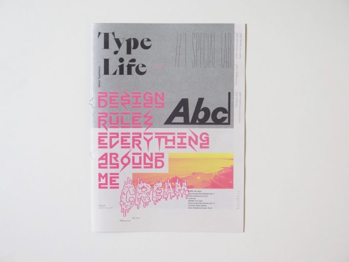
Type Life
Issue #1: Special Lab
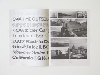
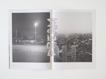
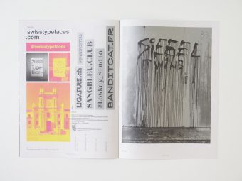
The inaugural issue is a special about the Lab. In this Research & Development department, we explore new ideas for future fonts. Two of the most recent additions to the Lab are showcased here. The first one named BRRR is a playful wide Grotesk with a great deal of disruptive details. A spin-off from Simplon Mono, it was initially created to design a poster series for Swiss artist Simon Paccaud. KRSNA started out as a custom version of NewParis Skyline, made for two vinyl record sleeeves by Geneva-based musician Grace Core. This experimental typeface abandons the convention of a continuous baseline and introduces a three-storey space where the letters can sit at the top, center or bottom, with the remaining space filled by bars and spikes. The resulting word images are captivating patterns with logo-like qualities. Type Life reveals how BRRR and KRSNA came into being by depicting preliminary sketches, evolutionary steps, and photos of experiments made during trips. Reproductions of the very first applications show the fonts in context.
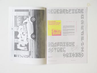
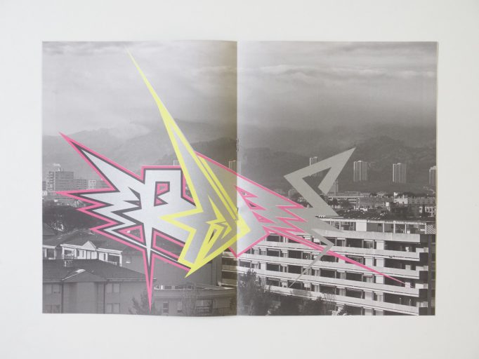
An underlying theme in Type Life #1 is the confrontation of opposites. Systematic typography is interspersed with footloose lettering, accurate vector shapes are shown side by side with drippy comic blackletter. Highbrow clashes with subculture when an icon of the Swiss International Style gets remixed with graffiti. Past meets present also in the typeface designs that always and inevitably are contextualized in history. The digital is contrasted with the analog, the local with the cosmopolitan, the abstract with the personal. On a formal level, all of this is represented by the combination of uncoated newsprint and glamorous spot colors. The minimal but nevertheless unique color palette featuring Pantone neon pink and yellow along with silver and black is a defining element of the publication’s identity.
Deprecated: link_pages is deprecated since version 2.1.0! Use wp_link_pages() instead. in /home/clients/43b290981c17e09d544641237b7f773f/web/site/wp-includes/functions.php on line 5326