Gay Areas Telephone Directory. Matt Connors (Ed.) Pre-Echo.

Posted in Uncategorized on August 28th, 2017
Tags: , , ,

gay_areas_telephone_directory_pre-echo_motto_01

gay_areas_telephone_directory_pre-echo_motto_03 gay_areas_telephone_directory_pre-echo_motto_04 gay_areas_telephone_directory_pre-echo_motto_05  gay_areas_telephone_directory_pre-echo_motto_07 gay_areas_telephone_directory_pre-echo_motto_10gay_areas_telephone_directory_pre-echo_motto_08 gay_areas_telephone_directory_pre-echo_motto_09   gay_areas_telephone_directory_pre-echo_motto_12

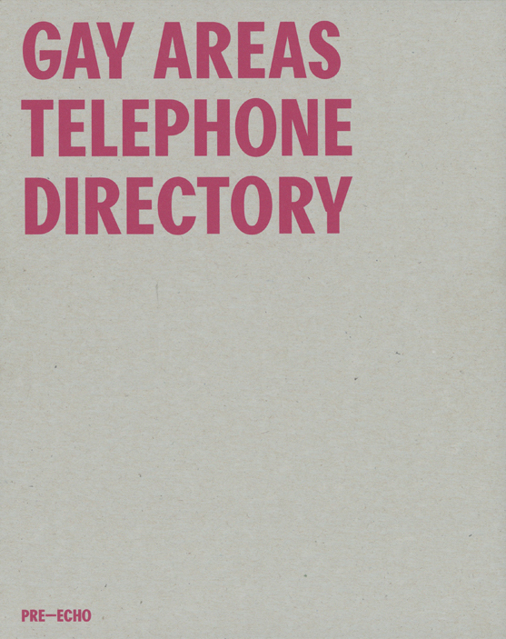
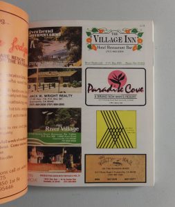
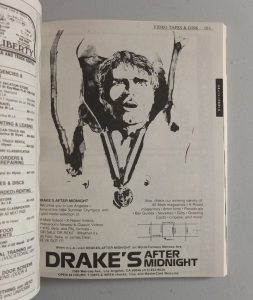
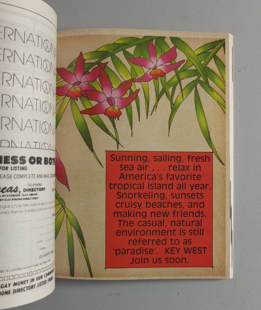
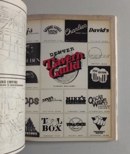
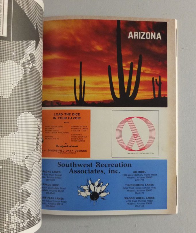
Gay Area Telephone Directory is an artefact from another age. It is an exact facsimile of an American telephone directory published in December 1983 by Gay International Inc. and targeted at a queer population. The phonebook is a now-obsolete format, but before mobile phones and the internet every household had one by the landline. This queer directory featured listings and advertisements for businesses friendly towards or catering to lesbian and gay men at a time when such visibility was a rare and possibly dangerous thing. 1983 was a watershed year for LGBTQ people. The first HIV/AIDS cases were reported barely two years before, marking the beginning of the health crisis that would go on to kill more than half a million (primarily LGBTQ) people within the next ten years. In addition to serving as a portrait of a community and its culture at a crucial stage of development, Gay Areas Telephone Directory stands as a time capsule of lost generation(s) felled by AIDS.

Originally published in 1983 by Gay International Inc. Facsimile edition

Slipcase design by Joe Gilmore


Buy it

Correspondences. Matt Connors. Ooga Booga.

Posted in painting on October 12th, 2011
Tags: , ,

Correspondences. Matt Connors.

Correspondences is Matt Connors’ first artist book. Taking its inspiration from 1960’s poetry paperback covers, the book acts as a kind of “themes and variations” / exercise de style, deploying a psychedelic template and reiterating it through a limited number of colors and formal iterations. The saturated colors and delicate play of formal repetition and variation create both a series of linked discreet images as well as an autonomous art object, with color and form creating a narrative rather than text.
Printed in stunning offset spot color, Correspondences becomes a sort of abstract flip book, with color and formal information spilling from the cover, to the interior and onto the spine and edges of the book.

In addition, each copy has been individually collated by the artist, so that every book has a unique sequence of colors/images, and is unique. Printed and bound in New York City.

Published by Ooga Booga
Softcover
Perfect bound
Offset printed in 5 spot colors on 100 lb paper stock, with a linen-textured coated cover
Edition of 500, 2011

D 26€

Buy